GRAD701 – Week 11
Recap of the week
- Refine logo – Colour and Dynamic
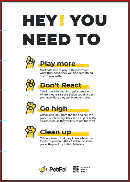
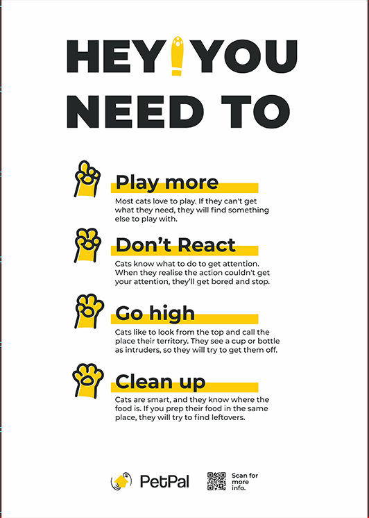
- Refine poster – Feedbacks & Improvements – the title on the 2nd posters is not eye catching, and my silution.
- Booklet content alignment
- Test print -Pinklime

Logo
Refinement
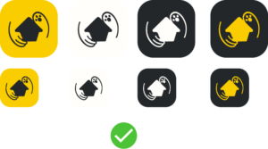
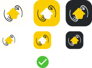
With the new feedback from tutors, we added colour to our logo, but we still maintain the solid logo used in other situations. One of the tutors also suggested adding more dynamics to the logo to make it visually balanced and engaging. She also helps illustrate the idea of dynamics and allows us to see the theory behind the design. Through her demonstration, I also learn some design principles. For example, she has done typography design before. She said in type design, where to put an anchor is essential to the visual and performance, which is also applicable to vector design. Less is more.


She was designing on-set, so the look is rough, but the core idea was there, and I was able to make changes based on the visual feedback. Because we decided to add colour back to our logo, it is crucial which colour to use. Considering we might have different coloured backgrounds, I designed three logos with different colouring to use in selected backgrounds.
Poster testing
Feedback
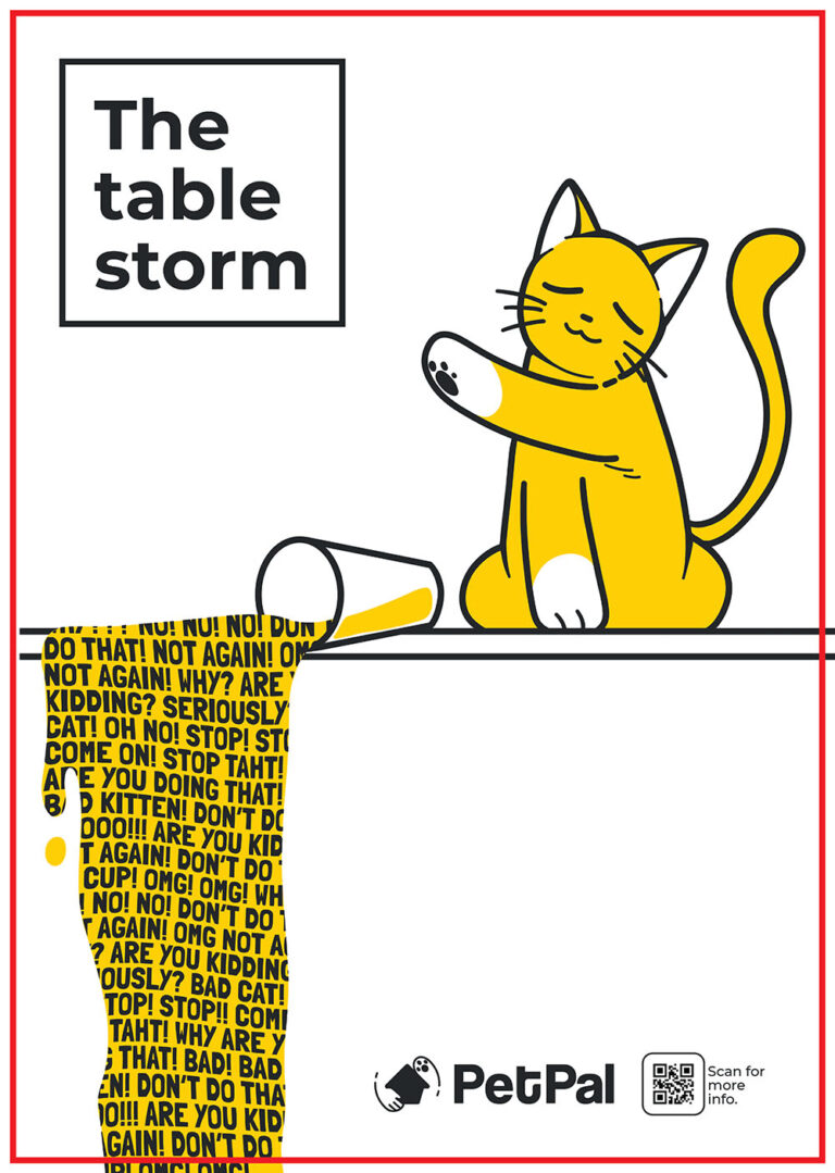
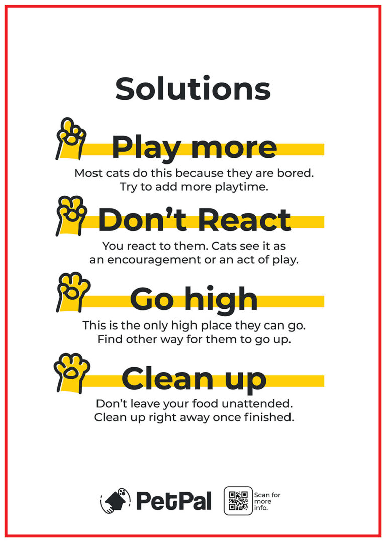
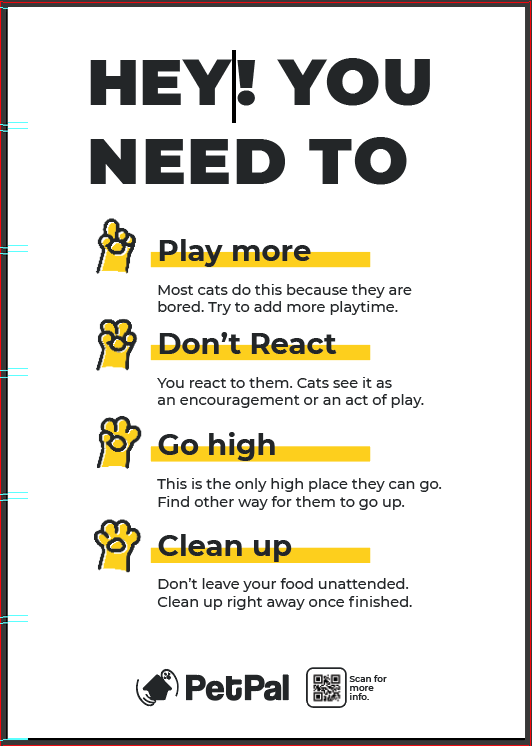
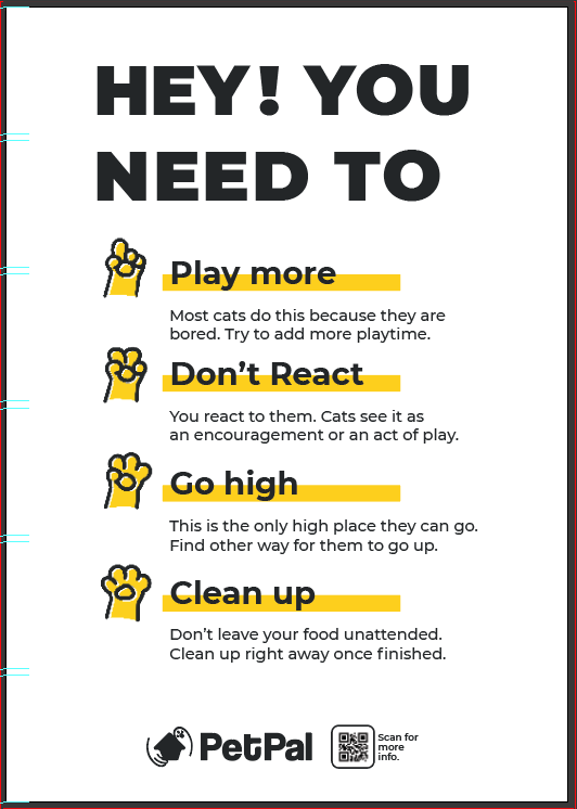
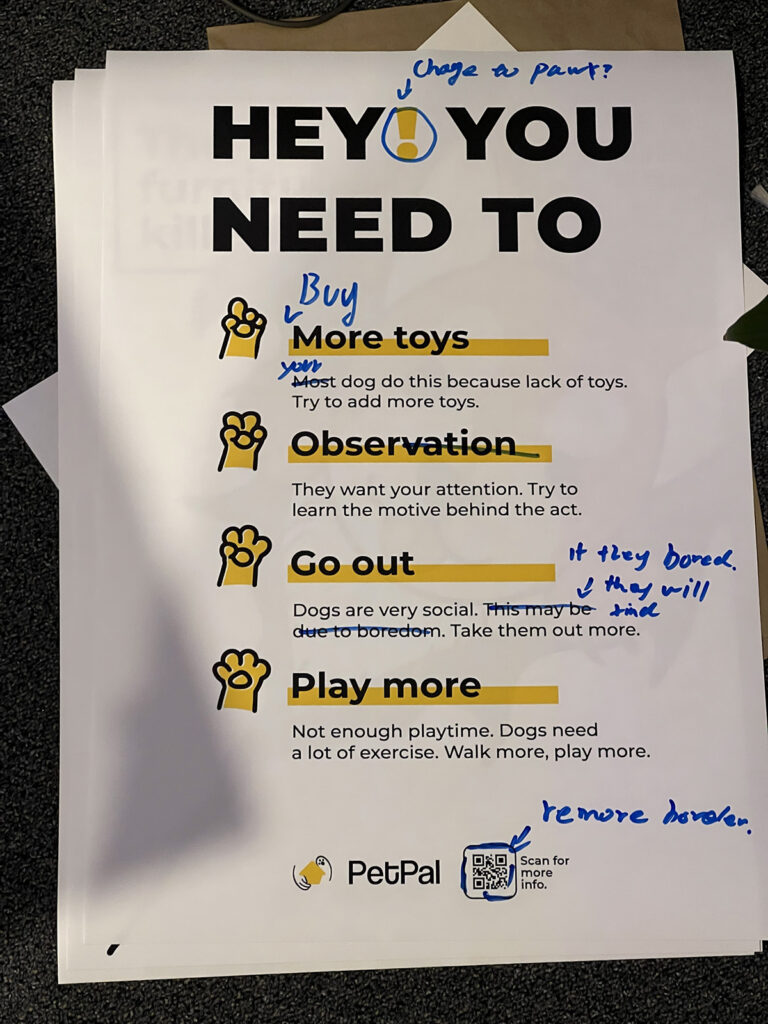
The initial second poster was designed to offer a solution to the pet behaviour issue. I wasn’t paying much attention to the wording and just the simple word “Solutions” as the title. I think this might work because the word is simple and thus can be scanned by a look. Whit fewer words, the readability will increase, therefore helping to gain attention quicker and communicate the topic more effectively. But, when I got the print out posters and asked for feedback from classmates and tutors, the response was surprising. Most of them quickly pointed out the wording issue with the title, and the size of the title is not working due to the font size being the same as the other content on the page. And the word “solutions” feel cheap and not interesting enough to deserve attention. In addition, a critical feedback from tutors suggested the eye movement through the poster is not as I planned. The focal point is not on the title but between the middle of the title and solution titles.
Title testing
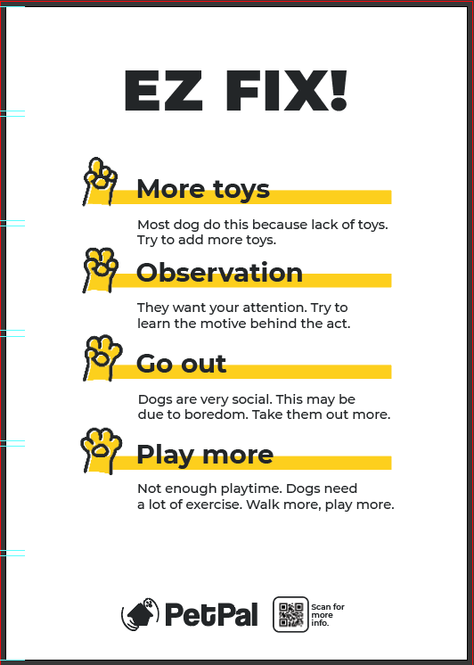
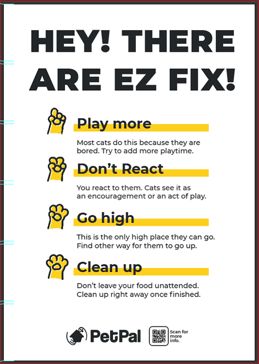
I was landing on the idea of using words that sounded like “Hey, Yo, Oi, Hi”. And to be able to connect with the rest of the poster titles like “play more, go high”. In the end, I decided to use the wording “Hey! You need to…” Also, I tweaked the layout to make the phrase separated between “you” and “need” and make it “Hey! you”, which makes the poster feel like it’s calling out.
"HEY! YOU NEED TO - PAY MORE ATTENTION"
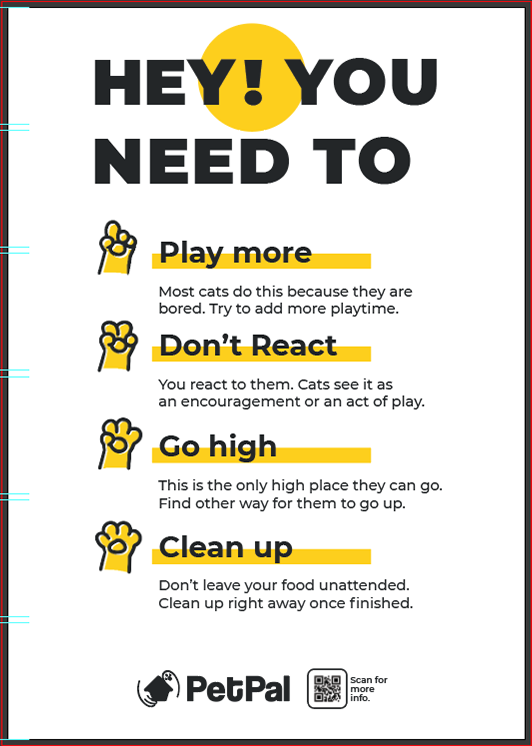
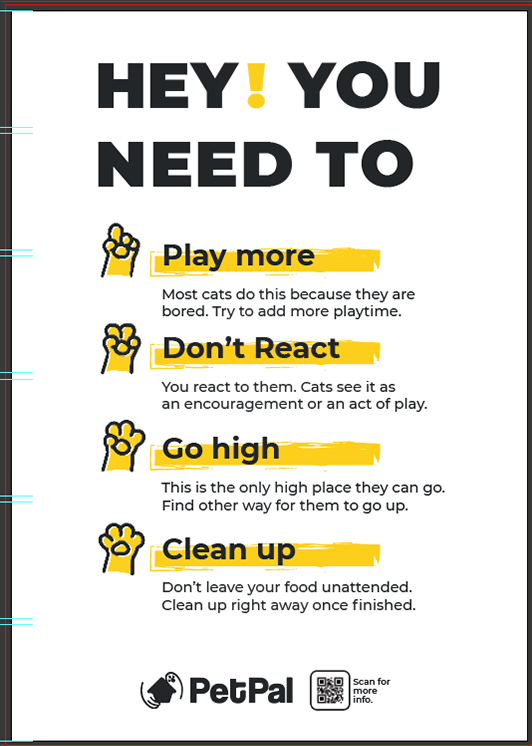
But, with just the words themselves might not be enough. Thus, I added some elements to the title in hopes of gaining more attention from the eyes. However, after many trials, I fell back to using the simple brand colour yellow to highlight the exclamation marks, as that is what I tested to be the most non-intrusive and disturbing solution.
Dox design
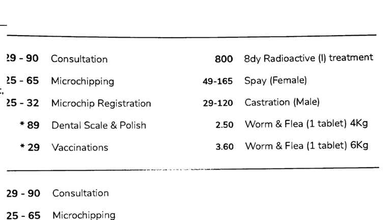
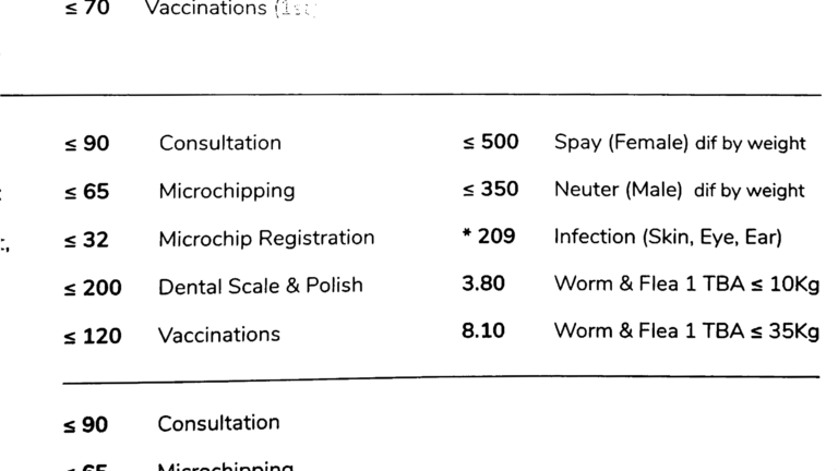
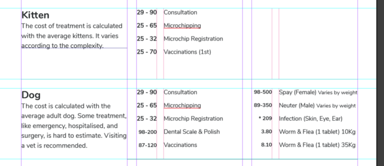
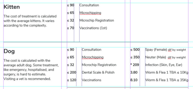
The feedback I got from class regarding my publication design was the alignment. Some of the alignments, especially the pricing and description. I aligned the price text to the right and the description text to the left, intending to group them together and create a block. But I didn’t realise the alignment caused a messy layout, broke the grid system and led to reading fatigue for some viewers.
I resolved the alignment issue. To make the alignment look alike on both sides, I modify some of the wording and kerning of the text to visually align the text.
Pinklime
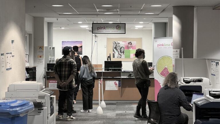
I use Pinklime in this project to print all of my materials as they are the closest print shop in my area, and the cost was reasonable. Their fast turn-around-time was also one of the factors I chose to work with them. I brought my own paper as well as their paper for the first printing. Because my paper was textured and slightly coloured paper, the result was fair, but there are some issues with the alignment of the middle page causing the two side print not lineup thus creating misalignment when binding.
More testing is needed as the print service offers a different printing method with other colour spaces. They use various machines to print the A3 and A2 paper. A3 uses a toner printer, and A2 and larger use an inkjet printer. The staff over the Pinklime told me there might be colour differences due to the two different print systems. But, the result from the machines was quite consistent, and I did not spot the difference between the rendering.
To do next
- Polishing poster and publication.
- Start designing layout and putting content in the brand system.
- Presentation preperation.
奥克兰理工大学作品
本作品是隶属于我在AUT学习期间制作,使用及传播需要遵循许可协议。详细可查帮助中心。 This post/project is an AUT university assignment, the use of any kind must obey the terms.
版权保护
可能含有版权保护内容
不可下载
未经授权,不可下载
不可商用
可能含有版权保护内容
