GRAD701 – Week 10
Recap of the week
- Redesigning logo – How it comes about
- Redesigning poster – 3 TO 2 – Typeface changes.
- Redesigning booklet – Grid & Margin
- Website design- A WordPress site that put our works together.
Publication Testing
Opinion
When we received the feedback from the tutor that our logo needs more consideration and that it is better to redesign the entire logo. To be perfectly honest, I was concerned because redesigning can take days to complete and might seriously delay all of our progress, especially on the logo, as it will be used across our outcomes. Another thing I was disappointed about was how much lag of communication there was during the logo design phase. We all agreed the old logo was good for lockup. With that confirmation, I started to expand the VI & brand guidelines. That’s so I thought, but NO NO, after the feedback, everything is changeable. There are only two weeks left, and making such a massive change is extremely risky, but the proposal makes sense, as the logo can definitely be more considerate.
Discussion
We still decided to redesign the logo, and this time, we are doing it all together to make sure that we all agree on something. We were using Teams and its whiteboard function to draw all of our ideas while discussing the core attention of the brand and what it is really gonna be. I was also using a notebook to draw some sketches and sent them over to Teams.
Ideas behind the logo
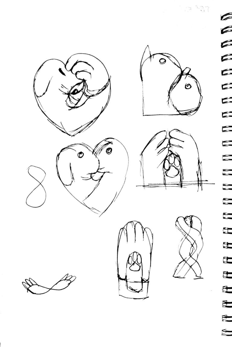
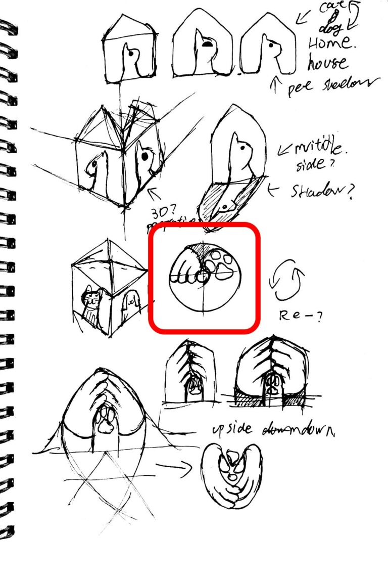
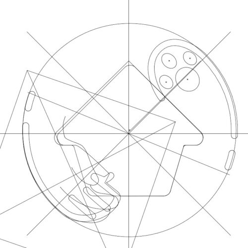
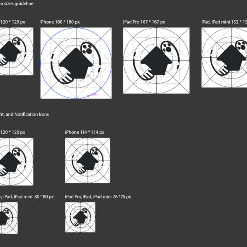
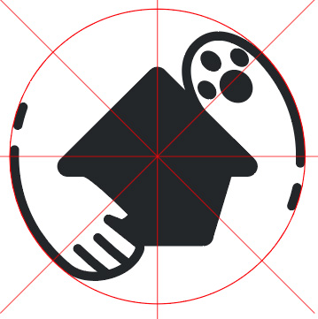
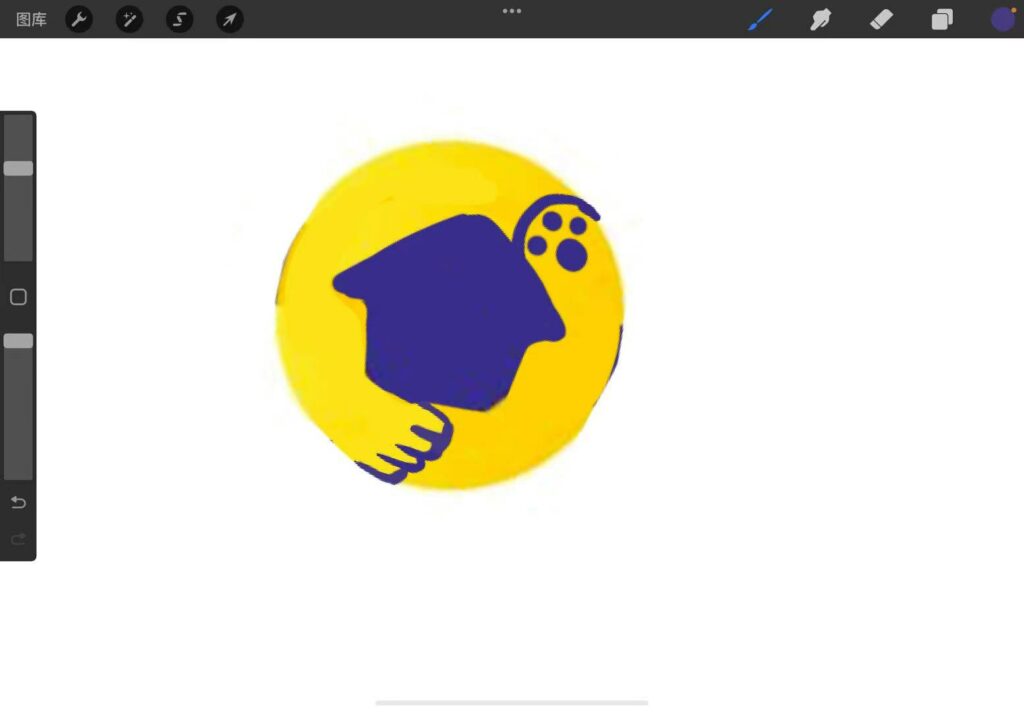
We were sharing our ideas for the new logo, and Cherry wants a house to symbolise the home. And I propose the idea of using a human hand and animal paw to form a circular shape to represent the meaning of cycle and codependent. And when Yiran did the drawing of my idea she said it looks like the Taichi symbol. We took the idea of combining both the rounded shape and the hose in the middle to be our new logo. In this version of the logo, Yirain drew the draft of the logo, Cherry converted it into a vector graphic, and I redesigned and cleaned up the graphic into the final form.
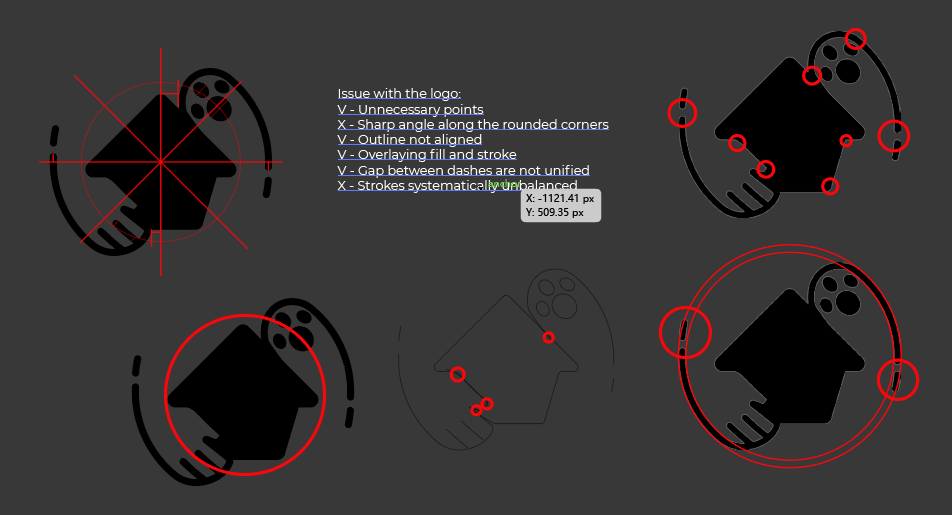
Logo & Colour
At the meeting, we initially decided to only use a solid colour for the logo. But after I put it into illustrator and viewed it in different placements and sizes, I realised it could be better to have some colour within the logo to make it pop a bit. When I propose the idea to the team, they do not like it. Thus, We went for the solid colour.
Placement and layout
Old posters
Number of pages
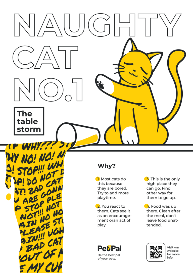
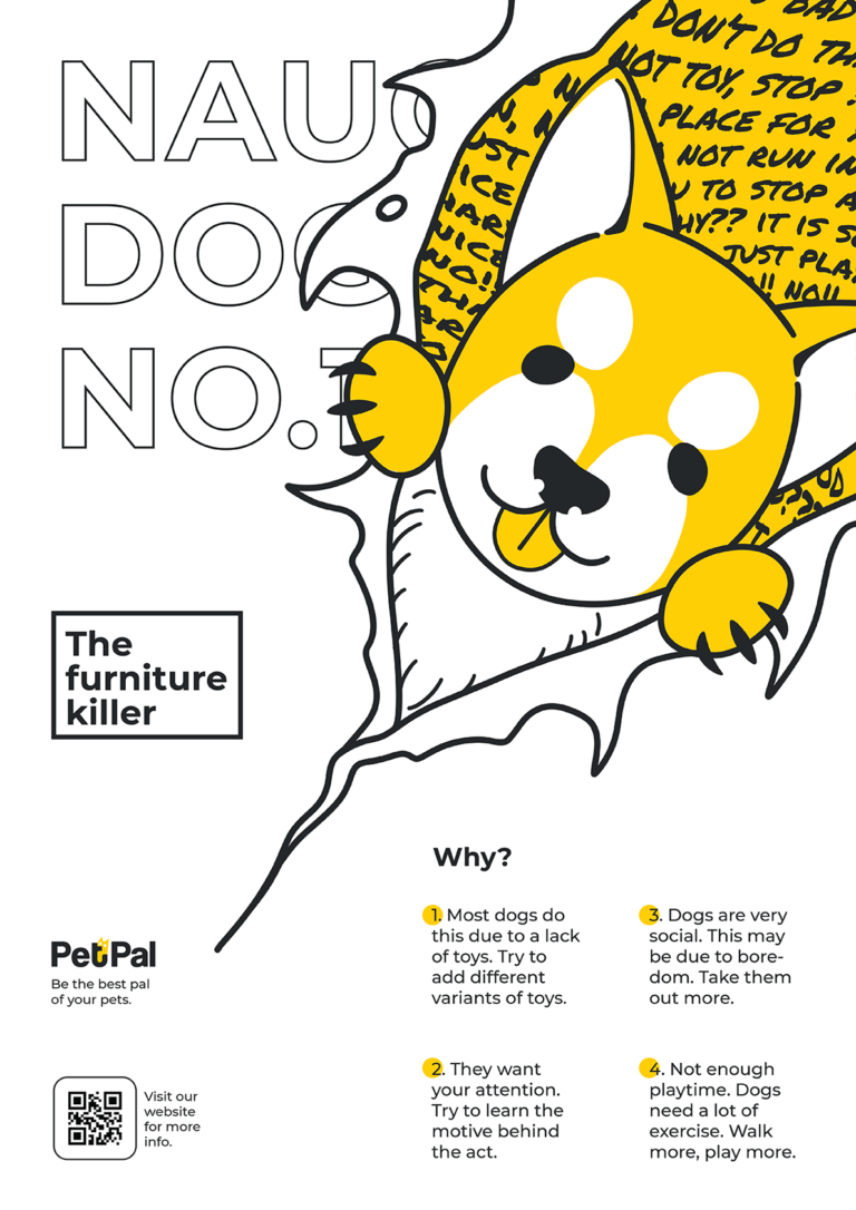
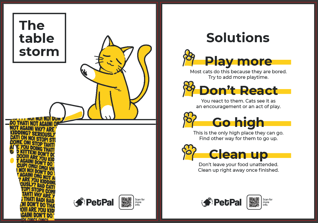
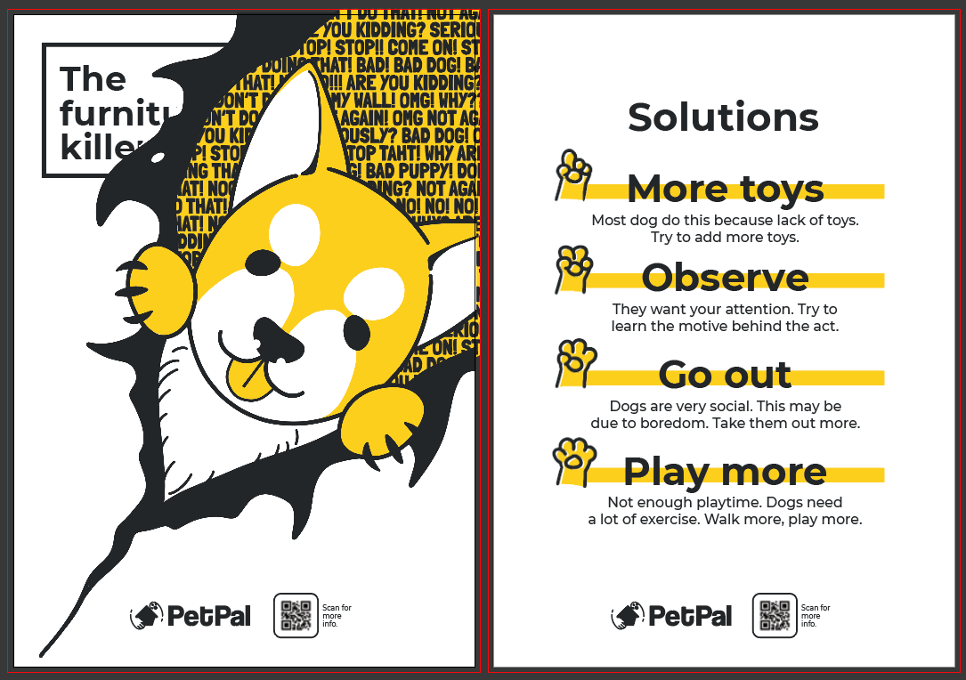
The poster design was making another major shift after the feedback from classmates and tutor. I noticed the one poster idea makes the graphic crowded and difficult to read. Therefore, I tested different layouts and found out that two was a good number for this series.
Ineffective layouts
With the page number locked. I started to design the new layout. According to the feedback I got, the Text on the bottom was the biggest issue. So I decided to place them on the second page as it was the essential piece of information to give to the viewers.
Typeface testing
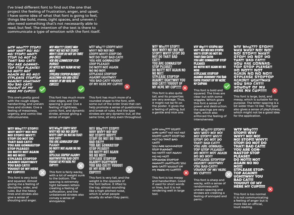
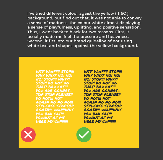
I initially wanted the text in the yellow background to show the inner mind of the owner and try to visually communicate the feeling of frustration through the text and the typeface. But with the feedback from Tatiana, I understand the typeface can still be improved. The main issue was the typography is not fitting well with the rest of the elements. Although the shape and look of the type did project the feeling of frustration, but the weight and the spacing are not cohesive with the other typeface.
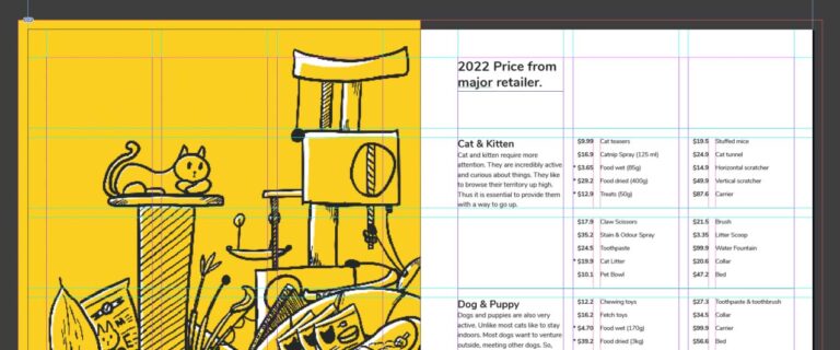
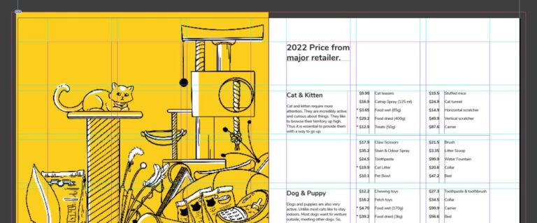
Redesigning grid & margin
Layout
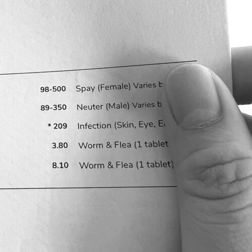
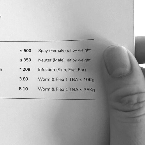
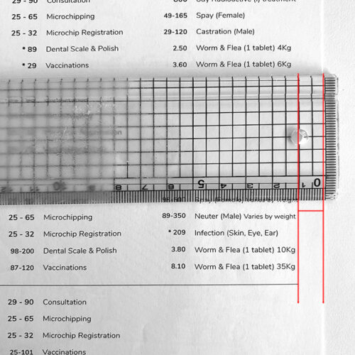
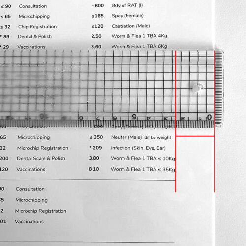
After printing out the publication, I realised that the text boxes are too close to the edge of the book and can sometimes be blocked by the fingers if holding it in a certain way.
A Site to host our works
WordPress & Domain
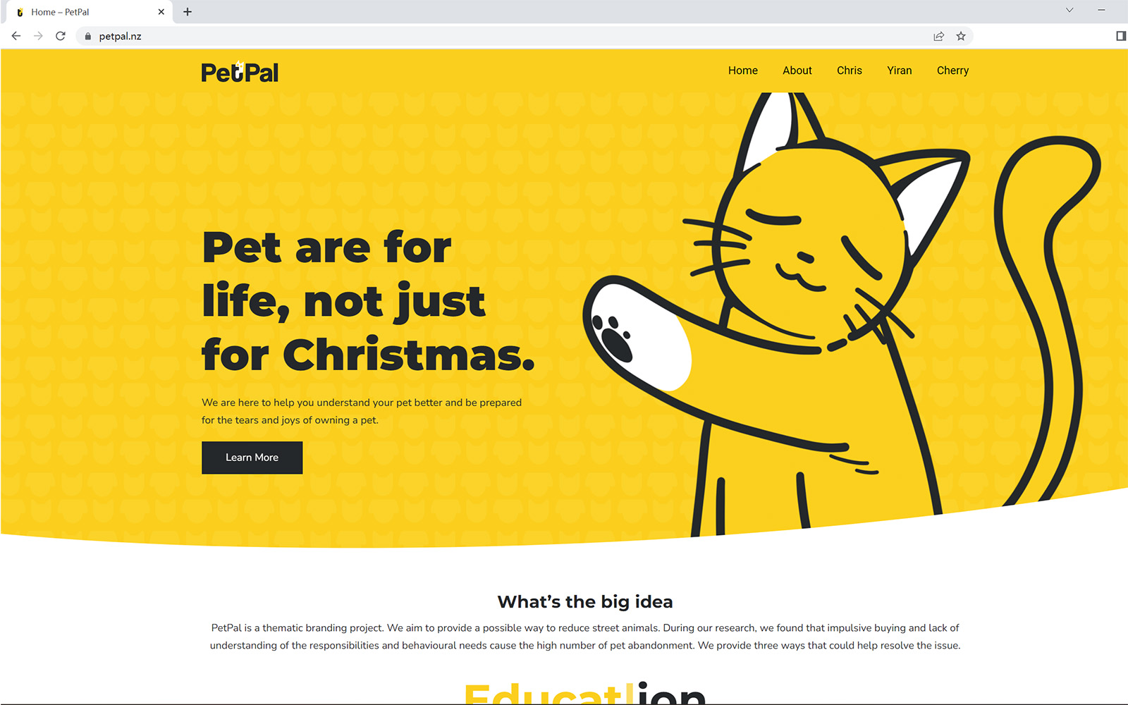
Because I was interested in making a website to host all of our works and make it accessible without the physical materials. Such as, making the publication, picturebook to an E-Book. I decided to use WordPress to create our site. The idea might not be able to fit into the project. Thus, I making it a side project for now. The site is open to the public and can be accessed via our domain: https://petpal.nz
The downturn
We had another major emotional outbreak. The team is following apart, but we are so close to the end, and we must get through this no matter how much we hate each other. Yiran was kind enough to be the transmitter of our fractured team. I think the reason for this argument was due to the pressure building up with the ever closer due day. And we were feeling insecure about the delivery.
To do next
- Prepare for the presentation
- Think bout the Brand System
- Update the QR Code on Posters and publication
- Prepare my part of the group report
奥克兰理工大学作品
本作品是隶属于我在AUT学习期间制作,使用及传播需要遵循许可协议。详细可查帮助中心。 This post/project is an AUT university assignment, the use of any kind must obey the terms.
版权保护
可能含有版权保护内容
不可下载
未经授权,不可下载
不可商用
可能含有版权保护内容
