GRAD701 – Week 09
Recap of the week
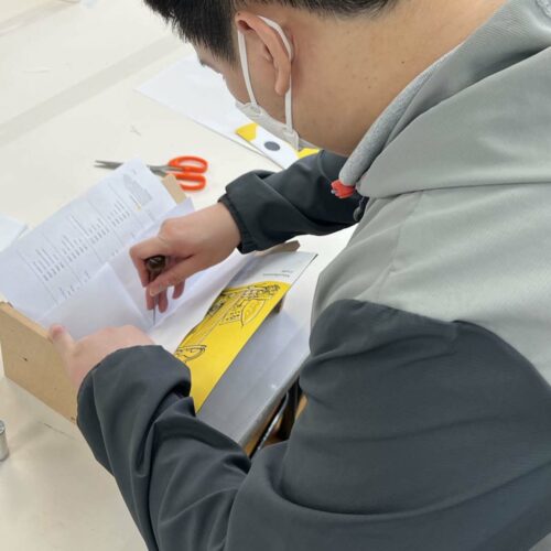
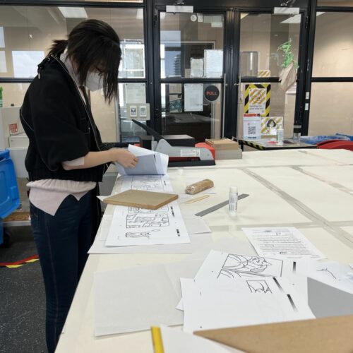
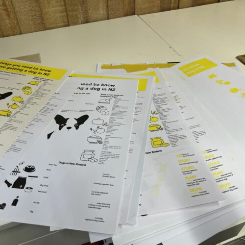
- Print testing
- Publication binding testing
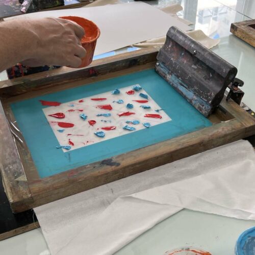
- I’ve gone to try out different ways of printing, screenprinting with a machine and traditional hand made
- I’ve changed the poster size to A2.
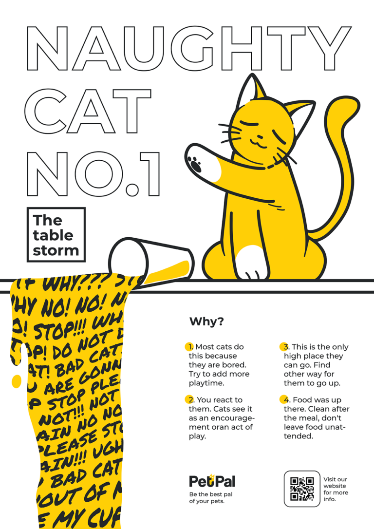
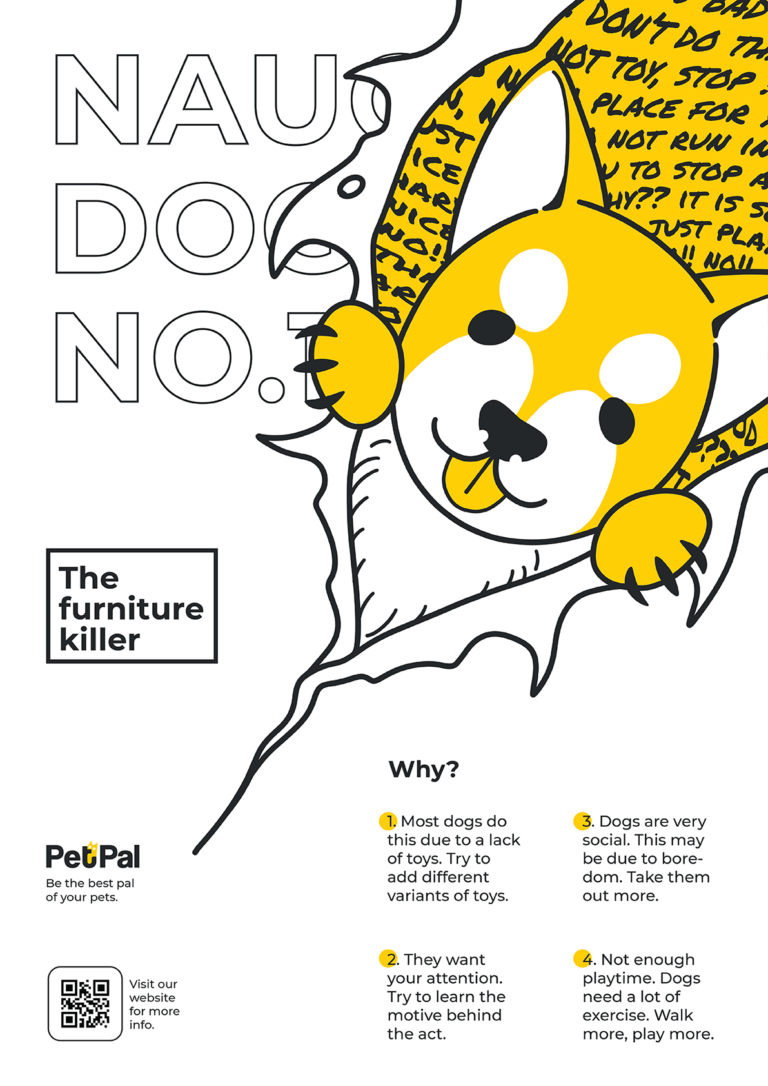
- I’ve worked with Yiran to inherit her illustration style into my poster. For more consistency.
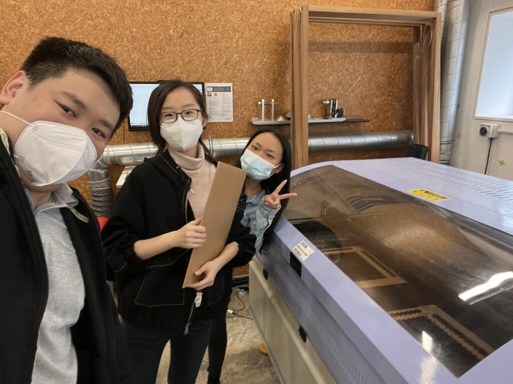
- Cherry and I went to a laser cutting workshop to test our box design. But a miscalculation in the cutting result in the box cannot be closed.
- After the laser cutting error, we asked the technician what to do to fix it. They said it is better if we can 3D model it first to see if the cut was made in the right way.
- We went shopping for paper, and I adore the texture and colour of the snow-white paper, so we decided to use this paper for all of our print materials.
Publication Testing
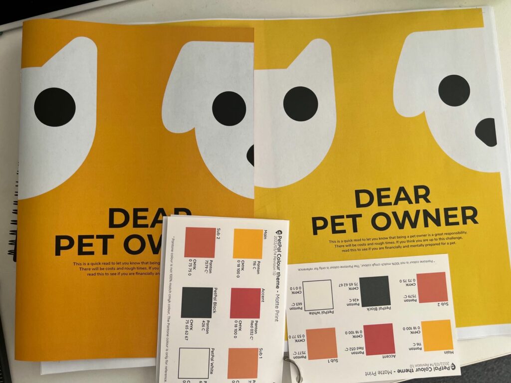
I went to test print on levels 4,5, and 7 printers. I realised different printers render a different tone of yellow and none of them can truly represent our brand colour. Therefore, I am trying to get a professional print from Pinklime as a reference print to compare which printer makes it better. However, even Pink lime can not 100% render the colour correctly. Thus, for the final print, we are going to a professional print shop ( The Print Guys ) for our outcomes. But we will still be using the school printer for testing because it is cheap and easy to access, great for doing minor changes and seeing the result in a second.
Binding
I’ve gone to Pink lime to see what binding they offer. After all that, I still find a simple binding is what I like. Its minimal intrusion is what I am interested in the most. I went to Lv7 and tested both string binding and staple binding. I have determined that this booklet is for a quick read, low cost, and can be massively produced. Thus, a more accessible and more cost-effective staple binding is more relevant to my need.
Poster testing
Screenprint
I went to the screenprint workshop and loved the texture given out from the mash. Therefore, I like to try to print my poster using screenprint. I’ve tried both digital and traditional screenprint. Although the machine makes a finder print in exchange for losing some texture, and the size can only go as large as A3. Thus, I plan to make it the traditional way because it supports a larger print. After trying the entire process of screenprinting. I realised the biggest challenge is matching the colour. I’ve tried to mix the yellow but never get close enough to be seen as a part of the thematic branding. Furthermore, we realised some of the details were lost due to the mesh size limitation. Therefore, we decided to move away from screenprint and return to the printout option.
Illustration
After the feedback from the class, I realised there is still more to develop in the art style. Although we are using the same colour, but the drawing just seems harder to match. Which is bad if our goal was to form a thematic brand. I decided to work with Yiran, she helped me with her illustration skill, and I will provide the group with my layout design. Together, we are now allocating different skills for each person.
I realised I used many examples of cats being the “devil” in my design work. Therefore, I try to add more examples of other pets in the mix. The cat poster is in the final step. Now is moving to print testing.
Dox design
The error
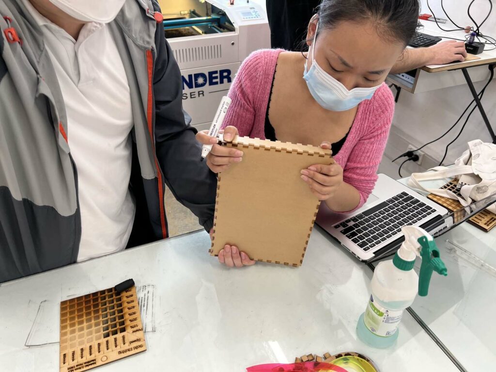
When we first tried to make the laser-cut, we made our cutting file in illustrator. Because using a 2D flat design software is hard to imagine what it will look like in 3D. And because in 2D design, everything has 0 thickness which creates an issue where it is difficult to determine the cutting point, join, and depth of a cut. Because of all that, the first test wasn’t going well. There where a miscalculation in the material. We forgot to calculate the thickness of the acrylic itself, resulting in the box cannot be closed.
Design in 3D
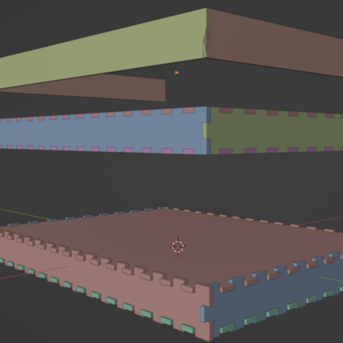
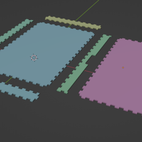
Luckily the technician in the 3D Lab reminded us if we could make the box itself in 3D first, then the process could go much smoother. I myself have some experience in 3D modelling, therefore I took the challenge and designed the box for the group. My box modelling was based on Cherry’s idea, and I made it in 3D and then reverse-engineered it into a flat cutting map that was later used in the box cutting.
To do next
- Poster information might be a bit crowded, try to break them into 3 poster for each animal.
- Refine individual publication work.
- There are some issues with the publication margin and placement of divider lines. Need to refine.
- Repaint the illustrations from the publication because it is a bit out of sync with Yirans style.
- Consider making a website for all our content. A showcse might be nice.
奥克兰理工大学作品
本作品是隶属于我在AUT学习期间制作,使用及传播需要遵循许可协议。详细可查帮助中心。 This post/project is an AUT university assignment, the use of any kind must obey the terms.
版权保护
可能含有版权保护内容
不可下载
未经授权,不可下载
不可商用
可能含有版权保护内容
