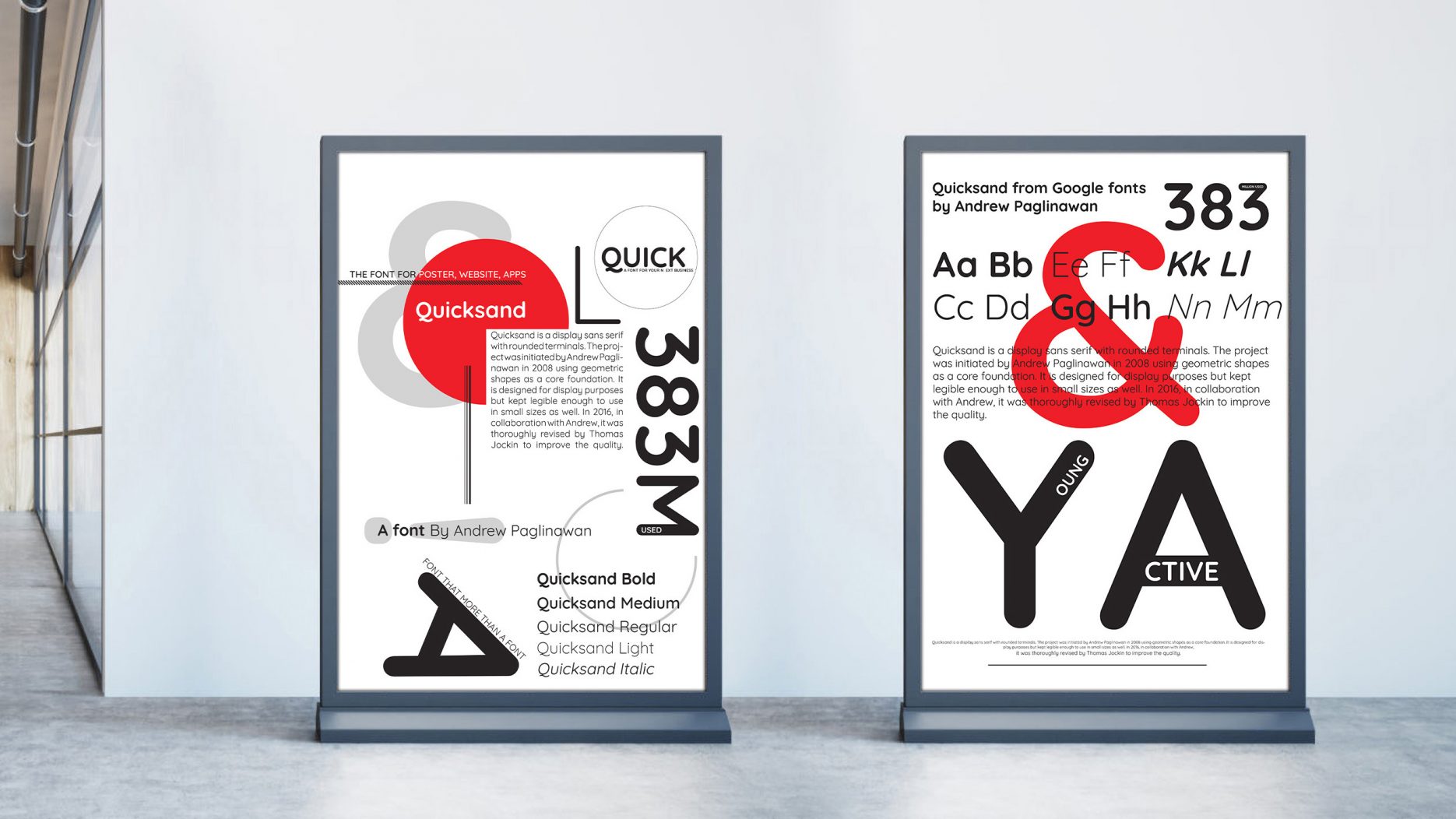
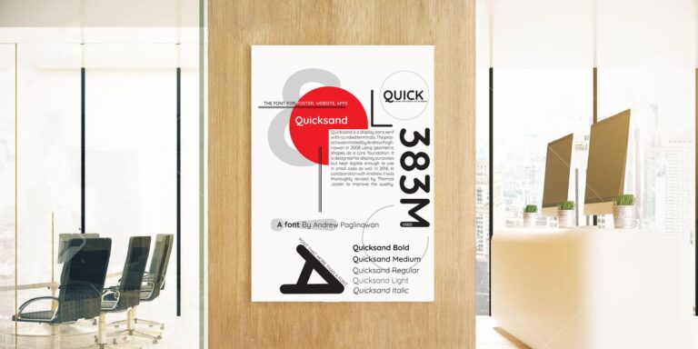
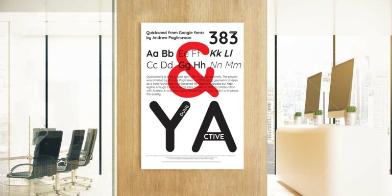
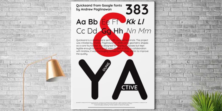
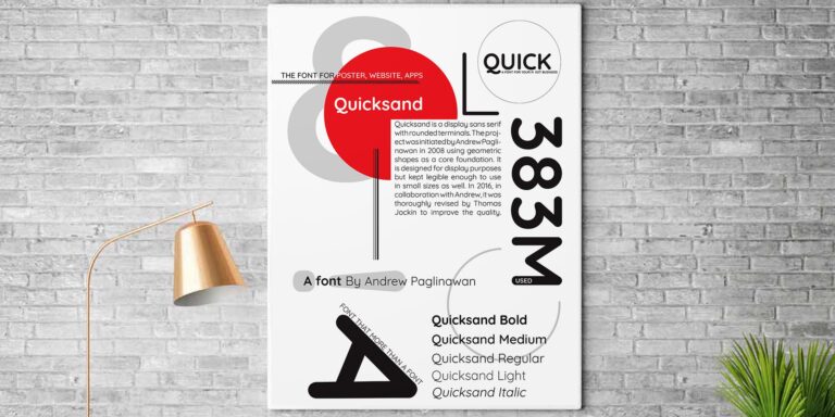
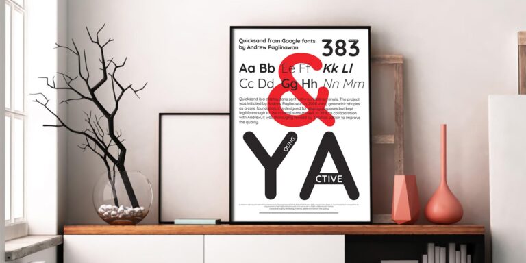
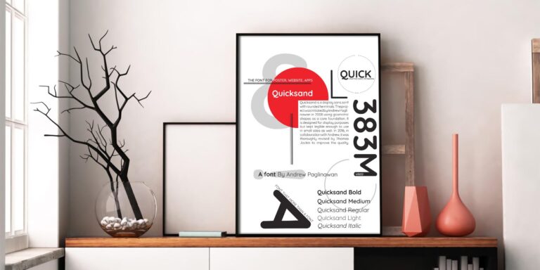
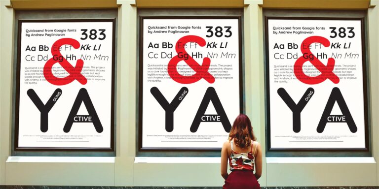
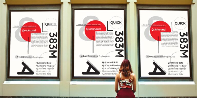
Quicksand a type specimen poster
字体展示与海报设计
本项目最终交付使用了120gsm雪白纸,印刷工艺选择了常规的激光打印。制作了A3大小海报。同时制作了数字版样机发表于博客。
工作簿
本项目的目标是甄别单个字体的个性,并且发现其可应用的领域。开发字体在不同大小粗细间隔下的展示效果。并且观察字体间的设计取舍并在最终设计中展示所选字体的个性。
Quicksand – Typographic Workbook
Design Rationale
modernised design, clean, neat, huge text, single co-loured, red, bold, less text.
On the class, I was impressed by the Dada movement. I was fascinated by the simple yet eye-catching de-sign, via using large text print and bright colour. At first, I thought it was intentional; however, later on, we learn that because there was only limited colour back in the day so they most likely to print in single colour. What they might think was a limitation, for me is a solid decision for a remarkable piece of design. Compare to most of the posters or designs today; they are different, less colour, fewer rules, little or no background, everything is designed for standing out from the crowd so it might be worth to try. Thus, I de-cided my designs are going to imitate the style from that era. After days of digging on Google font, I come across a font named Quicksand instantly I knew that is the font. The colour I using for all my design is solid red, because it is more noticeable, furthermore, I’m trying to eliminate the amount of shapes in my design. Because I don’t want the shapes to be overpowering from the main focus, The font
奥克兰理工大学作品
本作品是隶属于我在AUT学习期间制作,使用及传播需要遵循许可协议。详细可查帮助中心。 This post/project is an AUT university assignment, the use of any kind must obey the terms.
版权保护
作品可能含有版权保护内容
不可下载
未经授权,不可下载
不可商用
可能含有版权保护内容,严禁商用
