GRAD702 – Week 08
Waves, The evolution of the Chinese characters
Updates
- The title of the project changed, now is: Waves, The evolution of the Chinese characters
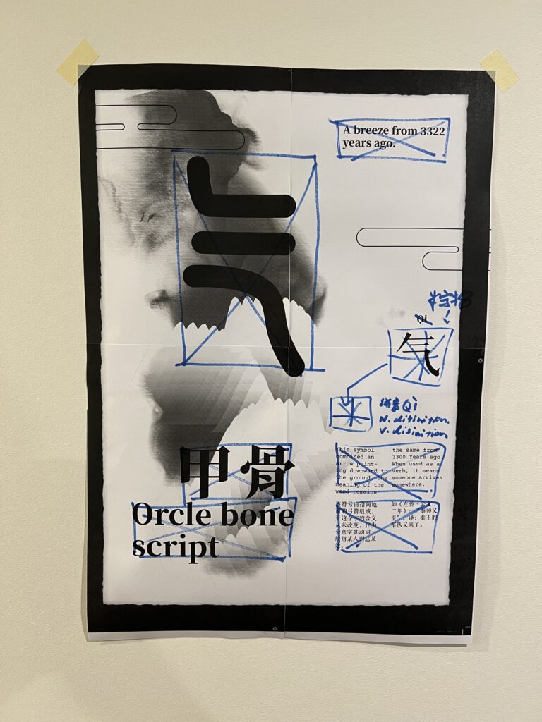
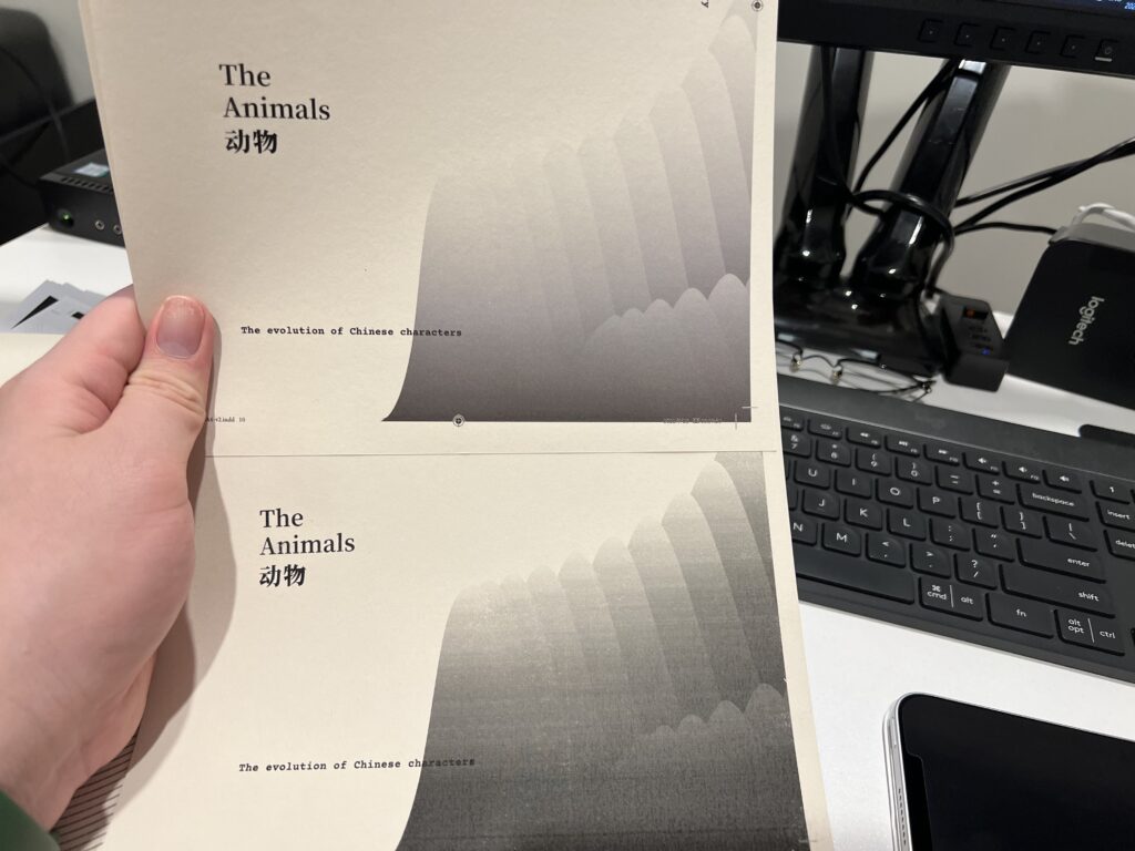
- The poster was printed and tested with another paper stock, scan is a challenge
- Keep working on the cover of the publication
- The content-gathering process began
Class activities
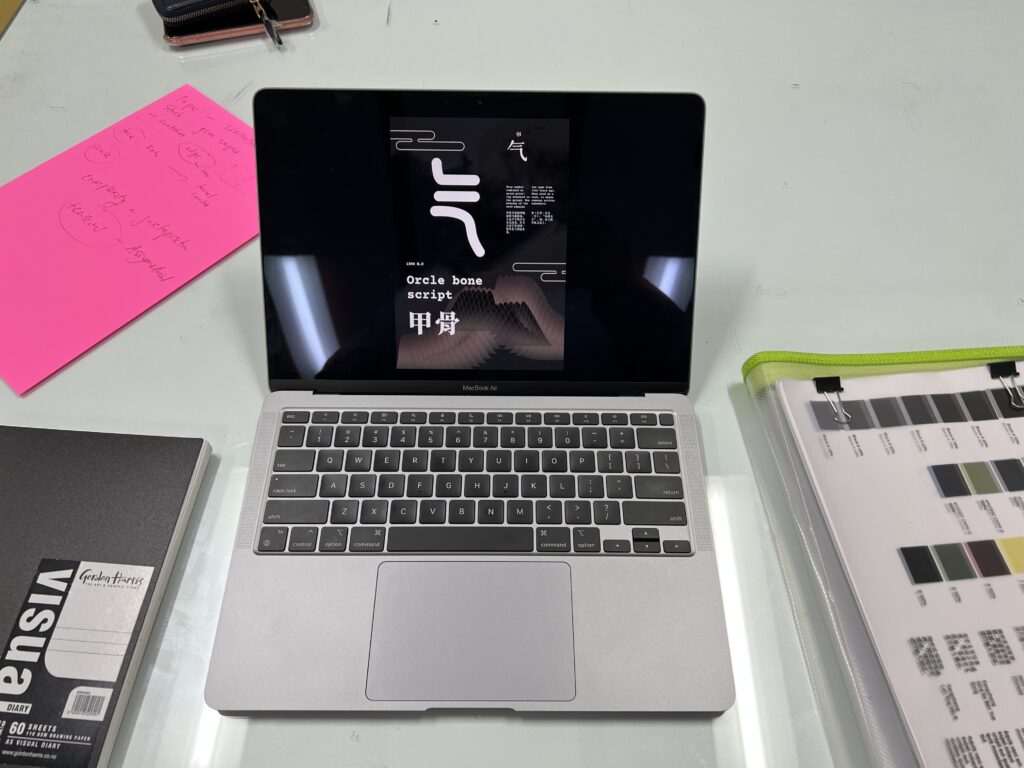
In the class, we worked on the prototype showcase and got feedback from lectures and colleagues. My work at the time was a mess, and the feedback for me was limited. But I saw the reaction from my fellow designers when I showed them the working version of the poster, I realised there is something more to the format. I wish the foiling process worked on the large format print.


As my lecture suggested, the printed posters could be in A1 or even A0 size. I agree that printing in large gives a sense of impression, and it is an immersive experience. However, considering the printing time and process to resize and rearrange the poster layout, it would mess up my timeline and workflow. Also, it costs a lot. My posters series, I think, will have at least three individual posters.
Also, I found InDesign is not corporate with working on large print; everything that is larger than A2 will show noticeable artefacts when output to pdf.

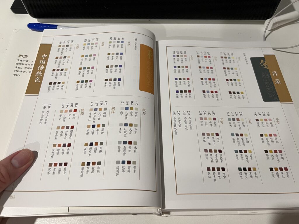
I’ve also considered adding colour to my work now, as some feedback from my friends said without colour, they find it dull. I have a book that is dedicated to showcasing the traditional Chinese colour found in historical objects and paintings. I found it fascinating, and I can take some idea from the book, maybe a colour theme for the featured page.

I’ve done even more testing with different materials on the foiling process, Yes, I really want to have some glow in my work, and this is the first time I have tried foiling, and it is amazing. I wish I could somehow make it work on my publication cover, as well as posters. MORE TESTING IS NEEDED.