GRAD702 – Week 02
IEDAS – Vr. 1.3
IDEA 01 – Speak out – Vol 1 – The take on Cantonese
Create a publication, that is interesting to read, things like local customs, traditions, and story writing in Cantonese, also provides the most up-to-date information on the current status of Cantonese, the changes, the meaning, and the user base. I might also include interviews with Cantonese activists, Cantonese researchers, and Cantonese social media personalities. To gain their option on the current situation of Cantonese, and how to preserve the language.
For more insight, please read the blog post on [ GRAD703 – Week 02 ]
IDEA 02 – The brief history of Chinese characters and their development
With this idea, I wanted to create a publication that showcases the historical development of some of the iconic Chinese characters. The Chinese language development can be breakdown into 6-7 periods, 1. Oracle bone script, 2. Bronze Inscriptions, 3. Qin Script, 4. Clerical script, 5. Regular script, 6. Semi-cursive script, 7 Traditional/simplified Chinese. The question is, How can I use editorial design to demonstrate the visual design of the Characters from different periods?
For more insight, please read the blog post on [ GRAD703 – Week 02 ]
IDEA 03 – The condensed information hidden in the Chinese characters
Chinese Characters from it origin are visual language. The meaning and appearance can differ with the combination of different parts or components. How can I showcase the formation of the components with graphic design so that people from other cultures can also understand the meaning without knowledge of Chinese?
For more insight, please read the blog post on [ GRAD703 – Week 02 ]
IDEA 04 – The book of satisfactory
This is an idea that I have from seeing a ton of satisfactory short animations on Instagram and youtube. I wonder how I can create them in an interactive way by using AR in combination with a printed booklet to deliver the final outcome. The booklet will show a selection of satisfactory objects and animations when the user scans the QR code on the book, a pop-up intractable scene will appear on top of the book for interaction. The book itself has listed pictures and text descriptions of the scene.
The feedbacks

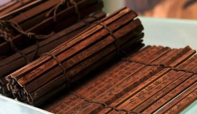
竹简 Bamboo slip


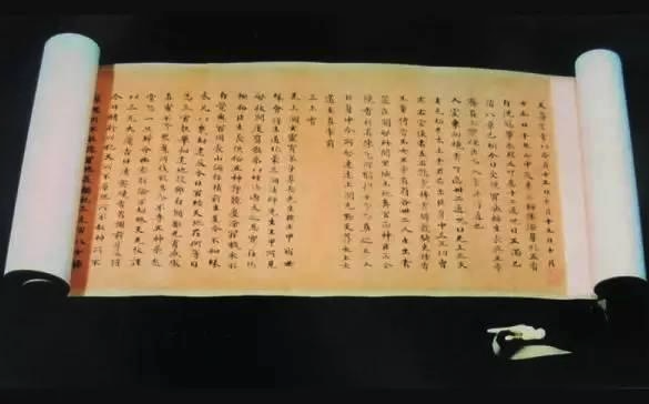
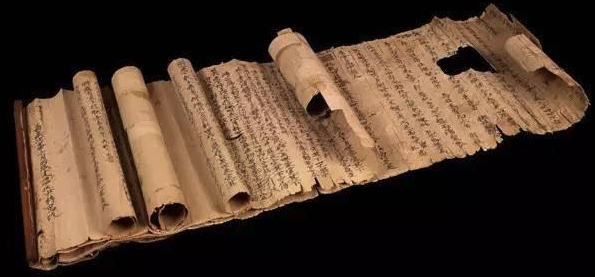
Traditional Chinese accordion binding
The feedback from the tutor suggested using traditional Chinese binding to give the outcome more cultural elements such as roll binding or bamboo roll binding. It is a good idea for the traditional eastern design and will enhance the project with a bit more cultural attachment, but I wanted to do more than just follow the traditional design philosophy and try to break the stereotype of Chinese culture being seen as classic, old and antique sense. I hope I can showcase our culture can be appreciated and created with modern ideology and thinking.

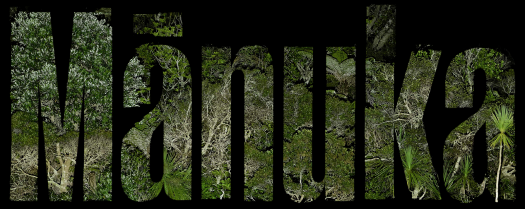
Case study suggestion, Klim Type foundry, Manuka is one of my favourites, and I think it has a promotion video and the sound was created by Maree Sheehan. Maybe I am not that good at explaining my motive. I was not trying to create a typeface but to tell the story of the Chinese characters. So, I’ll not be using a particular font in the project but using illustration to draw out the character in the most generic way.
https://klim.co.nz/ & https://klim.co.nz/blog/manuka-design-information/
Format and Medium
I am sure in this project, I’ll be using minimal design language and physical print to create the final work. The format of the print will be either in A5 or B5. I have not tested the format yet, and I’ll be doing paper and size testing in the following weeks. The next stage will be continuing research, including the base knowledge of Chinese character design and paper size testing.