GRAD702 – Week 03
IEDAS – Vr. 2
IDEA [Finalist] – Waves, The building blocks of the Chinese characters
The question: – Working progress
How can editorial design and type help to showcase the formation and connection between Chinese characters?
Activities
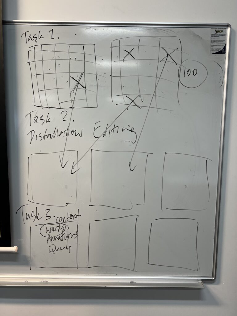
In this week’s class, we spent most of the time refining and reconsidering the ideas. Some of us are still in a fuzzy week, and creating a personal project is surprisingly challenging. The amount of pre-research required was intense. During the Wednesday class, our stage of confusion led to our tutor stepping in, and they asked us to find at least 100 images that were visually or ideally similar to our imagination of the outcome. Then, narrow it down to 5-10 for furder inspection. Finally, we were asked to create a booklet with all the images printed and bonded.
The images below can be clicked to view in large.
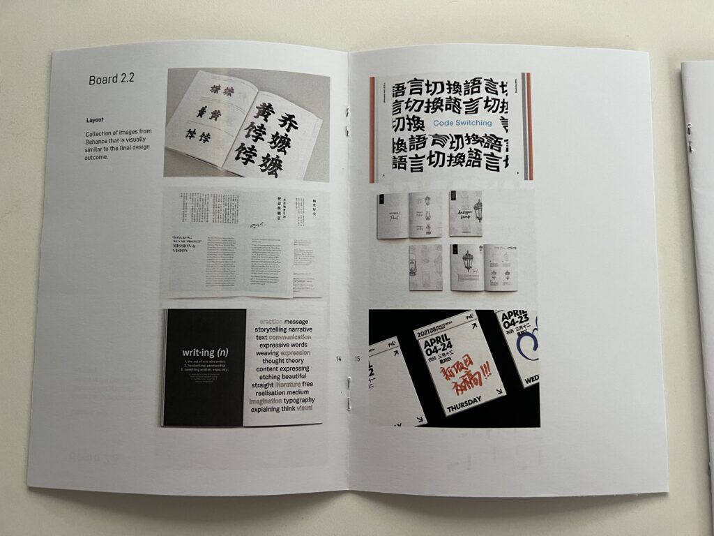
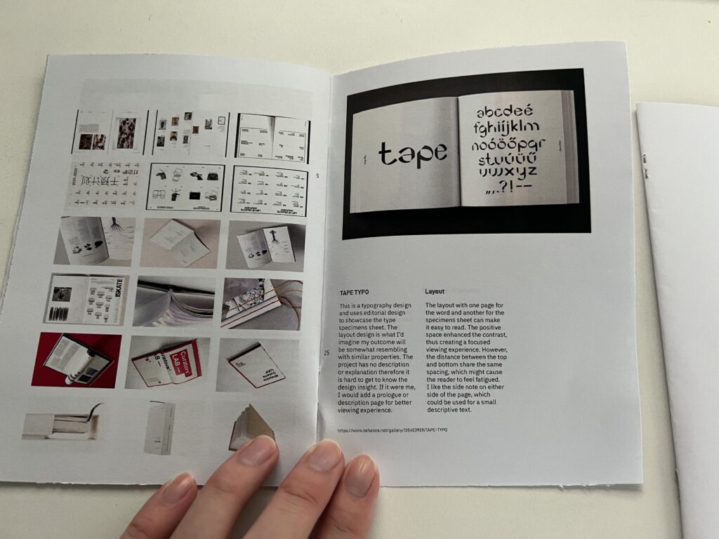
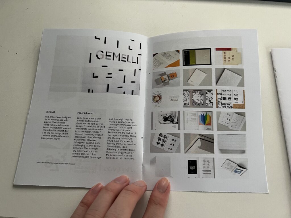
I used Behance [behance.net] as my main source of references as they have a clearer authorship system and projects from all cultures. I focus on the keywords for my project and use the tools on the website to filter the area of interest for more efficient gathering.

Feedbacks
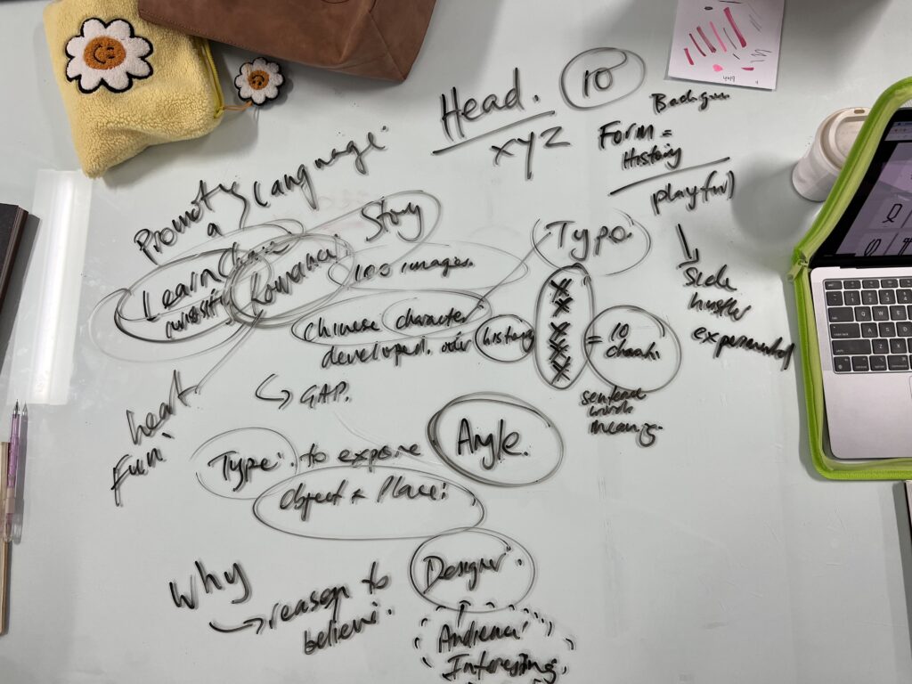
HOW AND WHY
The key issue for me to think about at this stage was how and why
How to make my project appeal to others, particularly to western audiences?
Why should other cares about my project?
What can they take away from the project?
The short answer for me at this stage is: I don’t know yet. BUT! I do have a clearer direction with the project after the feedback. And I have some ideas that might be able to answer the questions. It was always a challenge for all publication / Book designs to try to appeal to people.
My strength is just being simple. With most books and publications out there being full of colours, information and imagery on the cover, it is certainly eye-catching and strat forward, but when put together, information overload is taking effect and causing visual fatigue, but this might not work for well-known magazines or known-brand books. Thus, for an individual designer, It is helpful to design a cover with minimal design to contract with other books and publications.
Because my project was very personal and related to a culture [language] that is relatively new to western audiences. I need to find a way to simplify the core idea and maybe make the project more visual or implement some sensory design, creating a project that’s an experience or interactable.
The project can be someone interested in the culture, I am also considering someone who is seeking to reconnect with their culture.
Updates
Vocabulary: Sinologists – people who study the Chinese language/culture
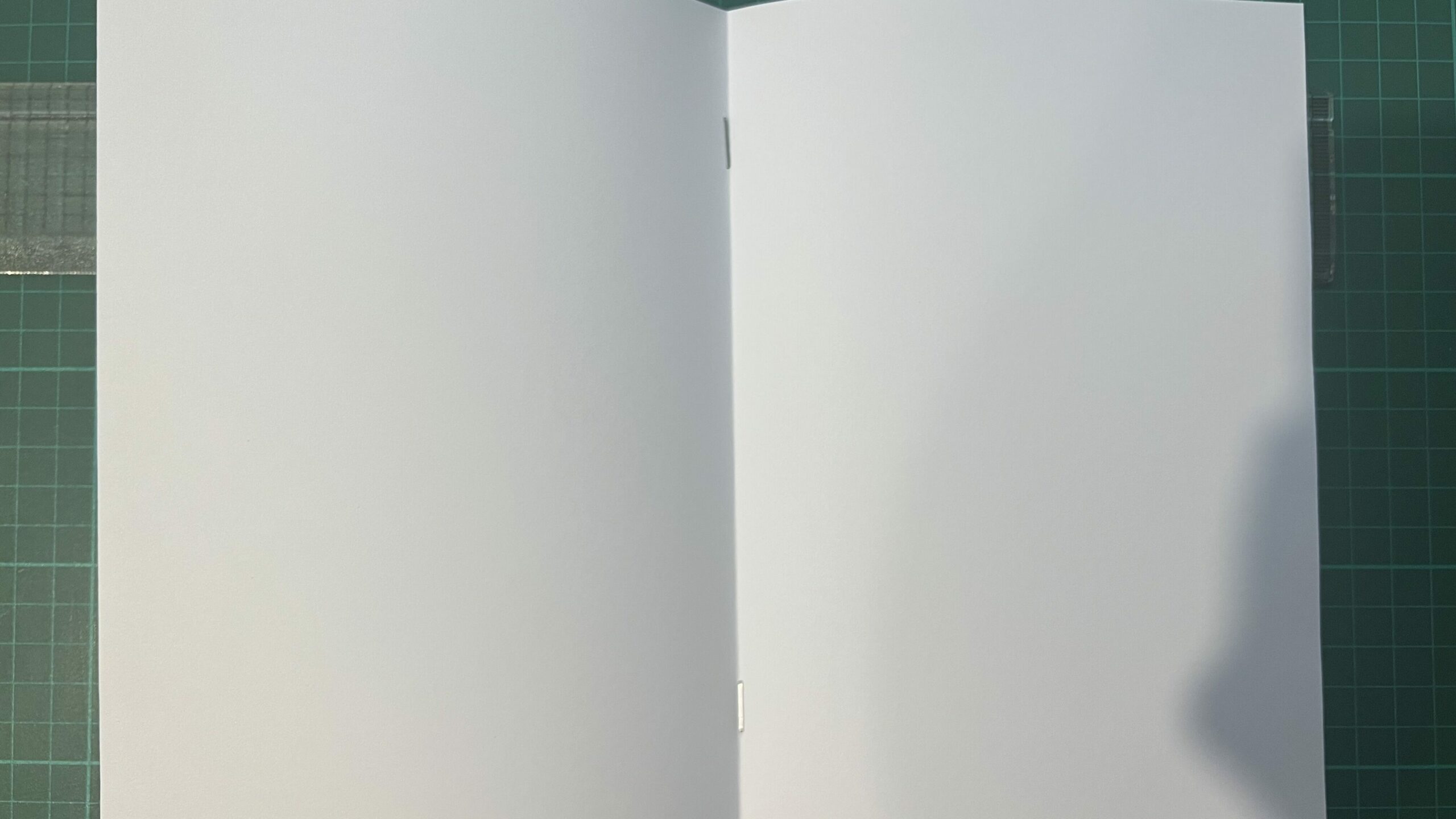
I began my testing with different binding methods and see which one was the most fun to make and different from what I used to. I like saddle stitches. It is simple, minimally invasive, cost-effective, mass-producible, and time-saving. Thus it became my favourite binding option.
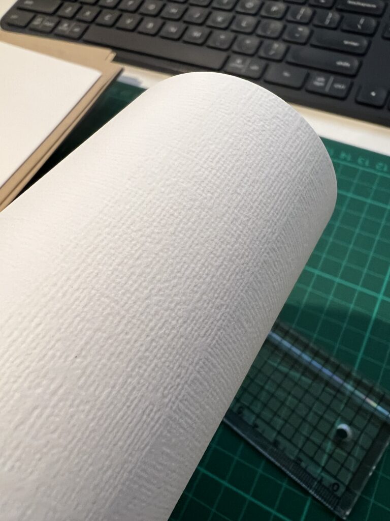
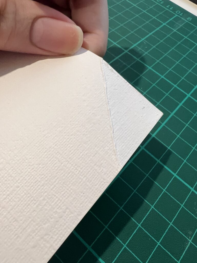
I also need to buy some soft canvas fabric, I love to have some texture to my cover, but I also wanted them to last at least 100 of opening and closing. From what I tested before with canvas textured paper, the durability is just not up to the task and breaks with only dozens of folding.
References in typography
I am trying to find a commercial-free typeface for the project. And not only is it challenging, but also hard to find a typeface with Oracle bone scripts as a typeface. But I could still find some resources through my friends with their university database search.
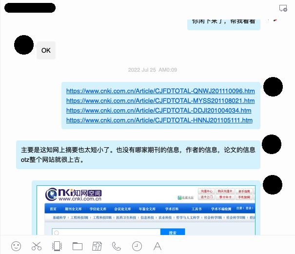
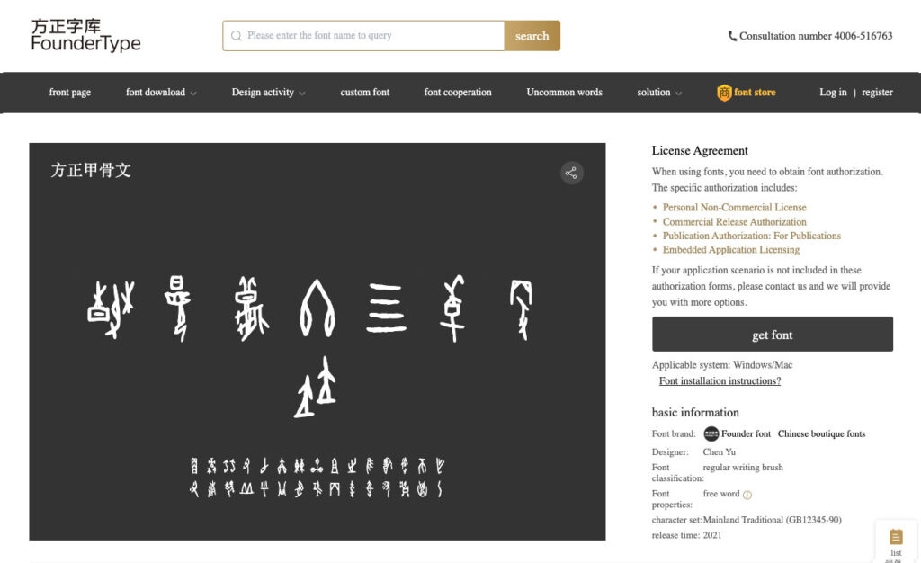
They found some of the universities had developed their own Oracle bone scripts typeface, but currently only for internal use and not open to the public. After some more digging, I was surprised to find a typeface made by one of the largest type foundries in China, FounderType. They have an Oracle bone scripts typeface available for members and free for non-commercial usage.
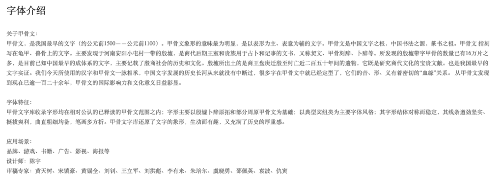
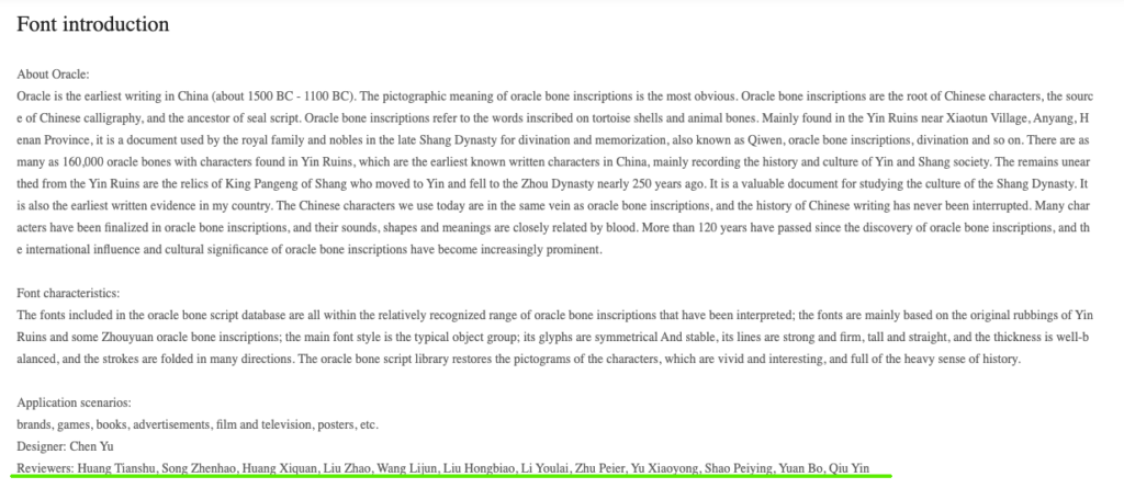
The best thing is, in the text description, I found some of the linguist specialists that might also be helpful for my exegesis writing as references. I might look up some of them and see if they have published any books or articles for me to study.
The images below can be clicked to view in large.
Binding & Paper choice
I have a basic idea of what kind of paper to use for this project. At this stage, I consider using matt paper for the inner page, snow white paper is my go-to option. The rendition of the paper was soft to the eyes, and compared to regular paper, it has a warmer tone to it, and the regular paper has a cyan tone, and it doesn’t feel as premium. I am still looking for the paper for the cover, and it determines by the binding method. I have two methods in consideration as of now, perfect binding or screw binding.
For next week
Proposal presentation happening next week, public speaking is to expected. FUN…..
The possible talking points: project title, question, significance, personas, and works so far.