GRAD701 – Week 13
Recap of the week
- Group report
- Migrating the Brand system from Illustrator to InDesign
- The final print
- Experience – where can be improved
Group Report
The report was assigned to everyone. Each of us needs to provide a copy of the text with all the parts and send it to Yiran as she will merge them together and finish with a designed and layout document for us to sign.
Migration
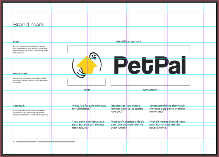
The brand system was assigned to Chris as he was in charge of making the VI for the brand, thus having most of the elements on hand to make the Brand guideline. He will be finished the brand system with a well layout and designed document and send it to each member.
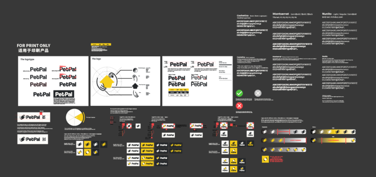
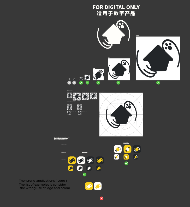
I created a grided layout using InDesign and started migrating images and notes from illustrator to InDesign. Besides moving all the graphics and notes, I also need to make descriptions on every page to describe the content of the page and application rules.
Brand applications
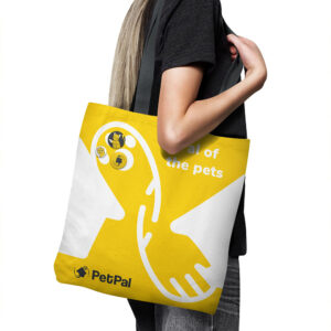
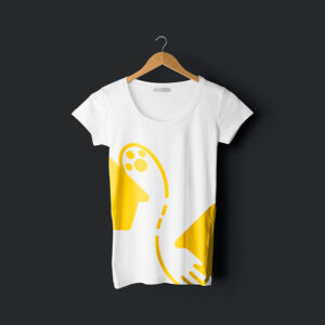
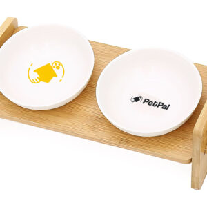
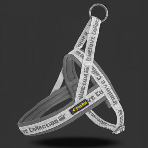
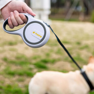
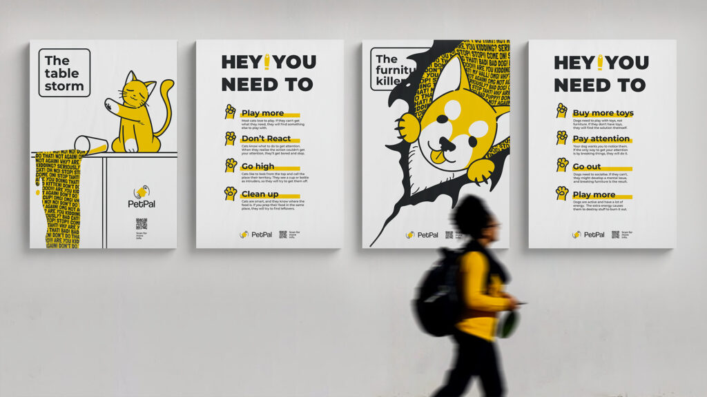
When I was designing the Brand system, I considered the usage of almost everything and even made mockups to see how effective the design was on different materials, applications and products.
Read the Brand system & Visual guideline
Final
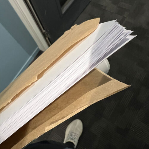
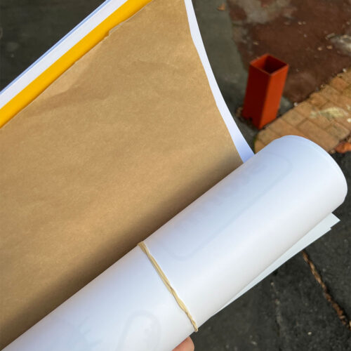
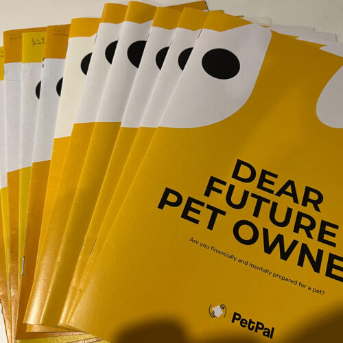
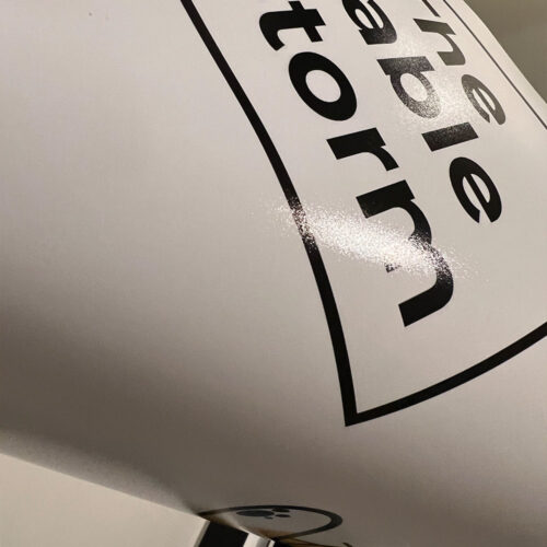
I went to Pinklime and had them help me print the final version of the publication and posters. I printed three copies of each design. The first copy is for backup, and I’ll put them in the drawer of WE Draft studio. Second copy for handin as the final work. Third copy for validation and save at home.
Experience
The journey was fun and challenging, and I learned a lot from this paper. The thing I wish I’d done earlier was the reason for the colour used in the brand. Especially the yellow. Why the yellow? Now, when I look back, I realised the yellow has more than just warm and welcoming. But also warning (traffic light, warning stripes) and serious (ASB, Unite afainst COVID-19) I can look into why they using it. The other thing was the website. It is unfortunate that it didn’t make it to the final stage. It could’ve been a great place to host our resources, create an online presence, and expand across digital, physical, and social platforms. But, considering the brand’s target audience toward people who live around the Auckland area, thus, making a website might not be necessary. All in all, we are able to make it all the way to the end, with all tasks done and handin on time. It is a victory in my book.
To do next
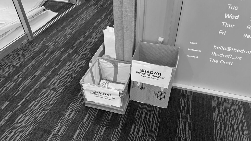
- Handin digital & physical
奥克兰理工大学作品
本作品是隶属于我在AUT学习期间制作,使用及传播需要遵循许可协议。详细可查帮助中心。 This post/project is an AUT university assignment, the use of any kind must obey the terms.
版权保护
可能含有版权保护内容
不可下载
未经授权,不可下载
不可商用
可能含有版权保护内容
