GRAD701 – Week 07
Recap of the week
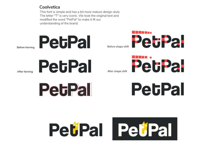
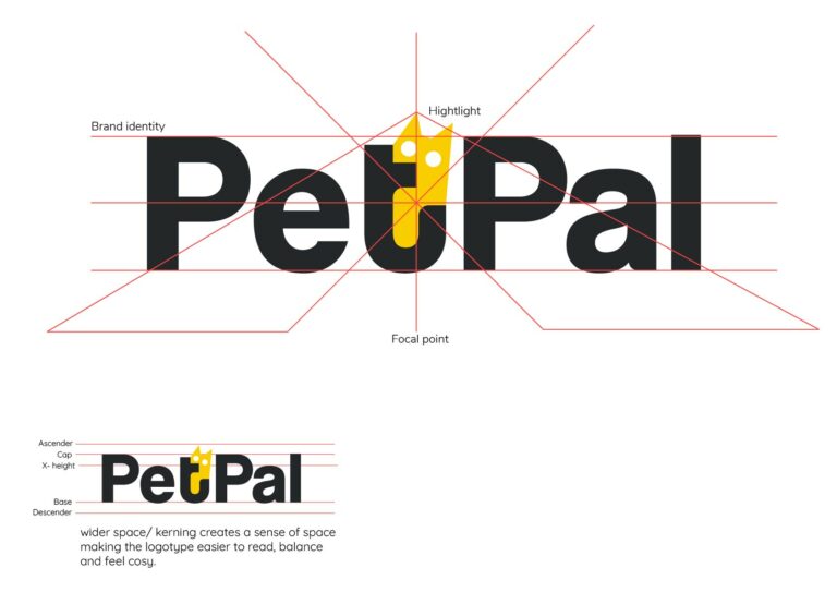
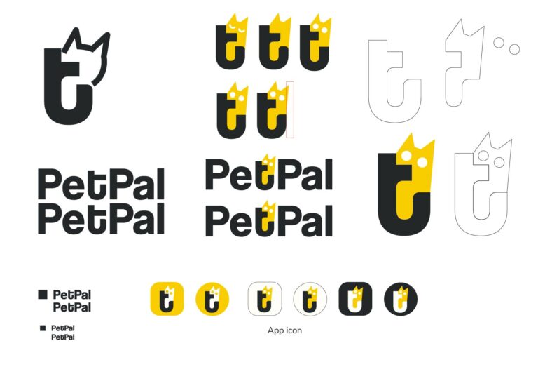
- For this week, we have taken the class feedback and analysis where the issues and how to resolve them. We decided our logo and logotype need to be redesigned. Which basically means redesigning the entire design system that we’ve build from the week 2. Thus, our focus for this week is to discuss again and again on the typeface, the colour, kerning, and more.
- At this stage, we have our differences, which make the process harder to manage. We all have different ideas on how our brand should be. We wasted a lot of time pointing fingers at each other, and there were sometimes, quite intensive arguments, and we ended up not having anything done for days (group work). Still, to this day, we can’t decide what body type to use for our publication. Therefore, we think of a compromise, we both choose 1-2 typefaces and make our own version of the publication, and compare them on week 8 testing.
VI System 2.0
After getting the feedback from the class, we’ve made a significant shift on our logo design and logotype choice. We start over our entire brand identity design. Which put quite a pressure on my part as I am in charge of VI design. That means I need to recreate the brand guideline, use of colours and application mockup.
Things to work on
- Refining VI System and making a final version for the group.
- Start reigning individual outcome, for me that is posters.
- Start gathering info and materials for publication.
奥克兰理工大学作品
本作品是隶属于我在AUT学习期间制作,使用及传播需要遵循许可协议。详细可查帮助中心。 This post/project is an AUT university assignment, the use of any kind must obey the terms.
版权保护
可能含有版权保护内容
不可下载
未经授权,不可下载
不可商用
可能含有版权保护内容


