GRAD702 – Week 04
Waves, The building blocks of Chinese Characters
The formation and components of the Chinese characters design
The question
The updated research question has slightly limited my ability to design the outcome that I imagined.
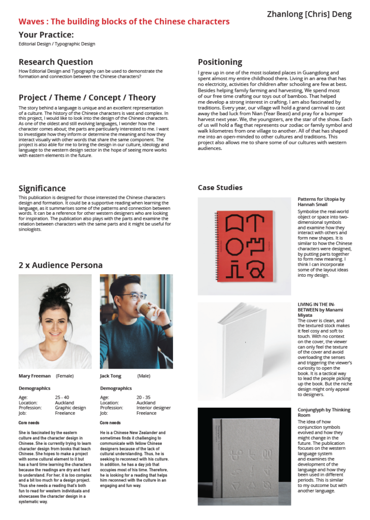
How Editorial Design and Typography can be used to demonstrate the formation and connection between the Chinese characters?
Editorial design is my biggest interest in this project, and I want to experiment with how the language of square fits into the grid and be able to design a layout that’s fun to read. As of now, I’ve been testing with different types of paper, and I really like the idea of using texture and layer (see-through) to create a design with a sensory component (senses, e.g. touch, smell, visual, and sound).
Typography is also important in this project it determate one of the most important elements, visual.
Presentation preparation
This week, we started to prepare our presentation for Wednesday. For the basic layout and style of the PowerPoint, I am considering following my brand guideline from semester one. Thus, getting into the hobby of unifying and streamlining my presentation/demonstration process. That includes the use of typeface, colour, and layout.
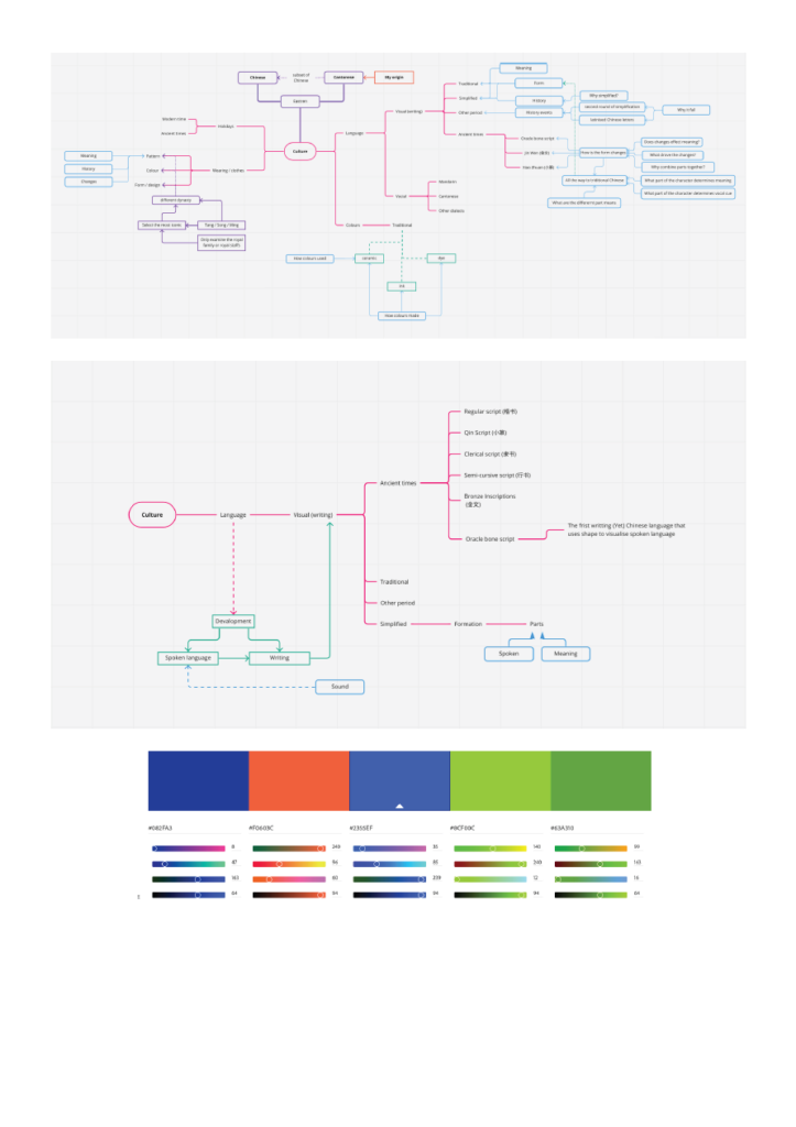
The overall look I am attempting to bring is closely related to the project, with clean and minimal design in layout, grid and wording.
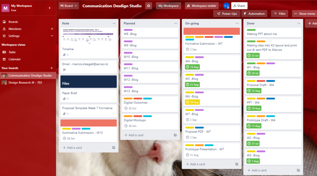
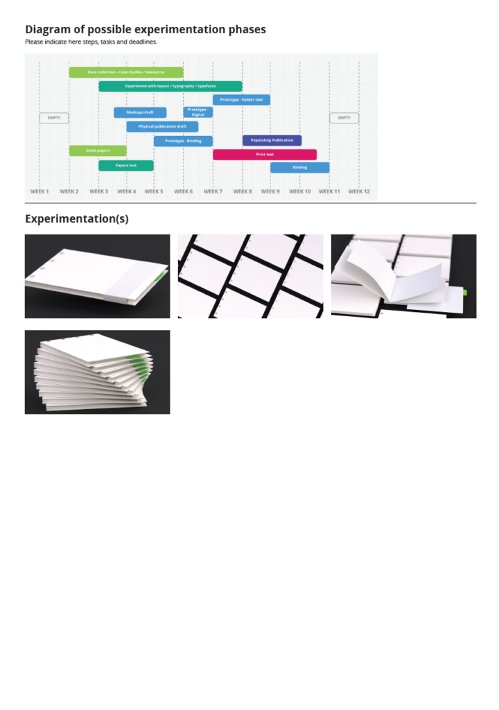
I use multiple tools to help me track my progress in this project. That includes Miro, Google Calendar, and more.
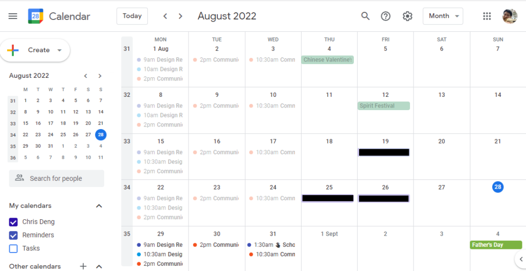
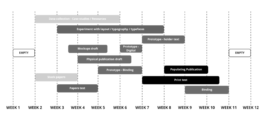
My timeline was designed to have some headroom for any incidence or major shift in direction. I usually empty out the final week to double or triple-check everything. But the time can also be dynamically allocated for other usages such as refining design work.
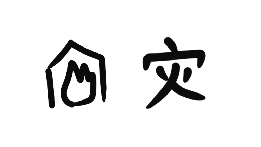
I want my presentation to be a bit engaging because the topic I’m doing is very personal and cultural influenced. Thus others might find it challenging to understand and get bored relatively quickly. Therefore, I consider adding some features in the language (Chinese characters) that are fun/horrifying to hook the attention and roll from there.
The style, the font, and the refinement of the question with help of the tutor.
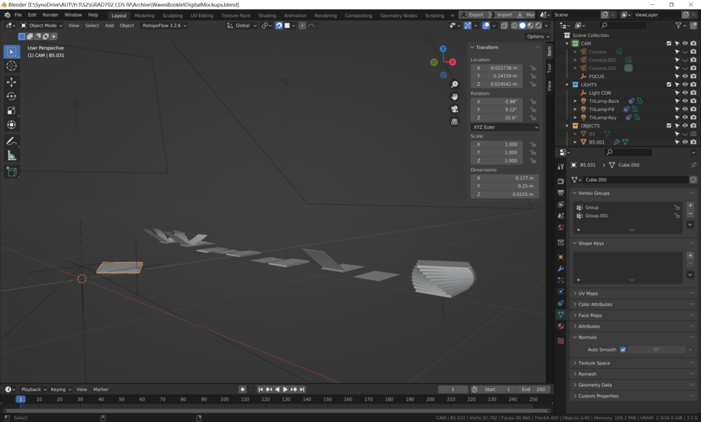
For the final image experimental, render with Blender and the visual representation of my final outcome binding, cover texture, colour, and bookmark with a green highlight.
The update of personas – the NZBC somewhat represents me as a person. The changes in the wording and refinement.
The case studies suggested by one of the tutors helped me clear out some of the fuzziness. Small Hannah – The patterns of Utopia, this project is also won the Best awards. Some visual ideas in the project were helpful, but the overall concept was not quite the same.
Other case studies from Behance are also only valid for binding options and printing/colouring/texturing methods.
Proposal draft
We also began to fill up the shatter information together with a provided template.
Updates
The intense preparation for this week pauses all other tasks. After the presentation, I had time to consider the colour in my design, and I began to do some print tests on different paper and try other print methods such as inkjet and laser print. I consider laser print has a much better rendition of black compared with inkjet, and the subtlety of the toner given to the paper was great.
