GRAD701 – Week 03
Recap of the week
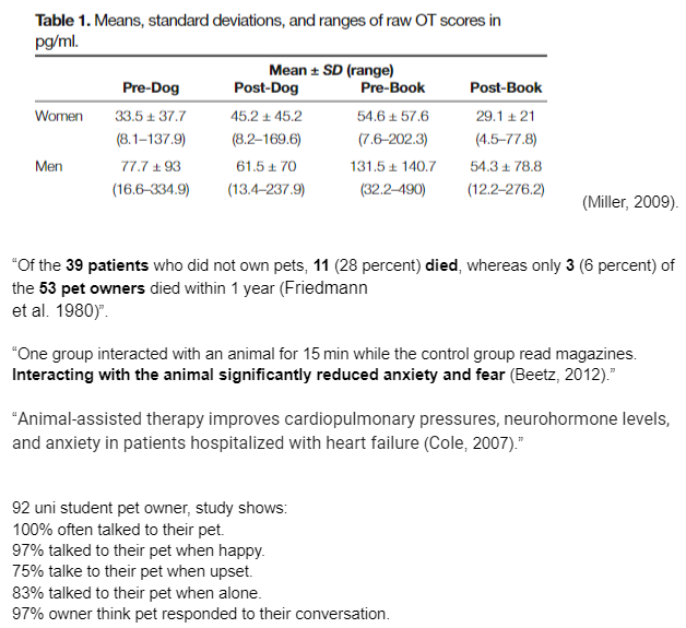
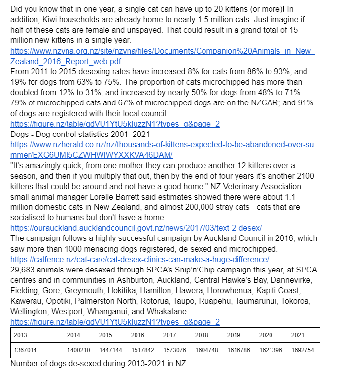
- Since last week till this Monday (2022/03/14). We have decided to collect more data for our project.
- One of my tasks for this week is to learn from the real world, what is the design “style” around Auckland.
- I’ve also begun looking at posters and publications for case studies.
- I’ve provided the icon sizing test for our group to streamline our icon/logo design process. With this tool, We can size our design into different applications and remain visually identifiable, such as phone, pad, and minimal-print.
- I also took my spin on the icon design.
Because we are doing a thematic design, we have also discussed how to unify our design so that we have the same visual continuity throughout our work.
- I’ve also looked into other platforms and compared the advantages and disadvantages.

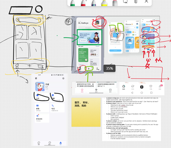
We also discussed last week and talked about what our app will be like. And came out some rules that our platform will have, such as user verification, feedback system. and blacklist system.

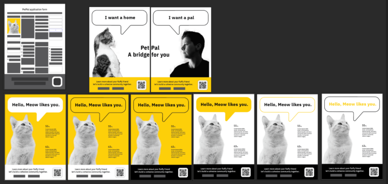
Another thing I did over the weekend and talked about this Monday was poster design, and got some feedback from my groupmate. The overall design is fair, but not sure how it would look with an illustration. Some suggested might be a bit ampty.
Things for me to work on this week
- Cherry – UI framework, survey.
- Zhanlong – poster data collection, poster layout, poster case study.
- Yiran – storyboarding, styling, persona, logo, Publication case study


奥克兰理工大学作品
本作品是隶属于我在AUT学习期间制作,使用及传播需要遵循许可协议。详细可查帮助中心。 This post/project is an AUT university assignment, the use of any kind must obey the terms.
版权保护
可能含有版权保护内容
不可下载
未经授权,不可下载
不可商用
可能含有版权保护内容
