GRAD702 – Week 12
Waves, The evolution of the Chinese characters
Updates
- Giving up on foiling
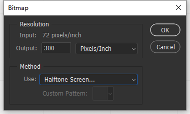
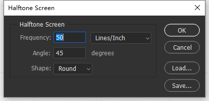
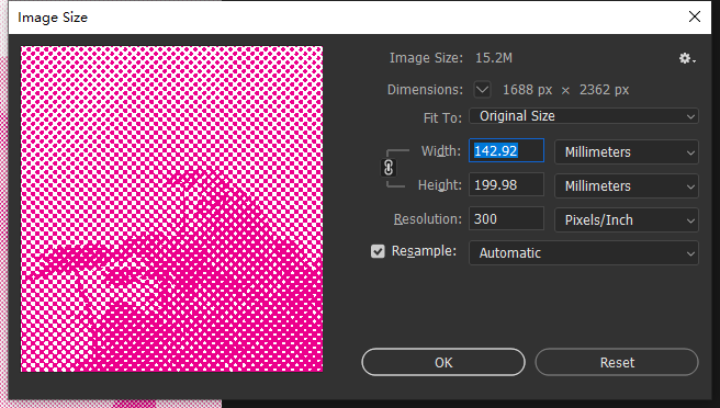
- Creating action to halftone screen
- Populating contents and adjusting the text blocks to clean-up
- Creating a belly band for covering
- Create illustrations for feature pages
NO FOILING
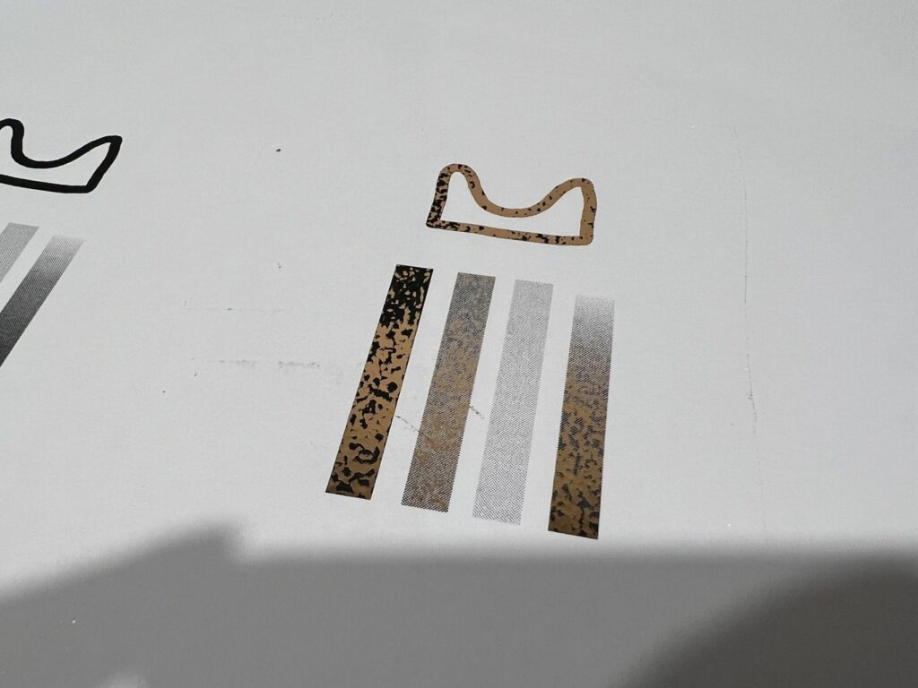
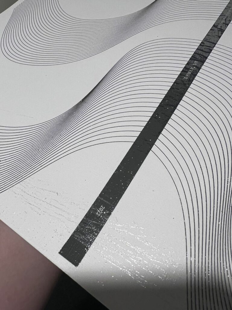
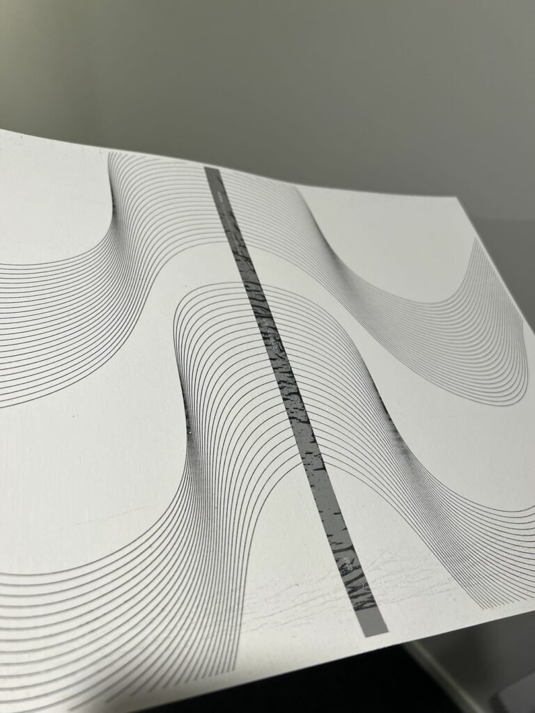
The amount of testing on different materials and foiling methods all result in some kind of imperfections, and the quality of it is unpredictable even with the refined method of the halftone screen process, which is not what I need right now. Thus, As fun as it is, I must drop it. Here are some of the testing I’ve done.
Publication
Cover
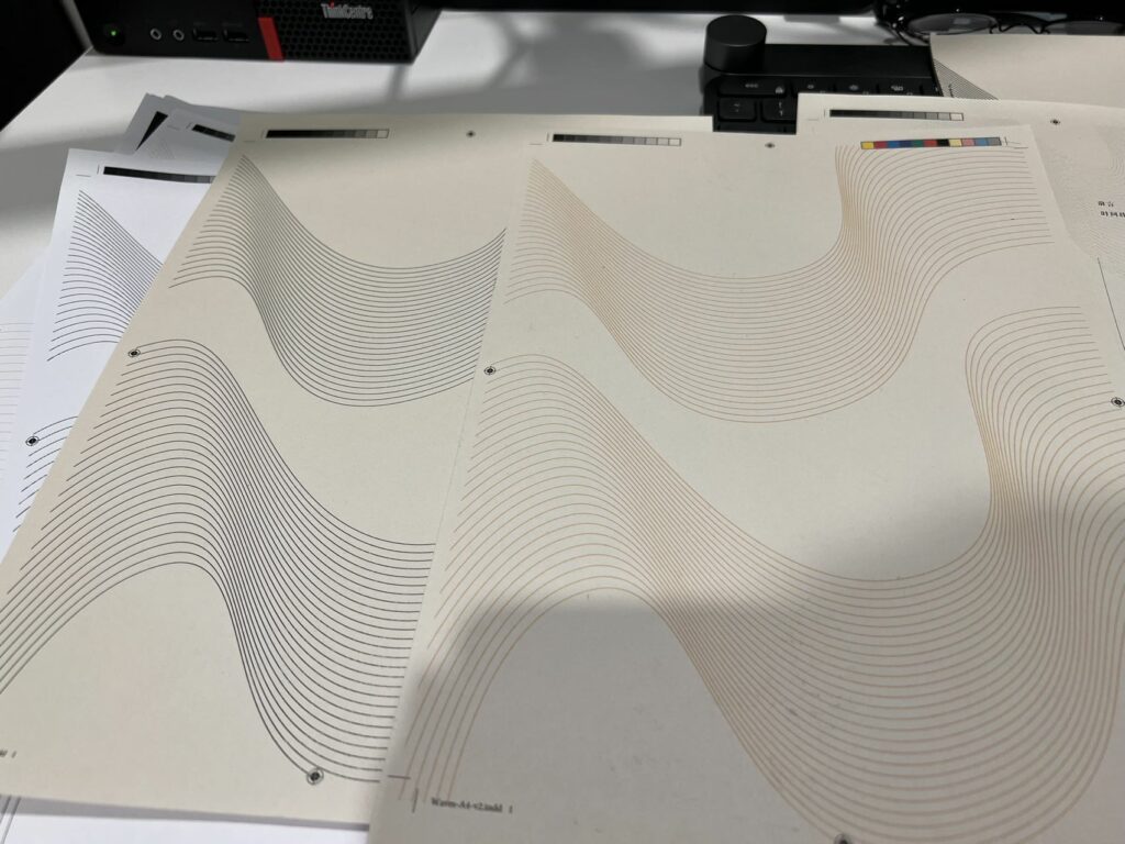
I tested printing out the cover with different colours, I was planning to make foiling for the entire cover, but as the result shown over last week, I wasn’t able to make it work. So I used colour as a substitute. But the colour was not good; thus, I decided to use black for the final.
Belly band
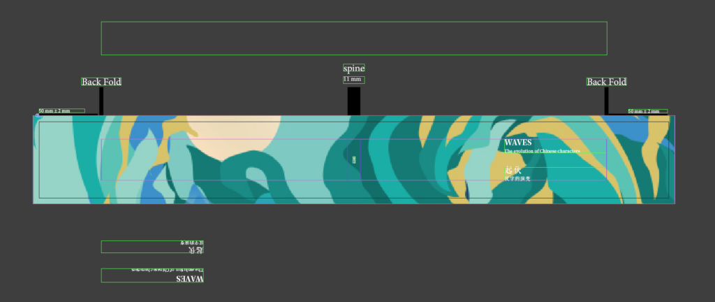
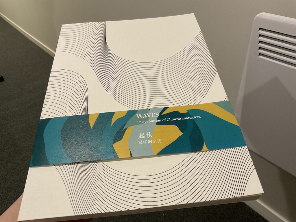
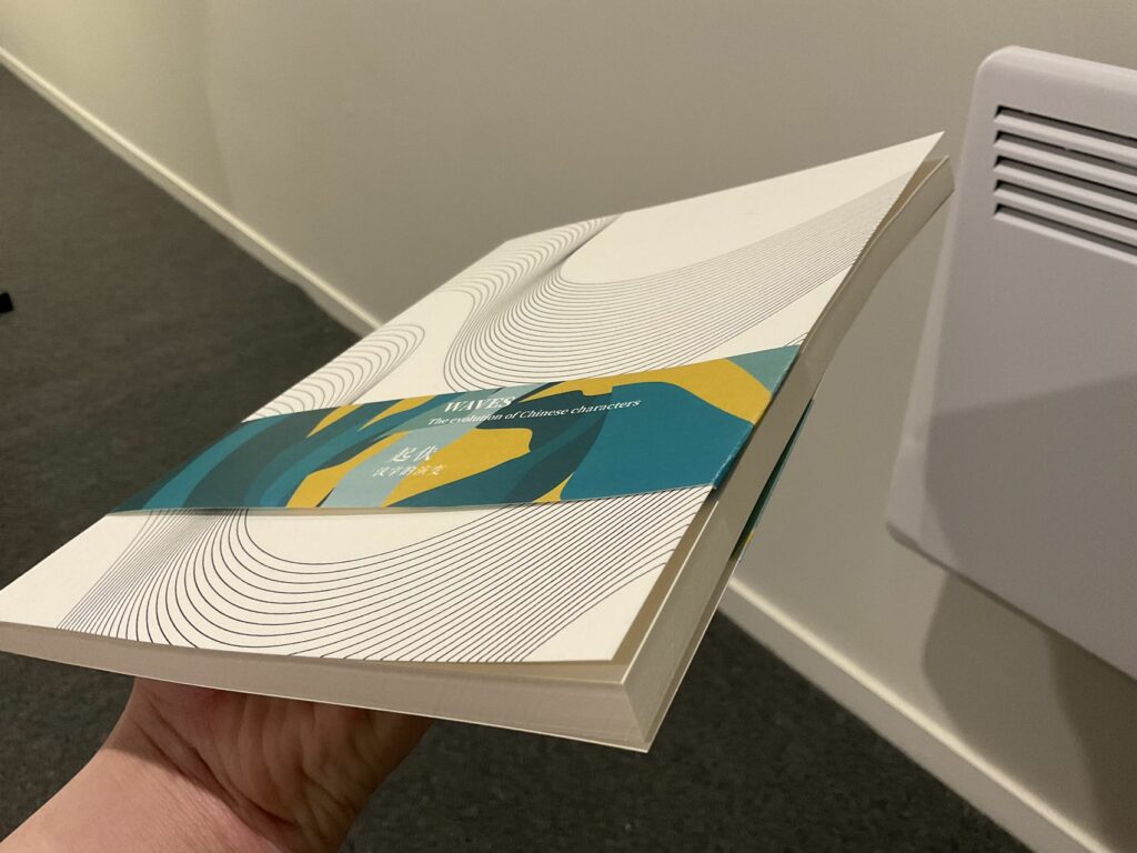
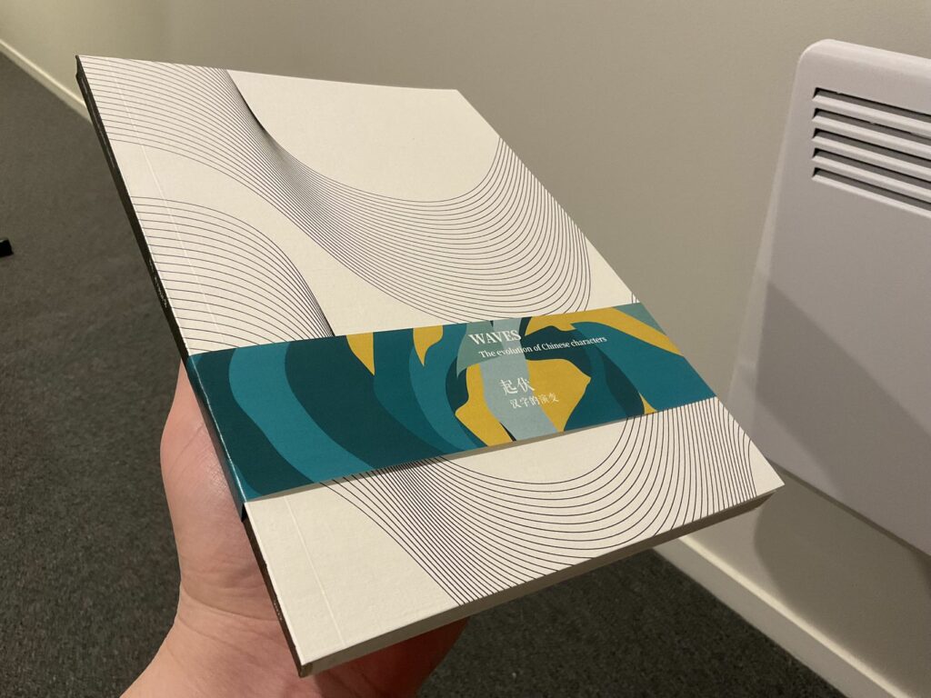
Because the cover is a mirror of the other side, a reader might not open the book on the right side; thus, I designed a simple belly band to guide the front and back cover.
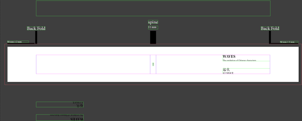
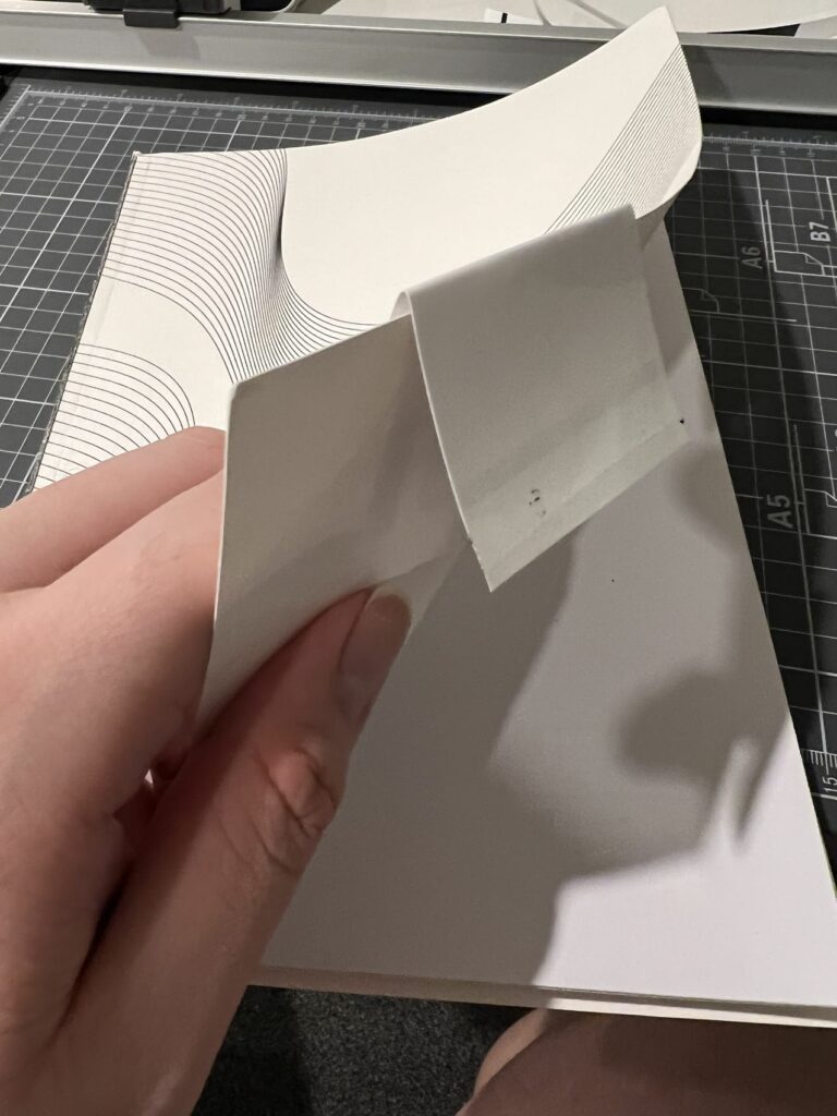
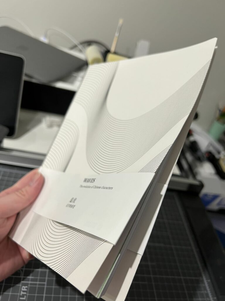
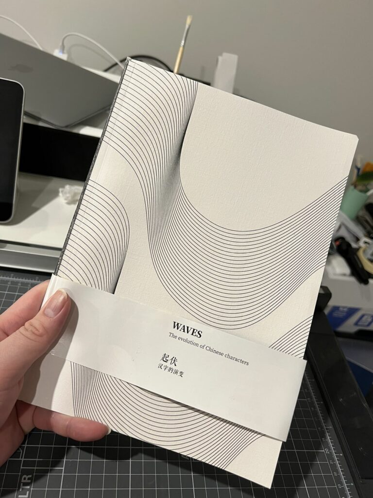
The inial design was simply a white band with the title text on it, but the feedback given by my friend said it was too dull, So I used one of the illustration files for the weather category as the background. and it does add some interest to the look.
illustrations
I am going to create one vector illustration per category, and I wanted to keep them in colour when moving them to the publication, maybe add some halftone screen process to make the style consistent.
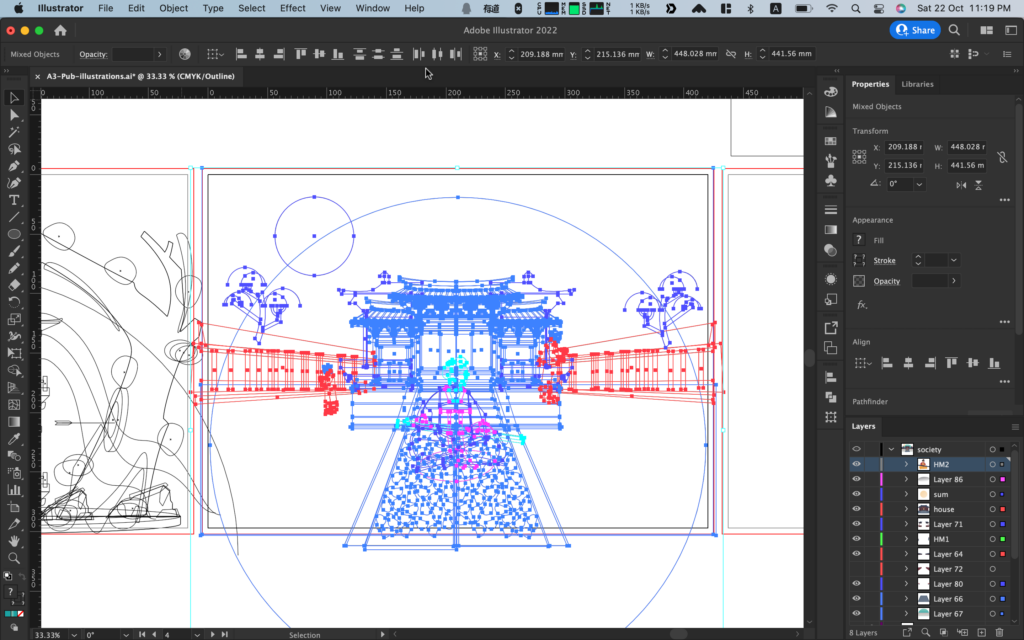

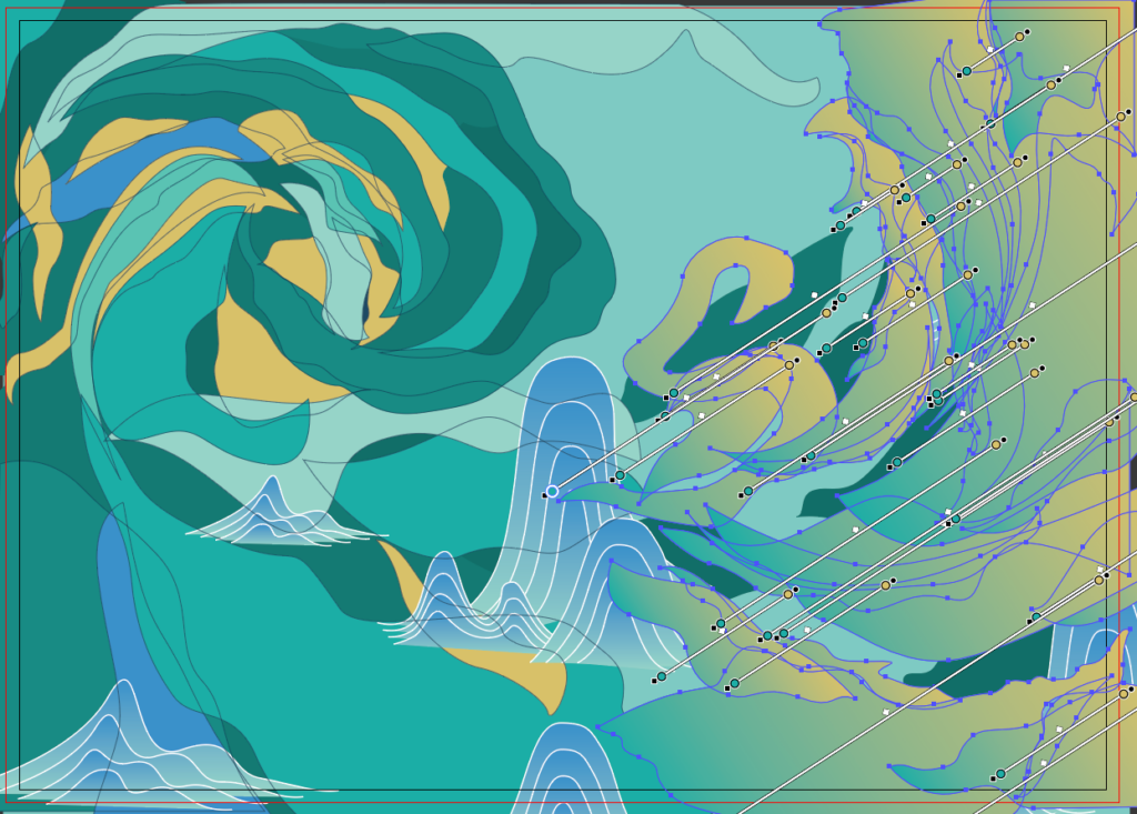
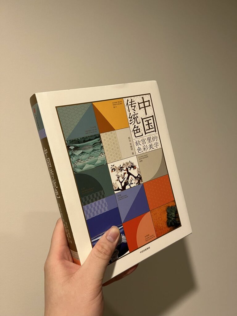
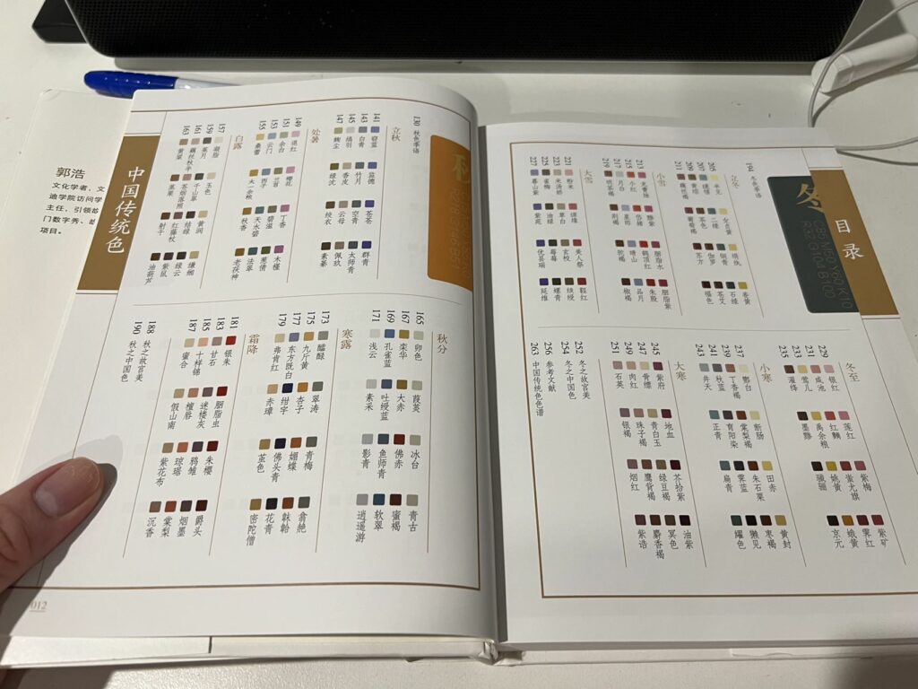
One of the reasons for keeping the colour is because the colour in the illustration was based on the traditional Chinese colour palette. I found it on this book called: Chinese traditional colour, the colour aesthetics inside the Forbidden City.
I was not good at drawing and had a terrible perspective estimation, so I found it easier just to create the scene in 3D and then port it over to illustrator.
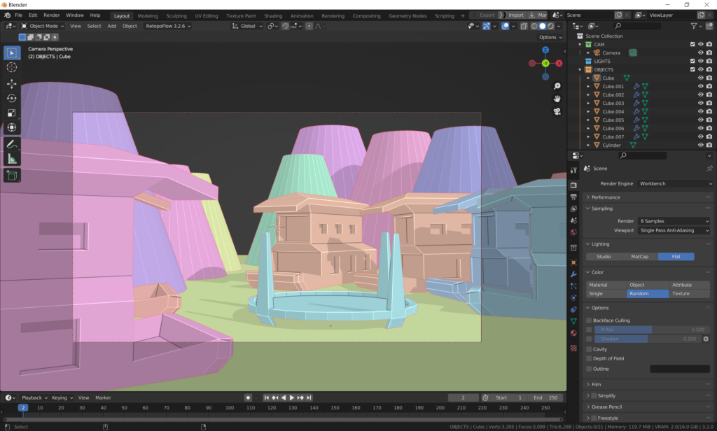
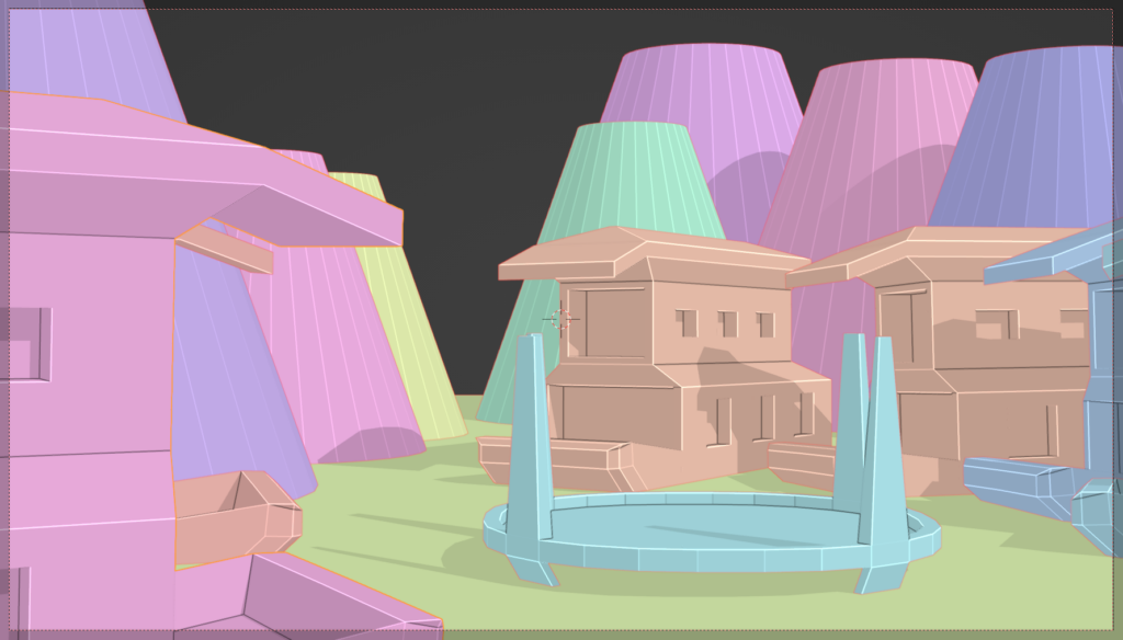
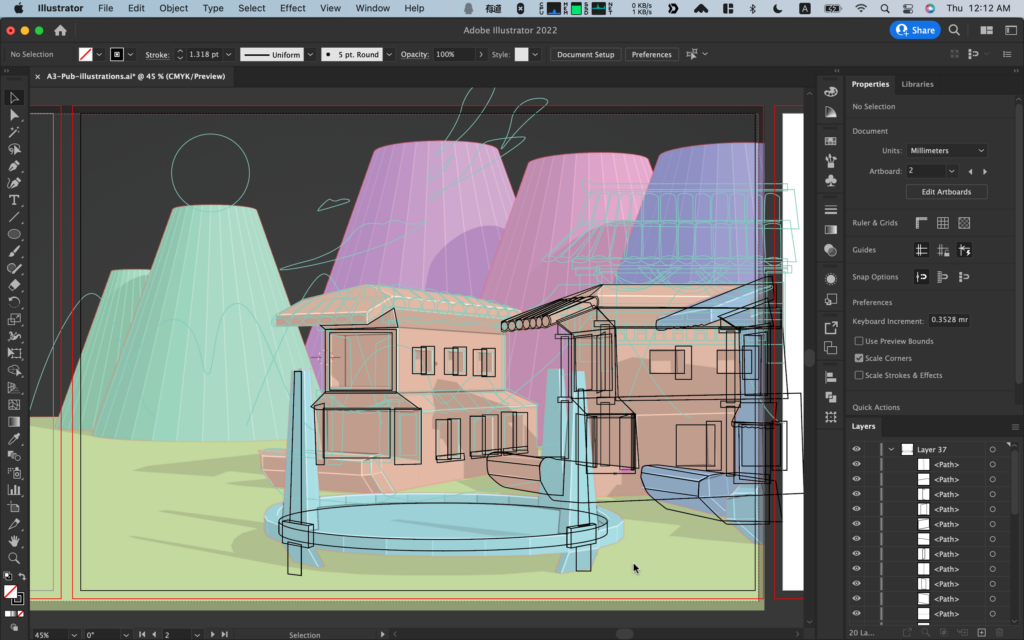
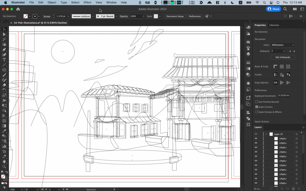
Image processing (Photoshop)
After deciding I was going to use the CMKY colouring theme for all the images in the publication, I created an action to speed up the process.


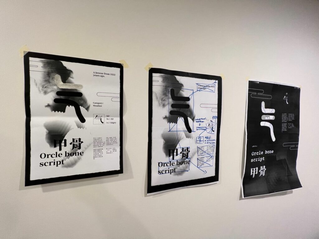
Poster
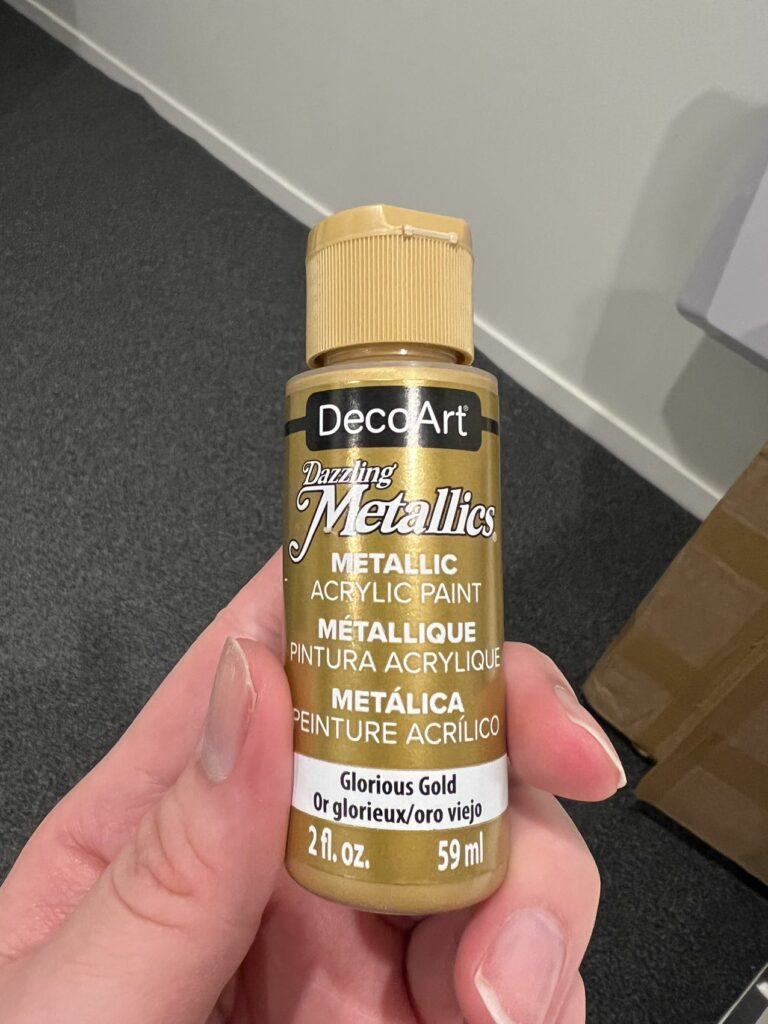
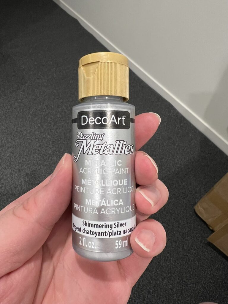
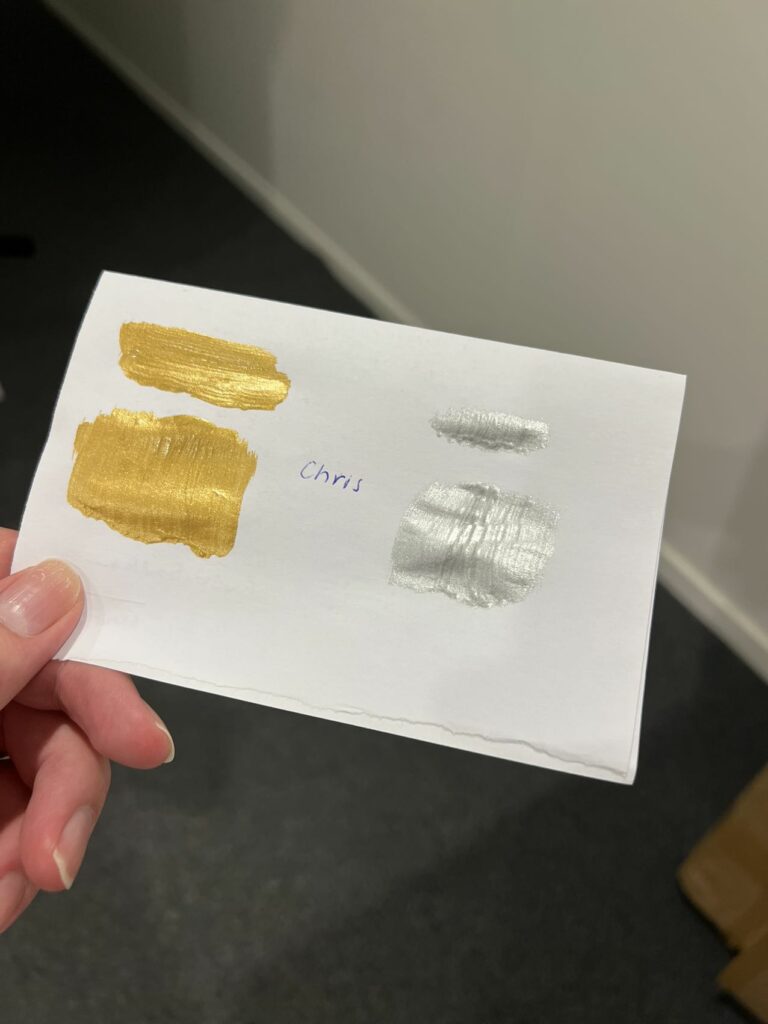
On the poster side, I was still trying to get the foiling working, but the result was still not good. I think when I printed the final in A2, the ink is not going to work on hot press foiling, so I changed, using other methods to get the metallic look on the poster. I tried using metallic acrylic paint, but the result was not as good; the uniformity is subpar; maybe it would be better not to use a brush but a roller or screenprint. However, I don’t have time to test either of them at this point. Thus, for the final, I am just using a gold-looking ink colour to colour the posters; it is truly, sad.
