GRAD702 – Week 11
Waves, The evolution of the Chinese characters
Updates
- Challenging content translation
- The invoice from the printshop resulted in my change of print method
- the poster explained to fives as one for each category
- the errors with foiling
- experimenting with the halftone screen
- The importance of backing up
Publication
BACKUP IS IMPORTANT!!!!
I DO NOT know why InDesign decided to force closed on me, and when I restarted InDesign, My publication file WON’T work, I couldn’t open it, and switching between my laptop did not work. I am so glad I have a versioning system in place, although I still lose 1-night worth of work; it feels suck, but just glad that I didn’t lose them all. What in the fresh hell is that, Adobe?
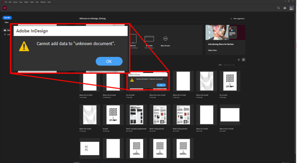
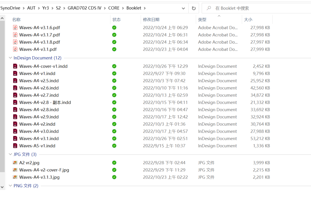
My tragedy in motion. Please, anyone seeing this, BACKUP your work NOW…
Foiling
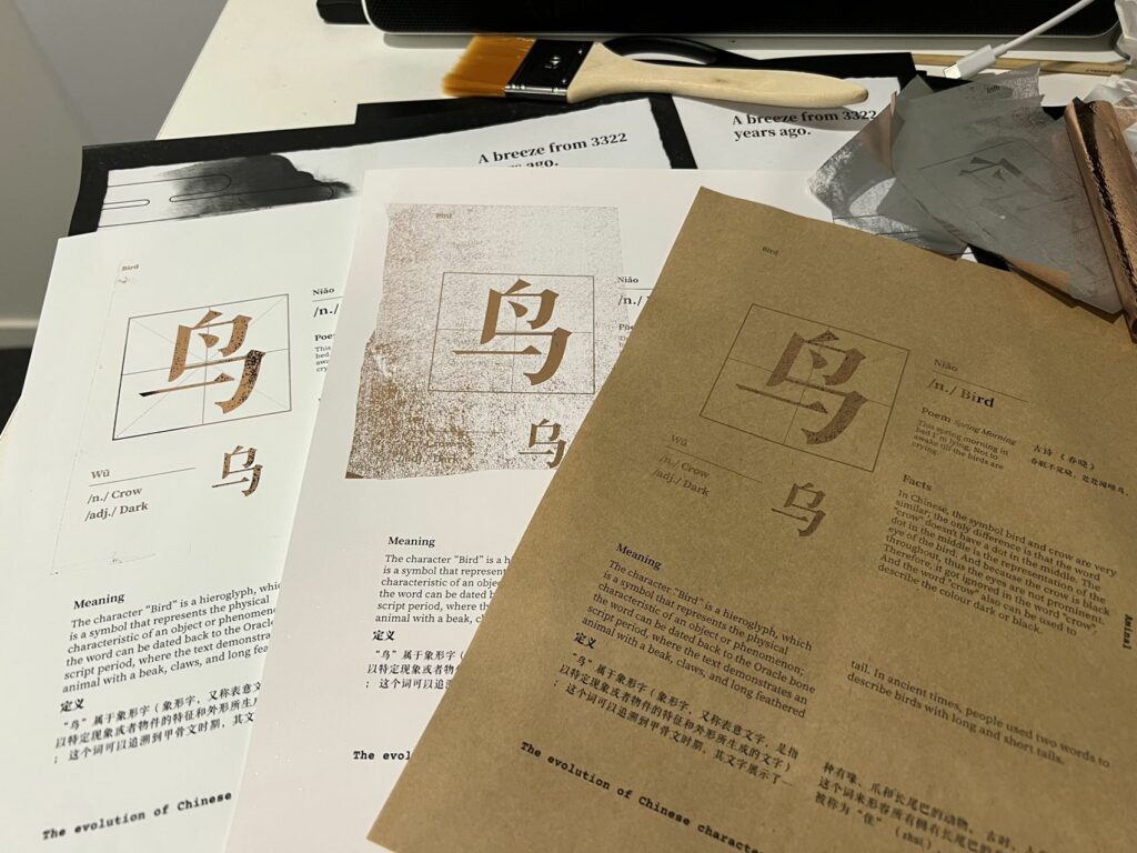
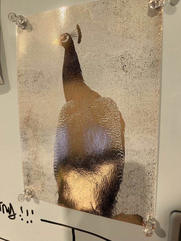
I tested a lot of methods on different materials and paper stocks, pressing temperature, speed and pressure, but none of them was able to create a good enough result. No matter how I change the setting and type of isolation technique, some of the foil just does not want to stick. But I do find out, using a halftone screen produces a more consistent result, but still not to the point that I’d call it good enough.
I also created a section for testing. It contains a solid shape and four blocks; each block has a different property, such as solid fill, gradient, 80% Grey, and 50% Grey.
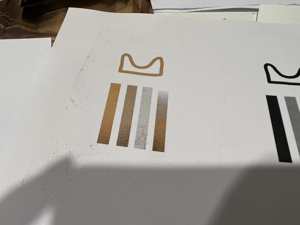
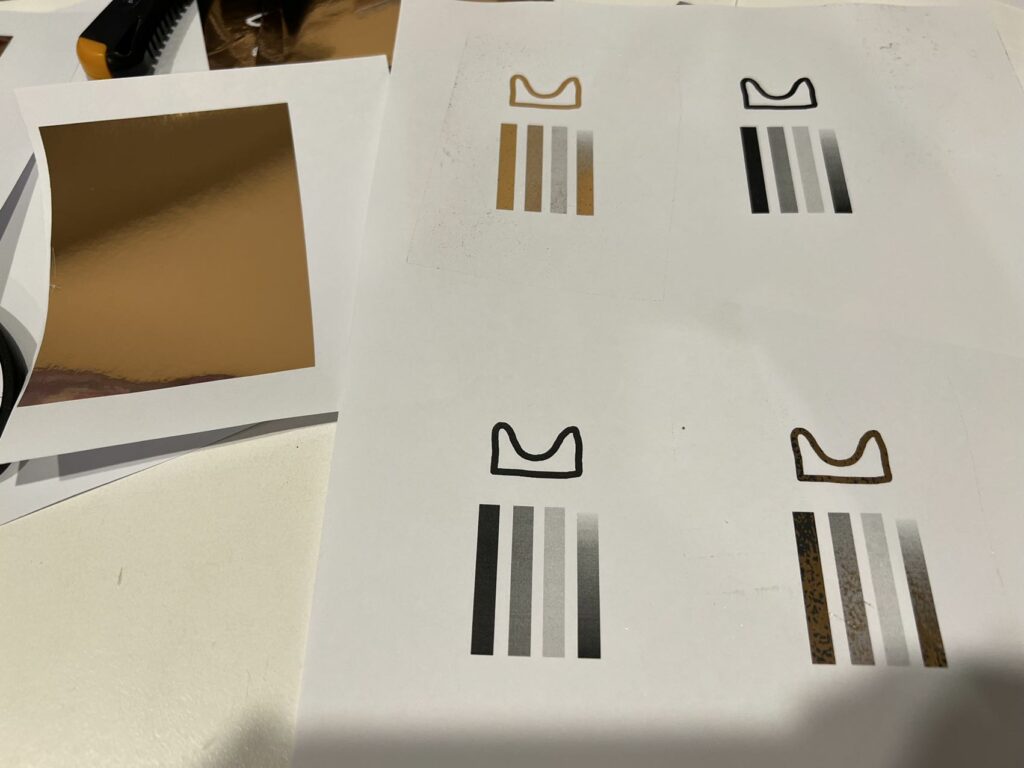
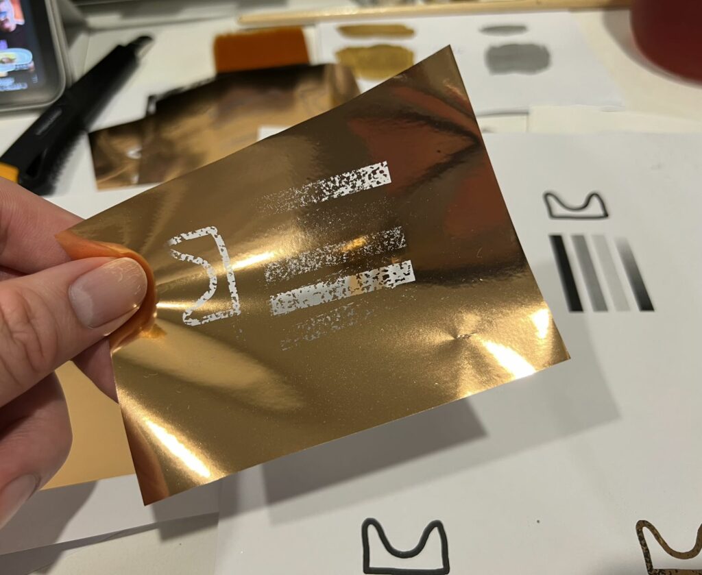
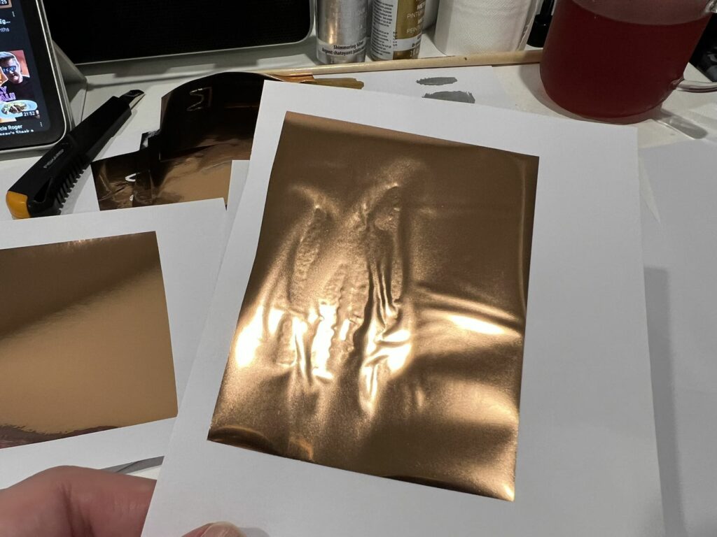
I noticed the foil loves to get stuck on the region that is not intended for foiling. I tried using the separator to isolate the foil and the paper to avoid bleeding but with limited success, as the thickness of the intermediary interfered the heat transfer, thus making the edges not foiled.
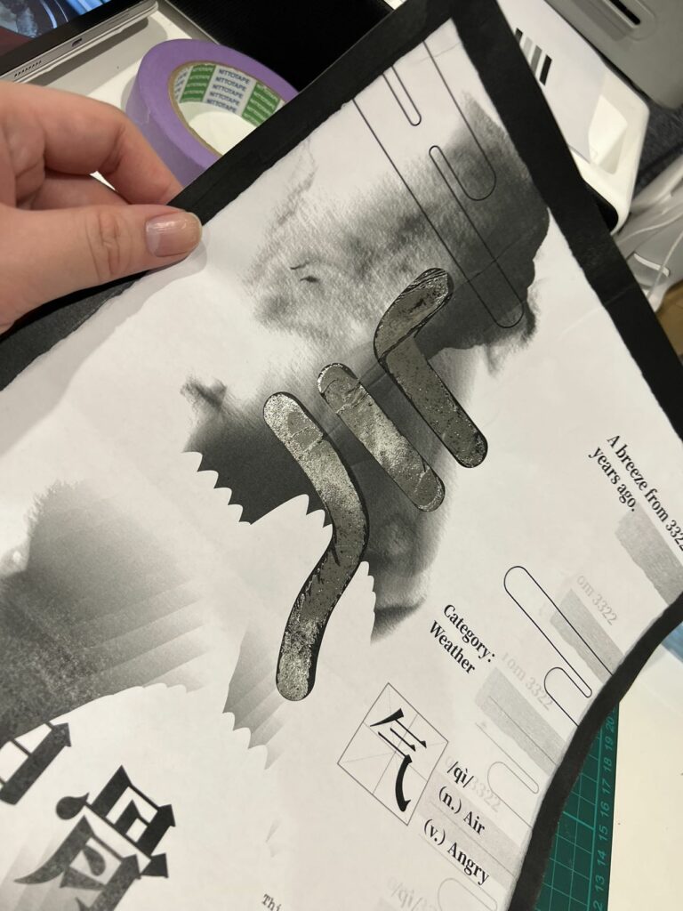
This is the best I can get, but it was still 50/50.
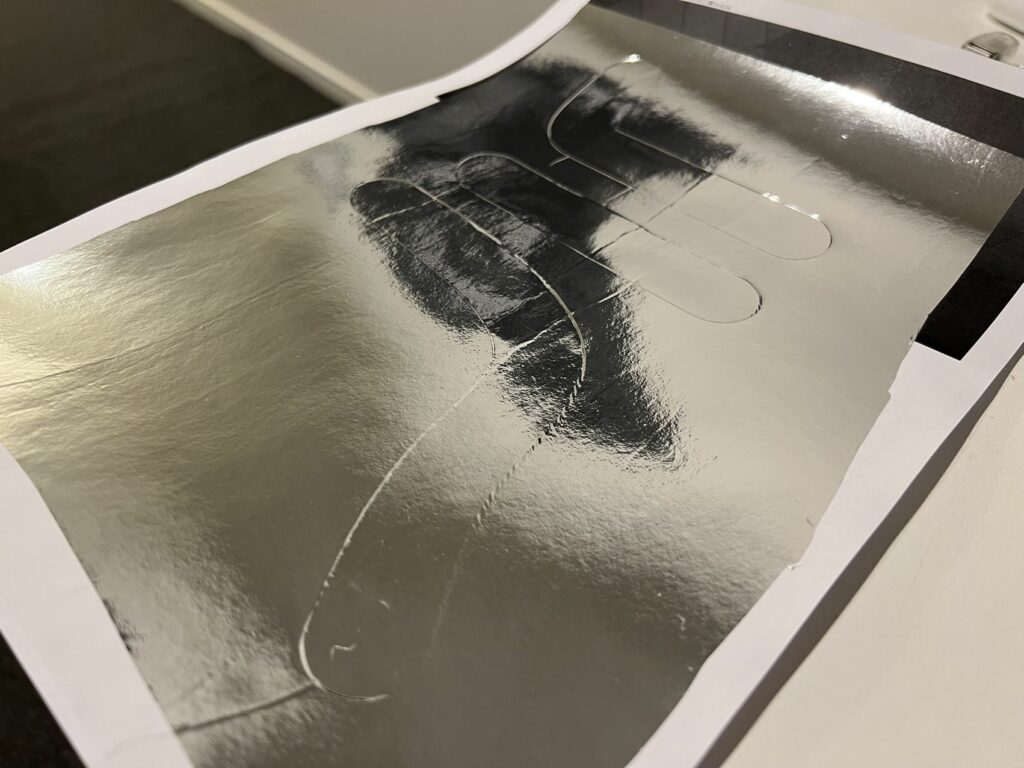
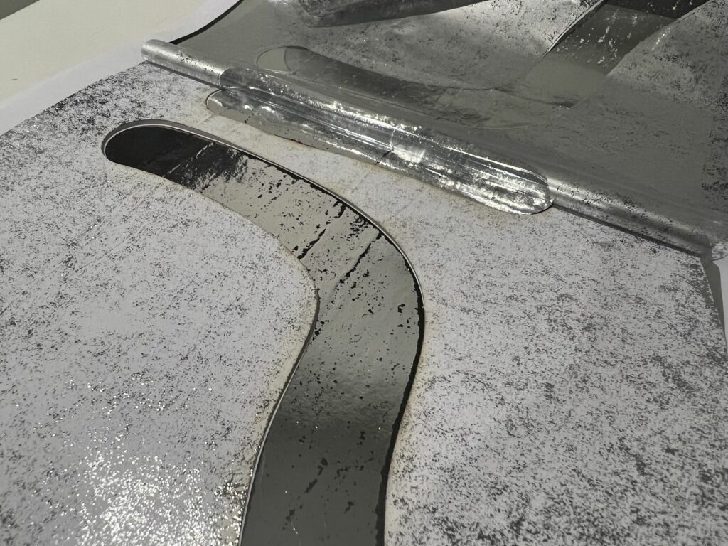
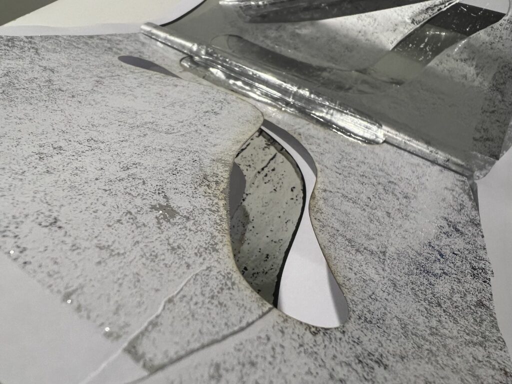
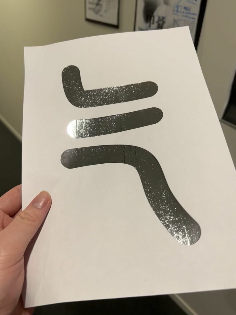
There is little success yet, and this is where I got what I think is the closest to being perfect; and I used the halftone screen method, I think the halftone is where it is at. More testing is still needed.
Poster/s
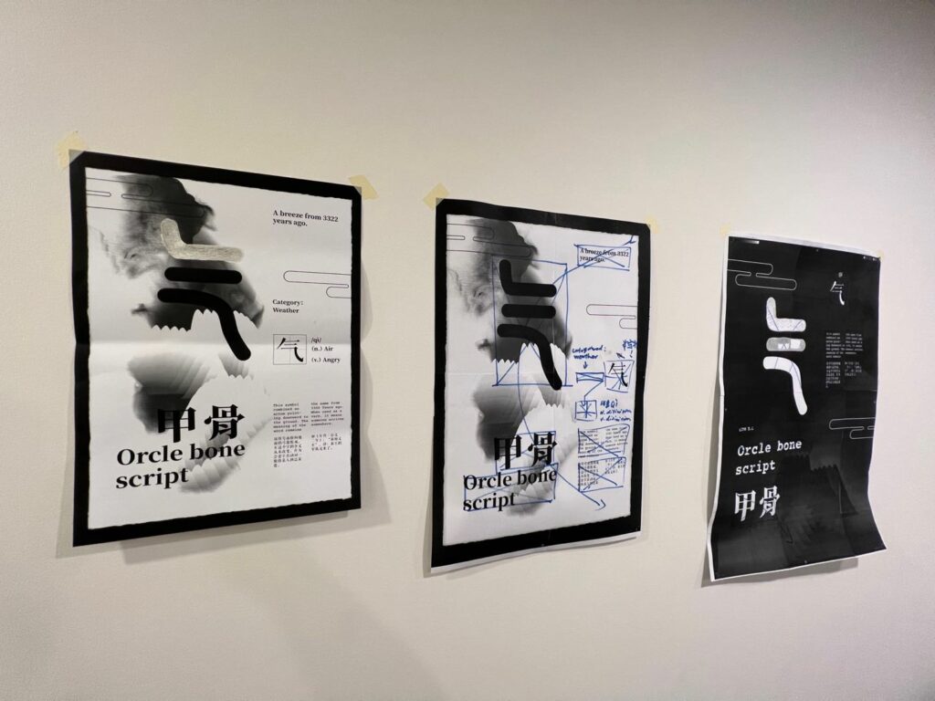
I was making minor changes to the poster, mostly layout, because I decided to create a poster series with at least 4-5 posters; I need them to look cohesive when put together. And I think, from the feedback, printing a gigantic A1 or even A0 poster is not going to work as it costs too much, and if I want to add anything special treatment to it, the difficulty will increase a lot, and the foiling method that I know of will not work on inkjet printed materials.
Halftone screening
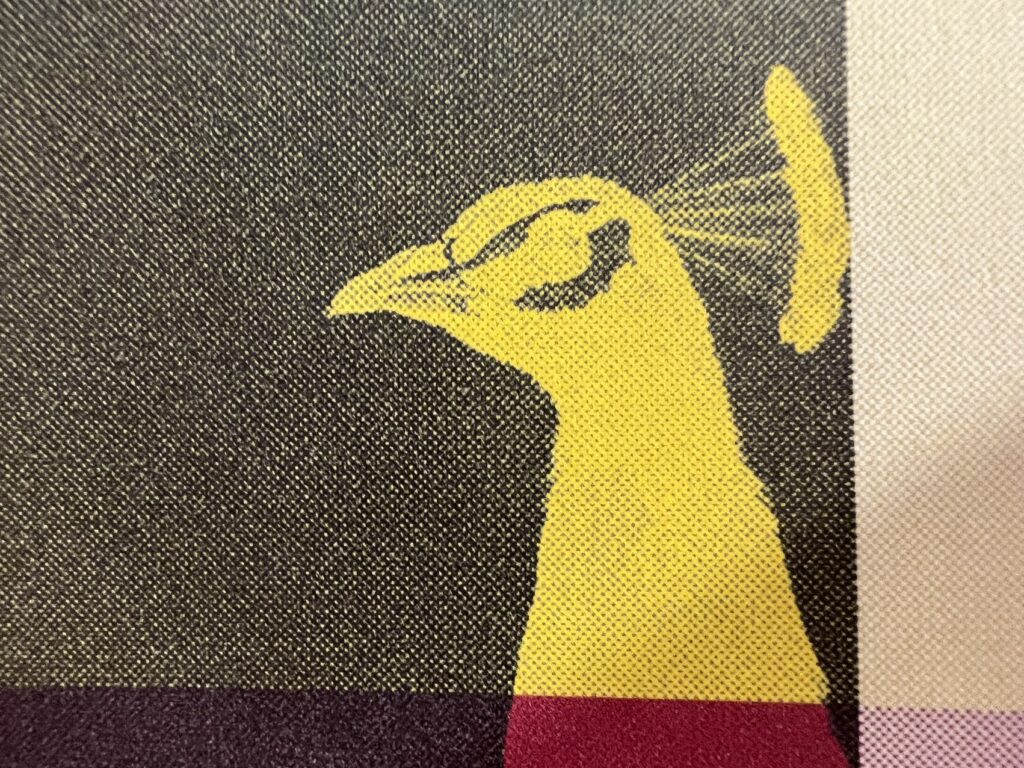
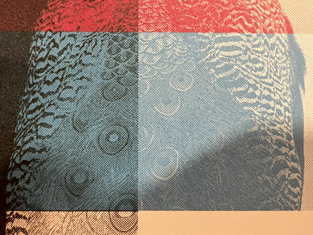
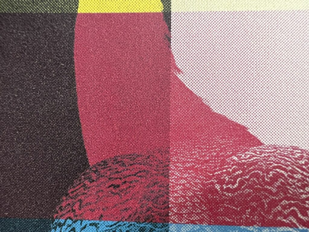
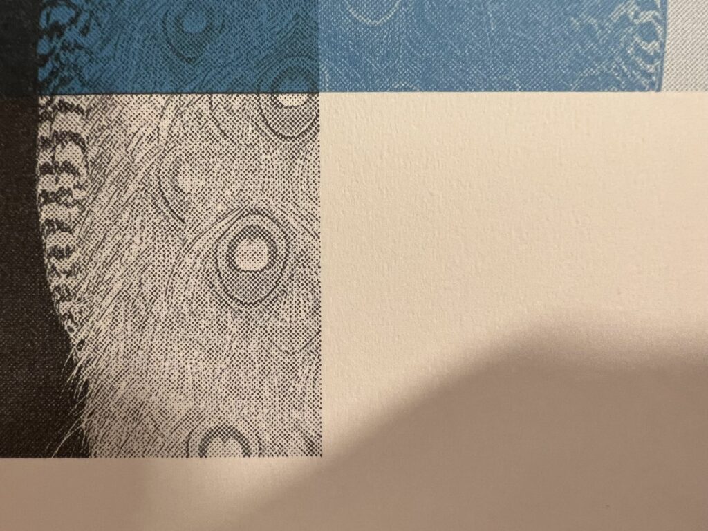
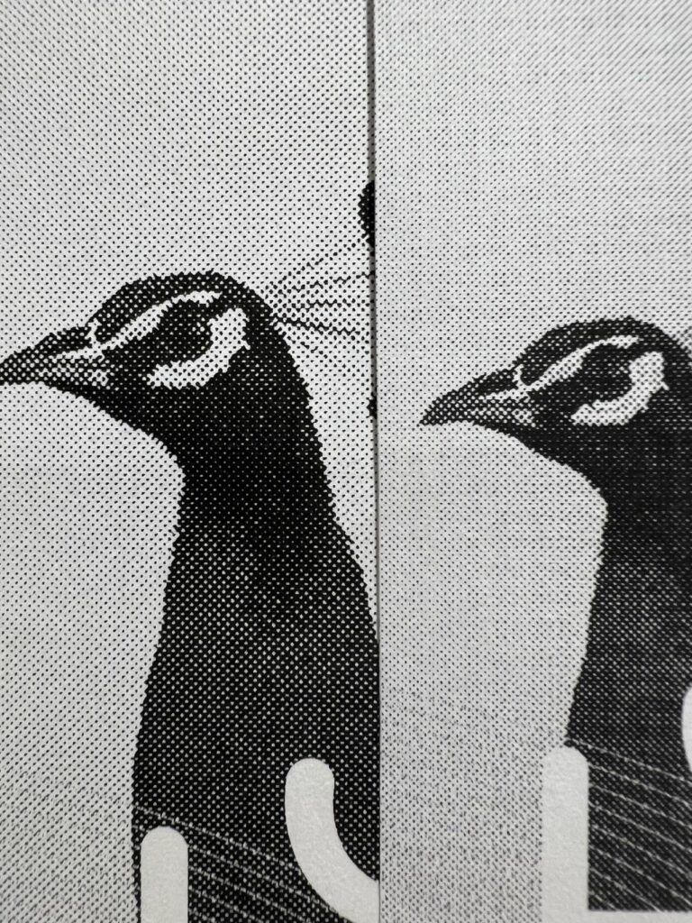
The process of using digital treatment to imitate a printing technique is fascinating. I do love the result from the process, but it was a bit tedious as I have more than 20 images to process, I think maybe I can create an action to do the process. But now, I still need some testing and seeing how to make it looks good with monotone or colour.
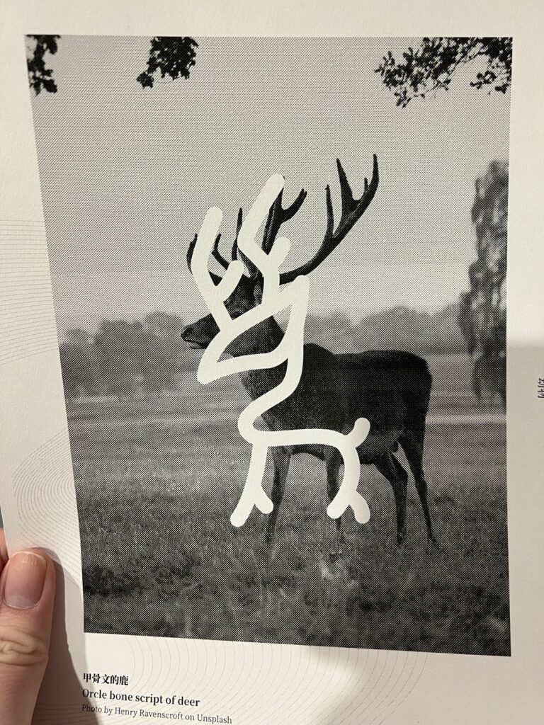
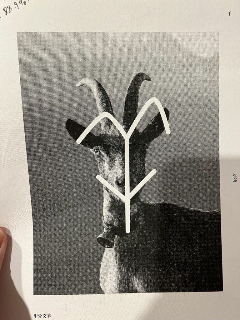
The use of a single, rich colour is amazing. The colour is clean, and with the halftone screen process, it looks vivid and well-textured. You can still tell what the image was, but also not that obvious.
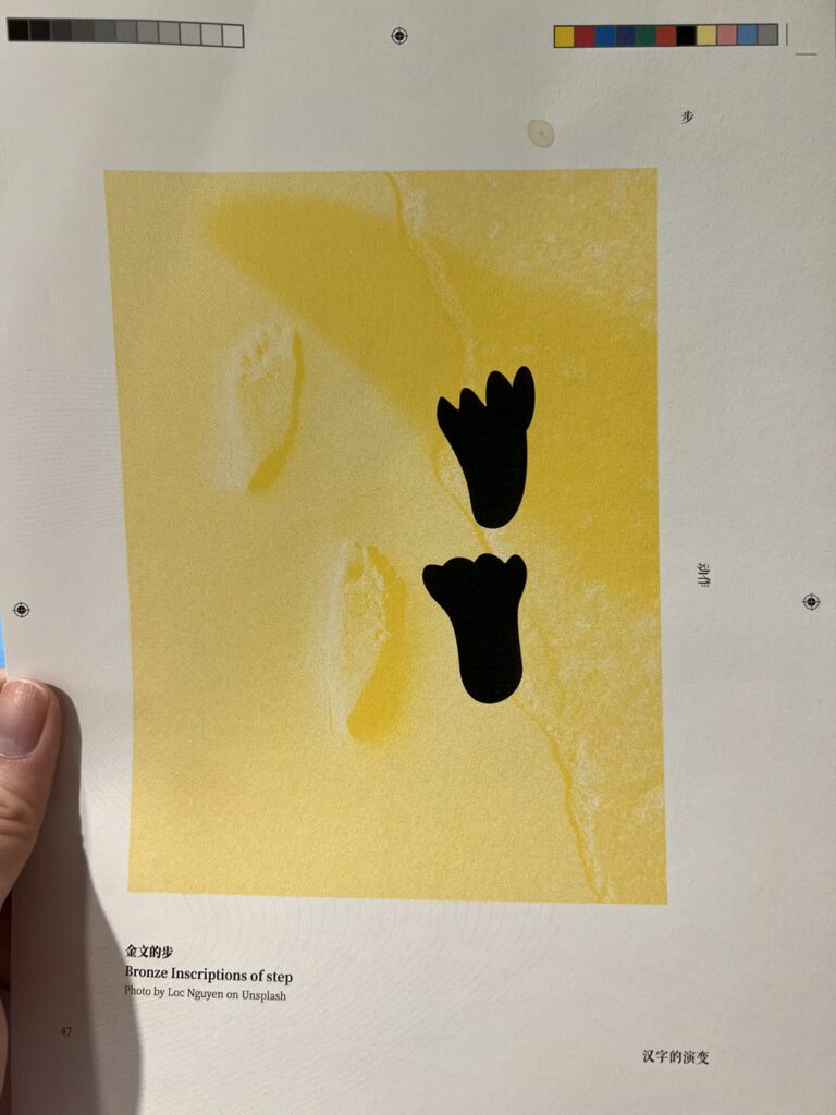
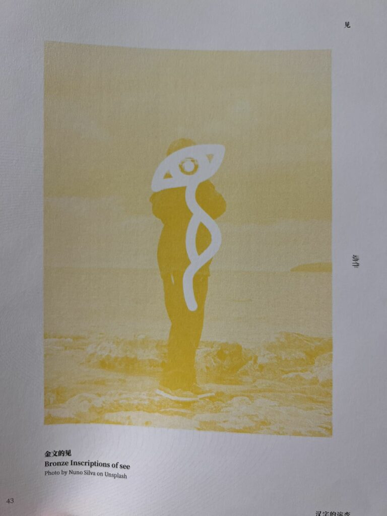
But, when testing I got, the yellow was the one with the most trouble, as the colour itself was light; thus, everything that came out of it looked flat and with little contrast. To fix that, I manually added some black into the images, and the result was much better. On top of that, with two colours, I can shift them and creates something very interesting.
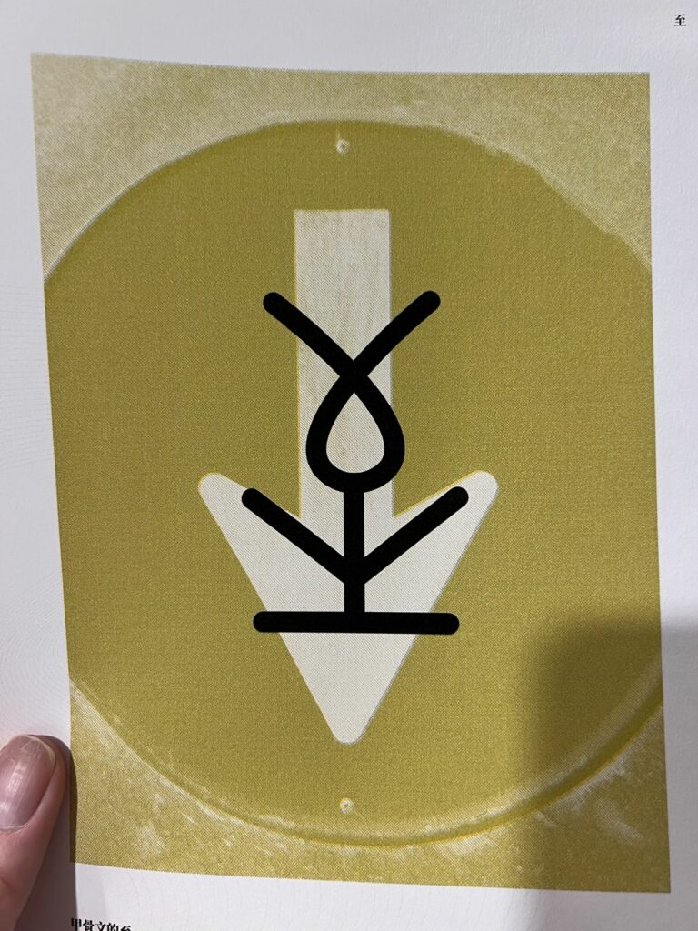
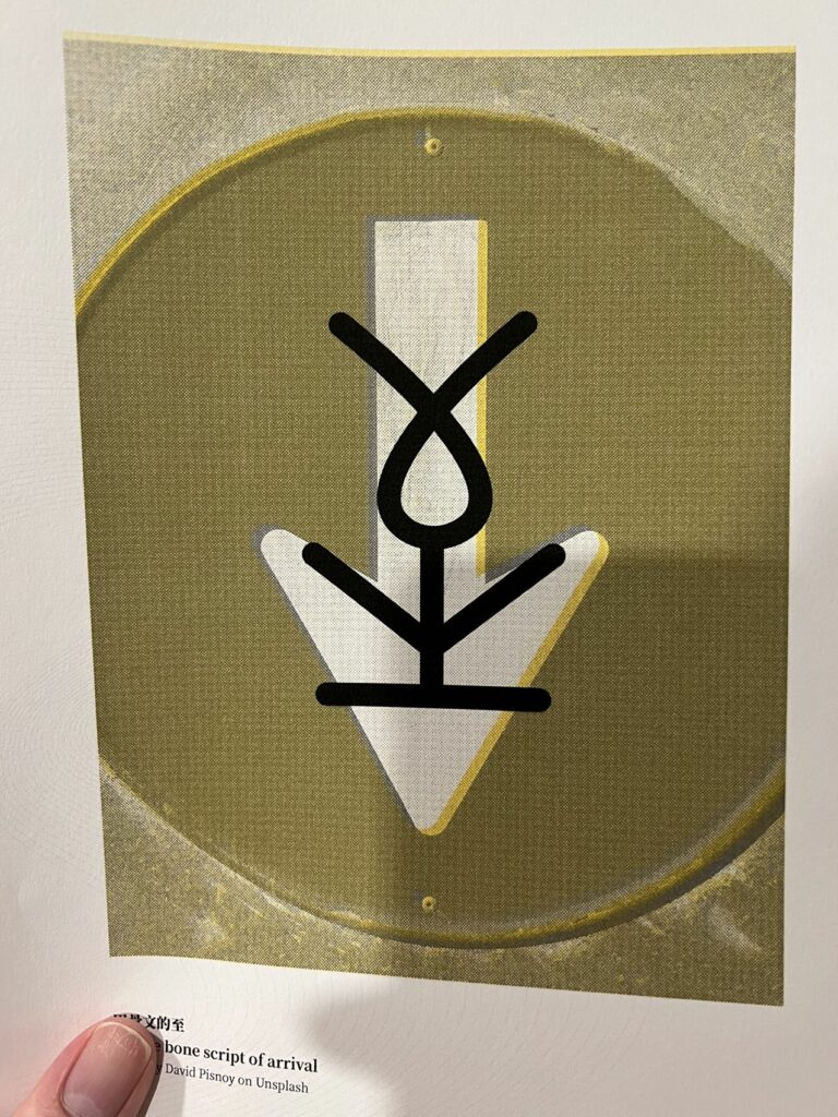
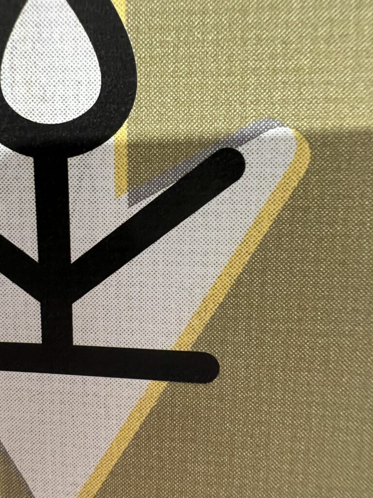
This is only with yellow and black, I also tried with colours, but the result was not as good.
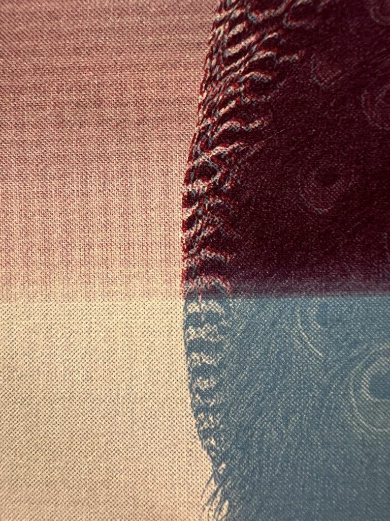
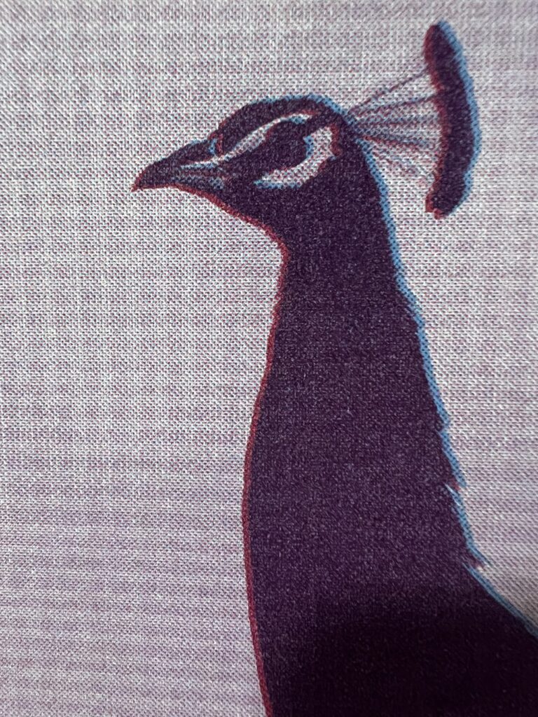
After some testing, I was able to create a colour chart as a reference, and the images in the publication were all done under this chart.
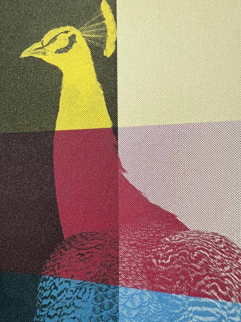
I love the yellow on black; it looks very sharp and highly detailed, but the application for that was very limited thus, I did not use it for the final product.
