GRAD702 – Week 10
Waves, The evolution of the Chinese characters
Updates
- Started content gathering
- Using the method from 703 to help speed up the process
- More testing with different stocks on foiling
- Poster refinement after feedback from class last week
- Publication feedback and adding illustrations to some of the pages
Publication
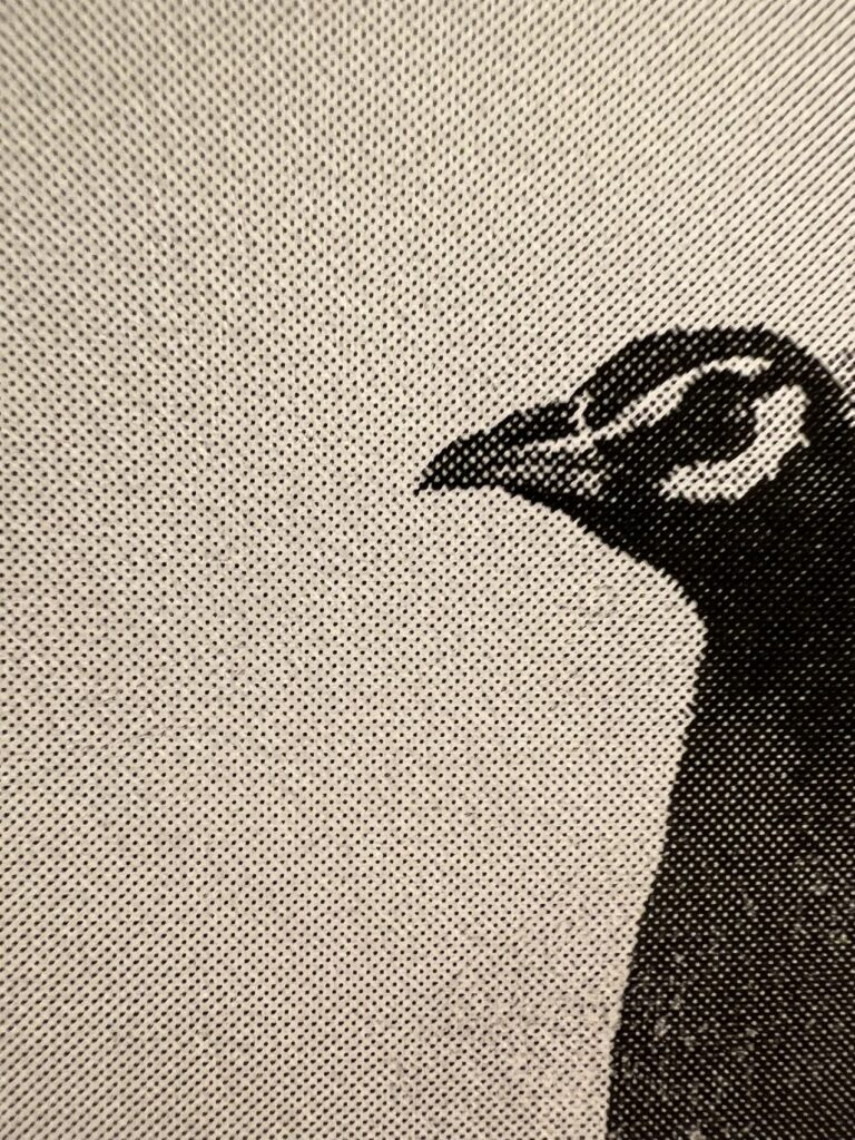
- process the image with photoshop after feedback from lectures last week regarding the pictures used in my publication being messy; maybe try monotone or single colour.
Layout
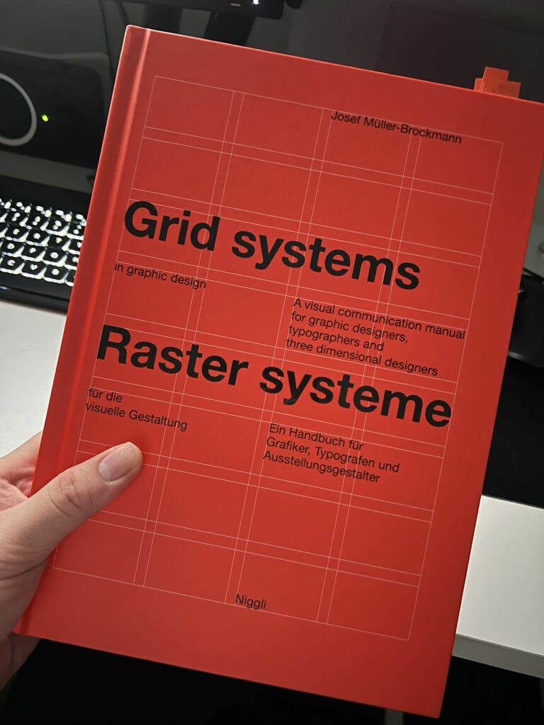
The layout is another challenging part of editorial design. I was able to find a ton of useful information in this book: Grid Systems in graphic design by Niggli Verlag
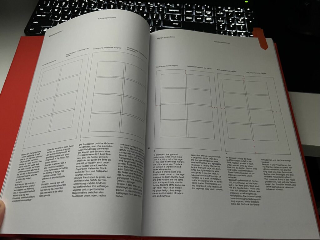
And my grid is based on some of the suggestions found in the book, And I did some print tests to see if it worked, and I am happy because the result was great. But some minor adjustment is needed to add some space between the text.
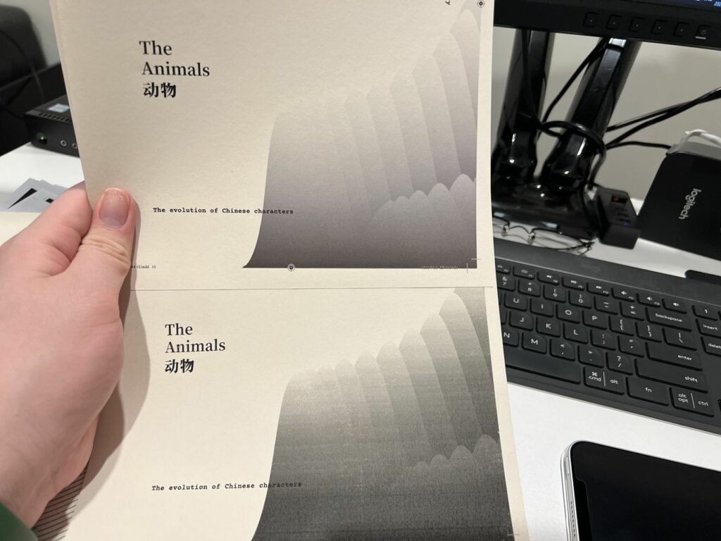
illustrations
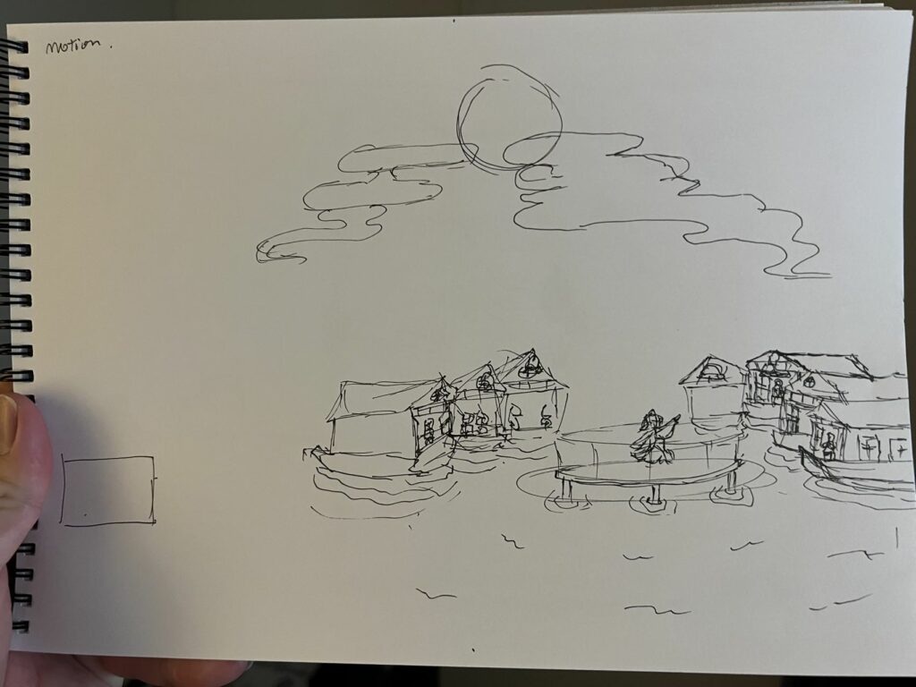
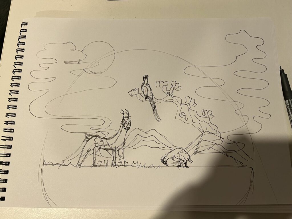
I got a suggestion from my colleague, and she said I should try adding some drawings to some of the pages because now the publication is too dry to read. I think she is right. The heavy focus on text leads me to a book that is boring and dull. Thus I decided to add some feature pages to each category to showcase the correlation and visual representation of what is in this section.
I began drawing some sketches to visualise how the picture would look and feel.
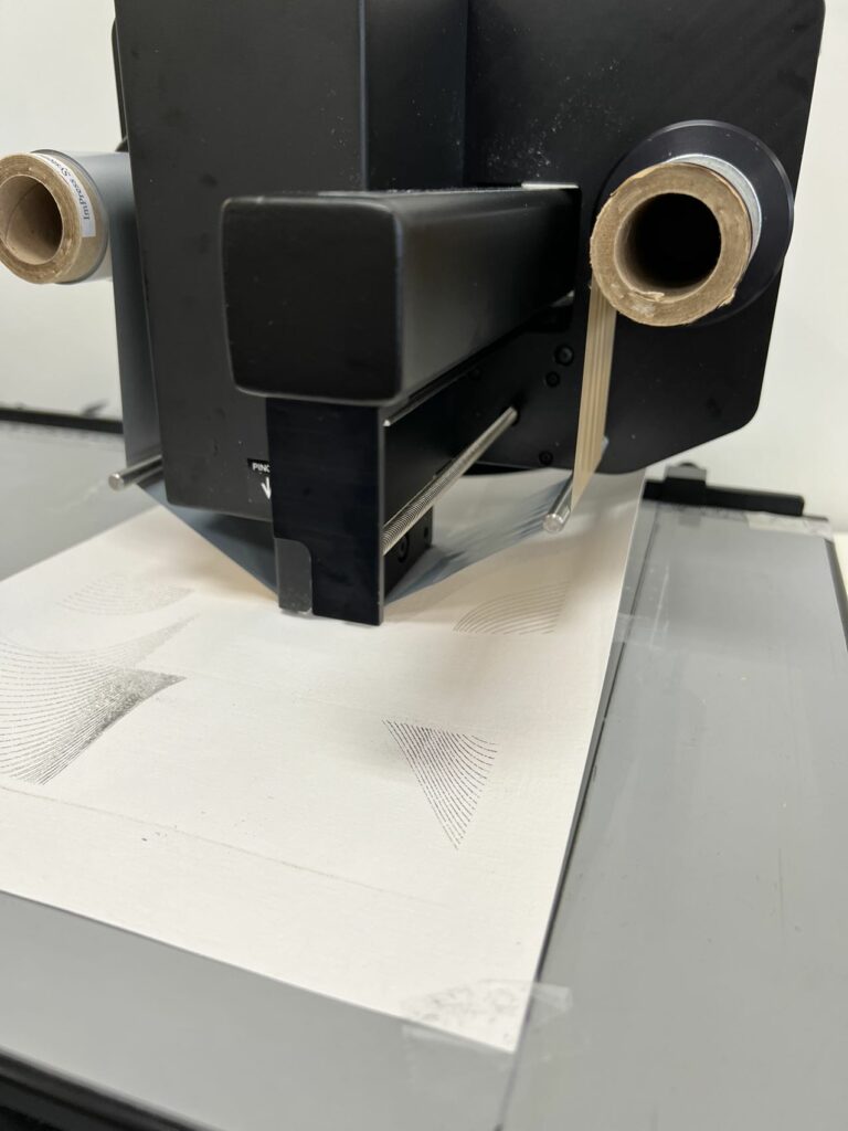
Foiling
One of the feedback from last time was testing with different methods of print and adding special visuals to the design. I was learning about foiling, and I went to L7 to use the foiling machine to test on my cover, but the result was sub-optimal. And the press flattens the texture on the paper, so I need to find another way to do it.
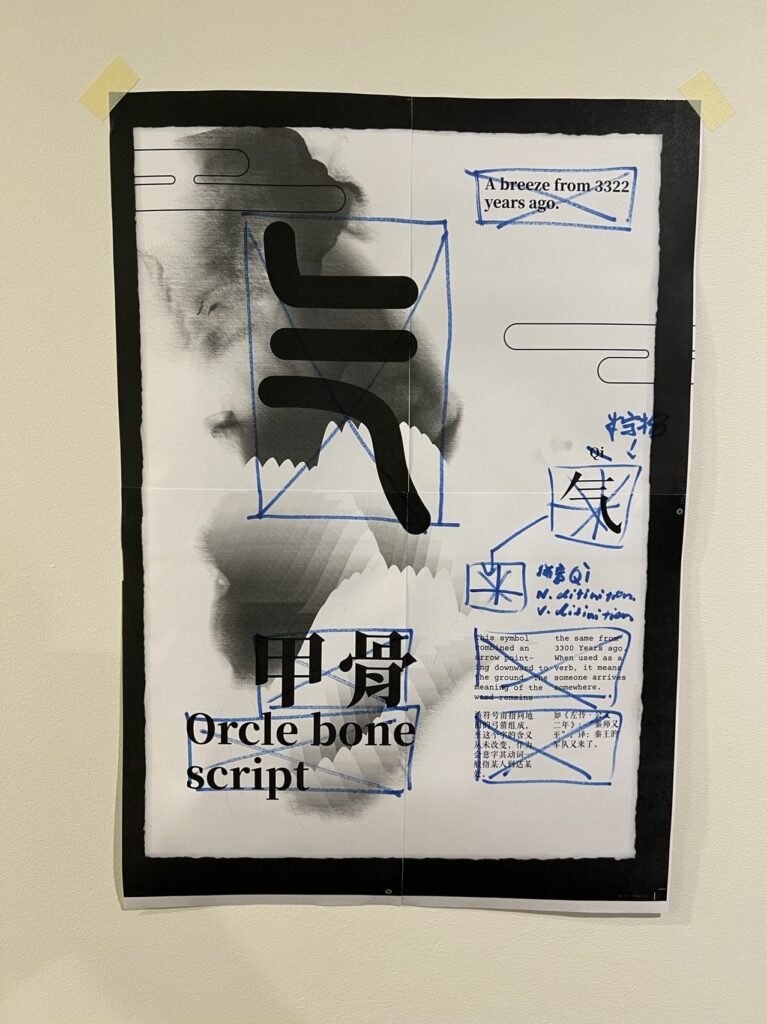
Poster/s
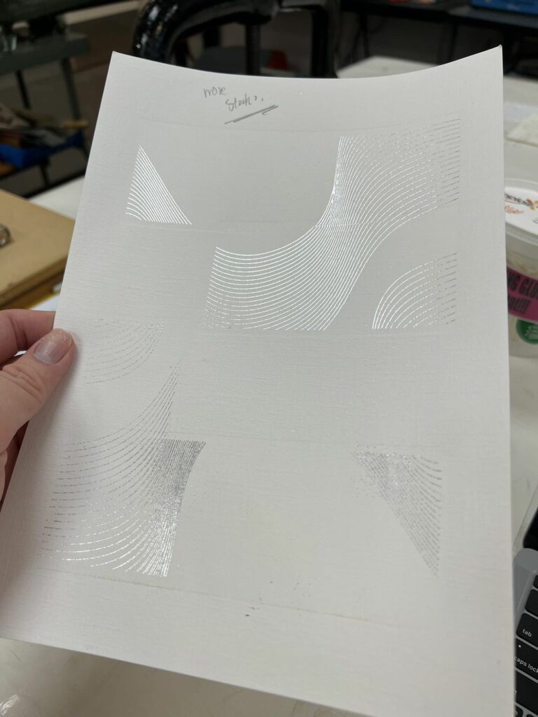
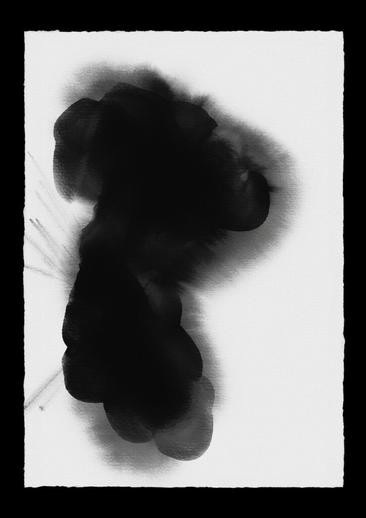
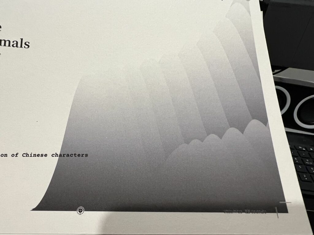
After another round of feedback, And the RAW paper stock I got from last week, I was able to use ink to render some interesting flow of shape onto the paper. I scanned it into digital format and then processed it with photoshop to enhance the details and contrast. With that, I was able to create a background that looked nice. Still, if I place it over the poster, the handmade imperfections of the edges will be cropped. I want to keep the edges. Thus, I created a black background to frame the paper, and it actually looks fine.
Binding & Colouring
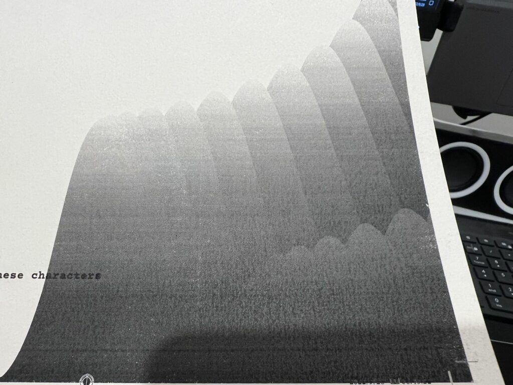
I accidentally found a method of print called halftone screening, it is a way to gain smoother gradients and transition between two levels of tone. In the traditional printer, it is hard to achieve without creating bending in the result, which I personally experienced quite a lot. I was worrying something was wrong with my printer. But with this technique, I was able to get a clean and smooth gradient between monotone, but more importantly, I really love the texture that it creates. The little dot of colour is almost like a screenprint with larger holes, and the visual of it was fantastic, and I definitely going to expand it to more of the design.
Character design
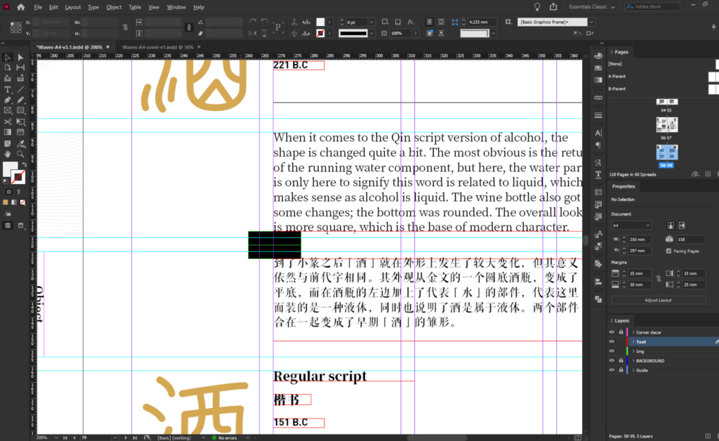
I’ve finished my character design, and now, I can begin the actual content extraction and start to translate some of them into English. I don’t think I have the time to have a poof-read session now, as I think time is not on my side.