GRAD702 – Week 01
Ideas
The ideas I lean forward to are culture and language-related. I am fascinated by Chinese characters. Even though I’ve been using them for my whole life, little do I know about the story behind them. The history of a character, from the beginning to modern time. I want to take this opportunity, to scratch the surface of Chinese letter history. I want to make this project not only for me but for everyone who is interested in learning some basics of Chinese characters and their story. The idea at this stage is to make a publication in two languages ( English and Chinese). The publication will mainly focus on editorial design, creating a nice-looking, feeling and modern layout optimise for ease of reading. On top of that, I’ll be doing a bit of illustration to recreate the ancient characters, such as Oracle Bone Inscriptions.
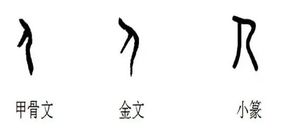
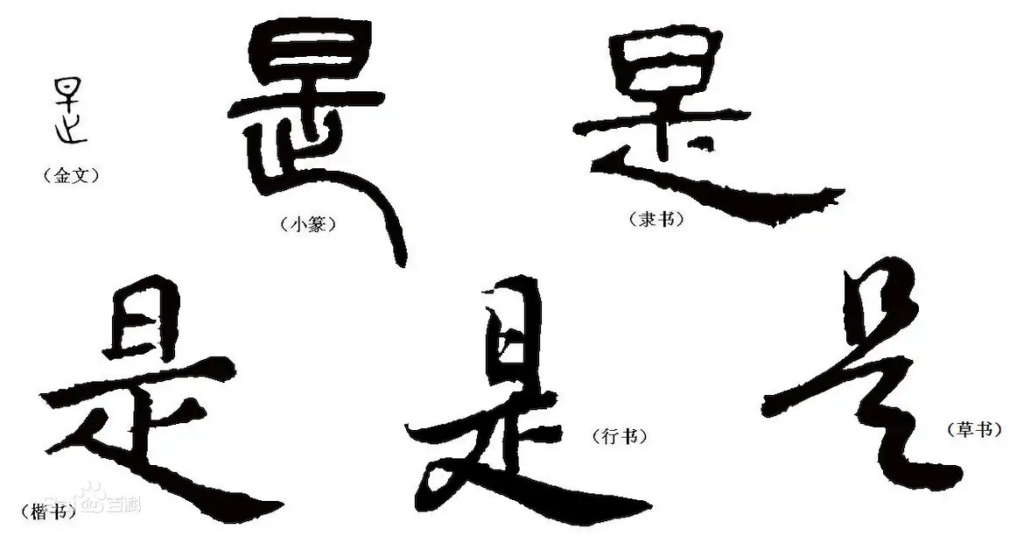
Techniques & Style
I wanted to have a textured cover and paper to give the publication a boutique-like quality in the feeling when holding in hand. The size of the publication is going to be printed in B5 size for now (might change depending on the development of the project).
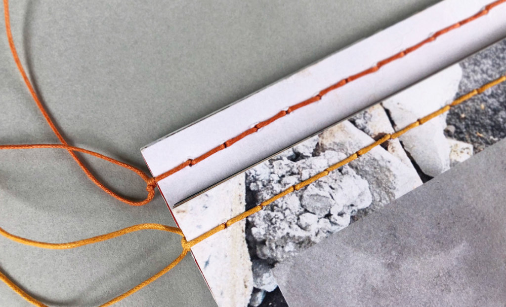
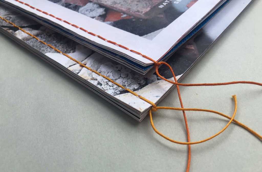
Binding idea and approach.
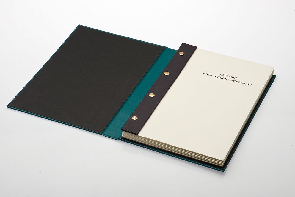
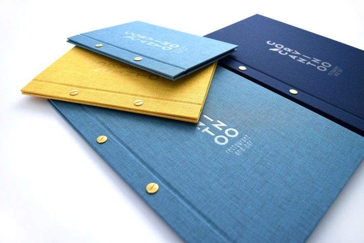
This type of binding is flexible and easy to manage.
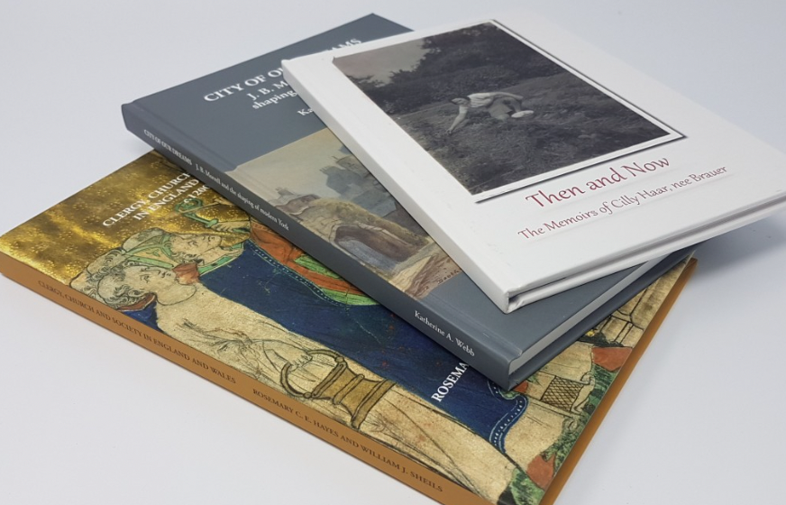
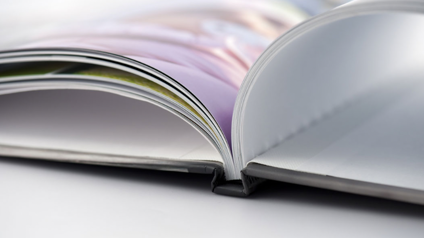
Took longer to make and hard to get perfect. But feel and look impressive and quality.
Current market & Audience
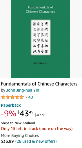
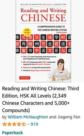
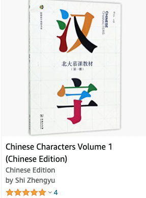
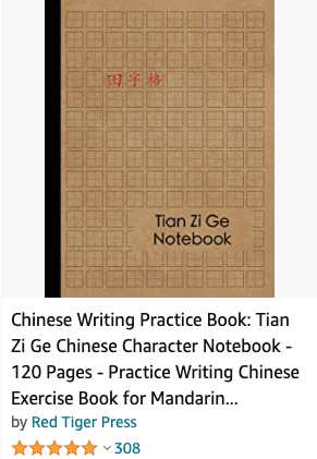
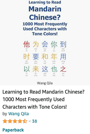
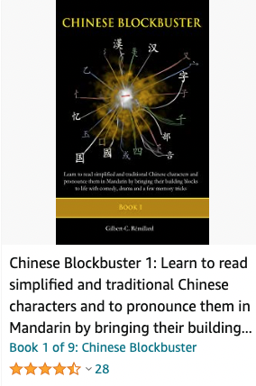
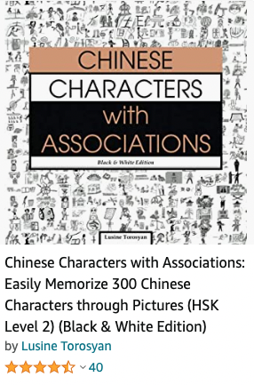
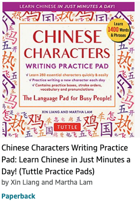
From brief browsing on the online market (Amazon). I saw the books that related to the topic are mostly focusing on being a tool for learning to read the characters. It is good for people who learn to speak and read. I wanted my publication to focus more on the history and story behind the characters, and I haven’t seen much artistically inclined, a well-designed publication for those who are interested in the shape and form.
Inspirations
The list of images is collected from Behance.
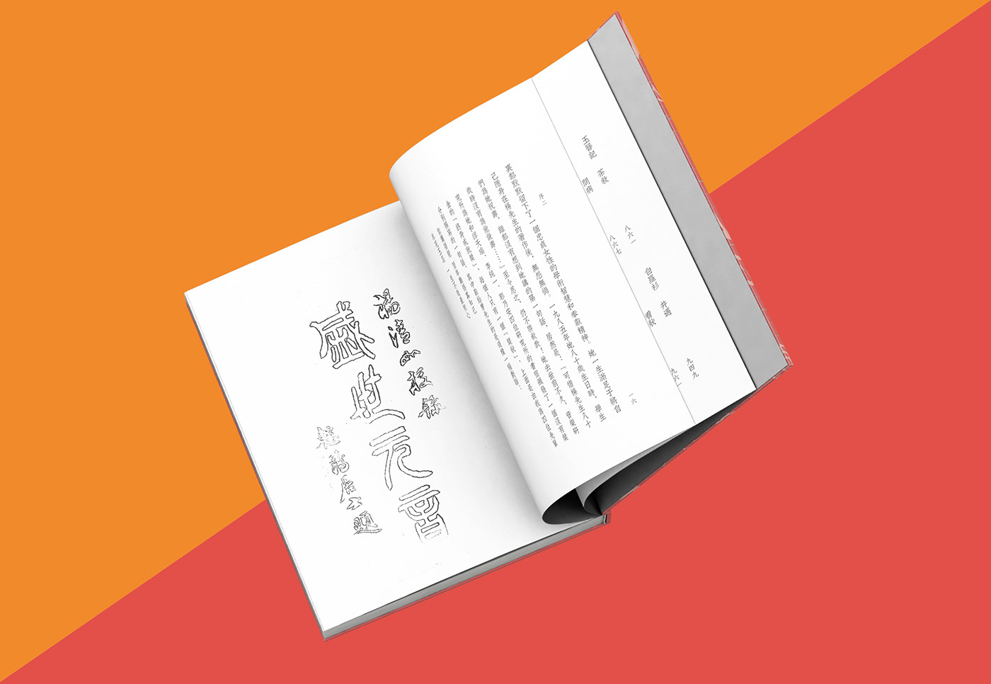
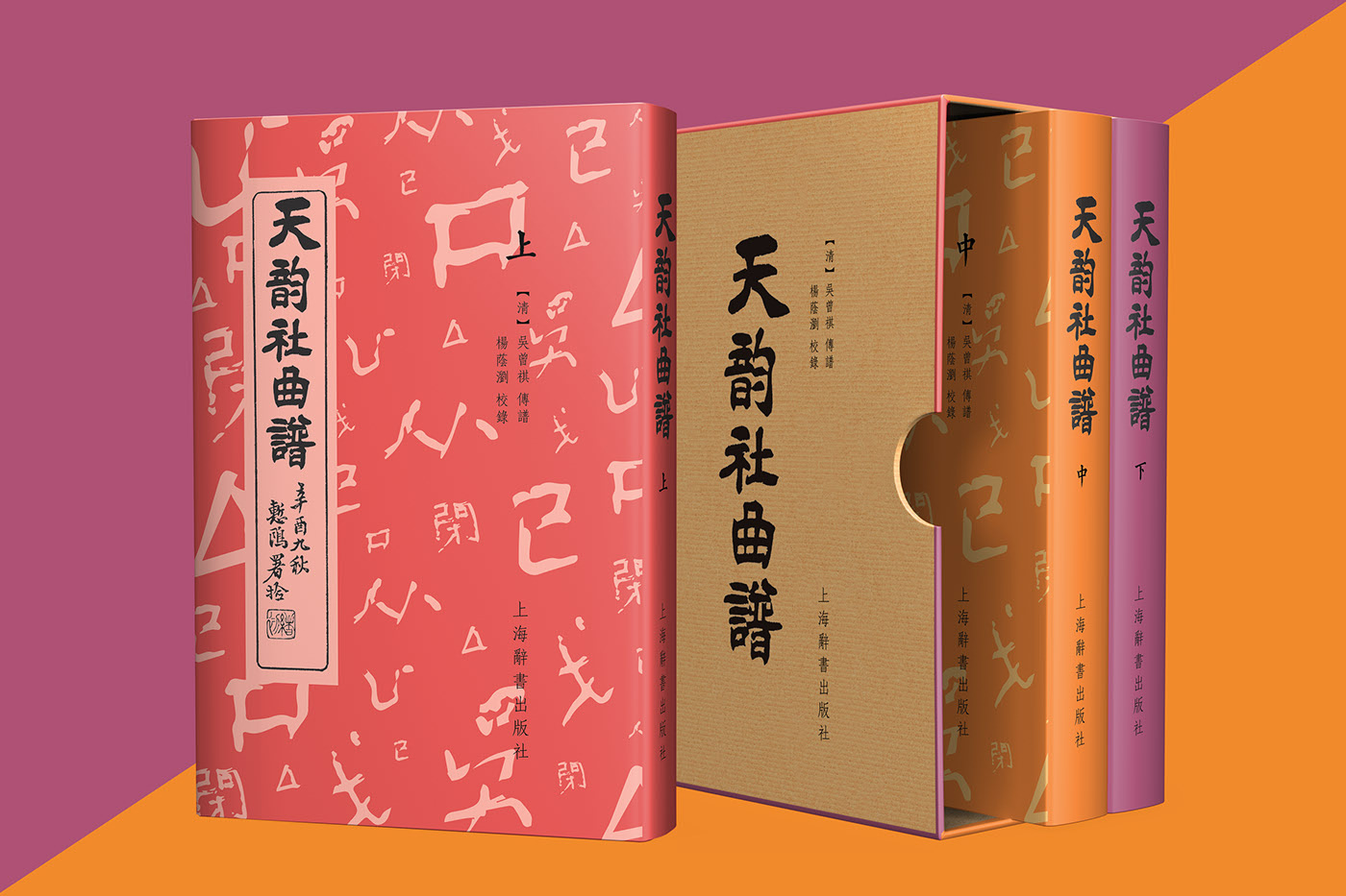
天韵社曲谱/Tianyun Society’s Kunqu Opera Opern
https://www.behance.net/gallery/64500191/Tianyun-Societys-Kunqu-Opera-Opern
This design project and its packaging design are nice, simple yet effective. The cover itself is also fun; it plays with the parts of the words and arranges them in random order. The cover also uses the traditional way of laying out the grid, from top to bottom. The colour is also feeling eastern with its less saturated wheel.
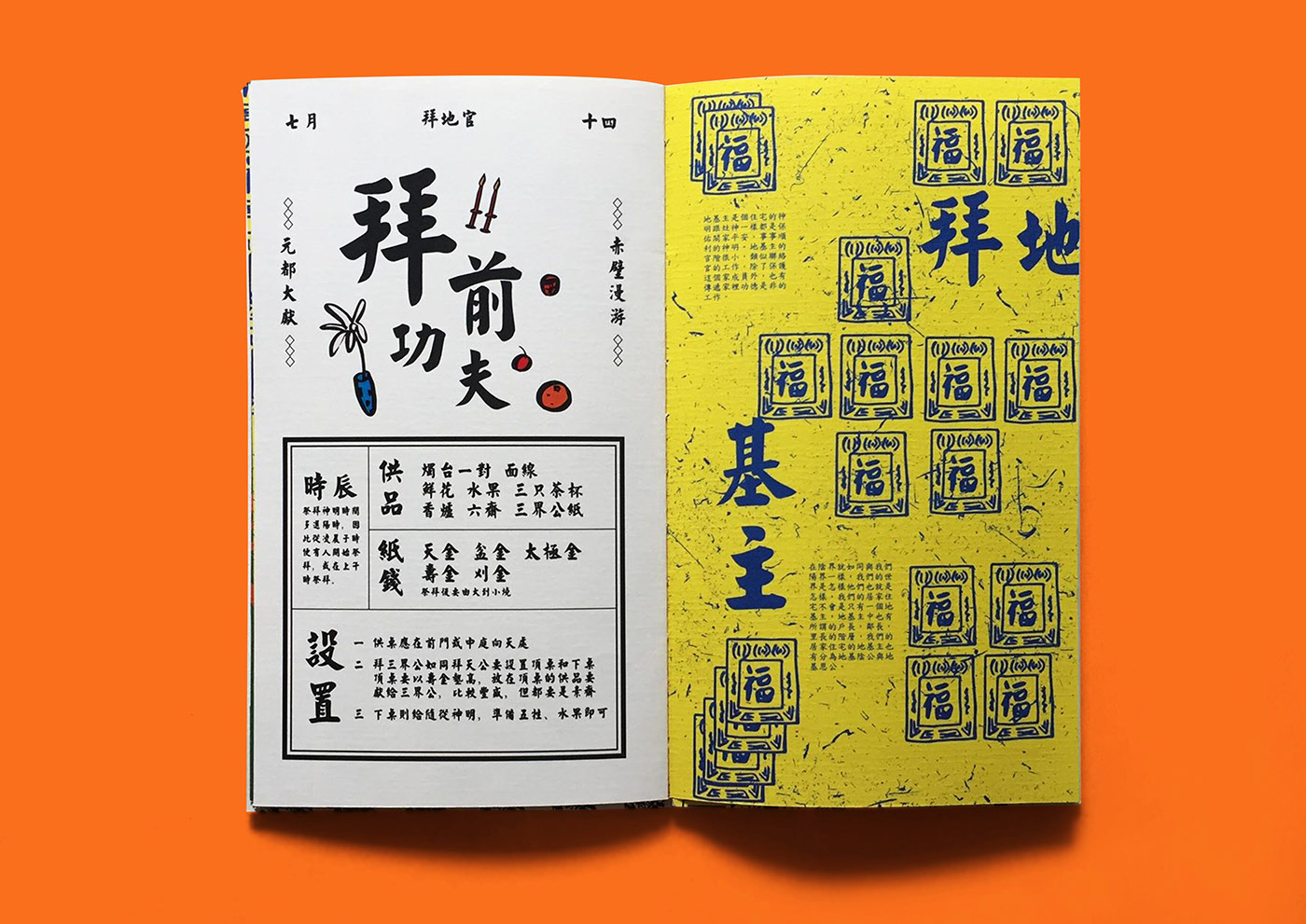
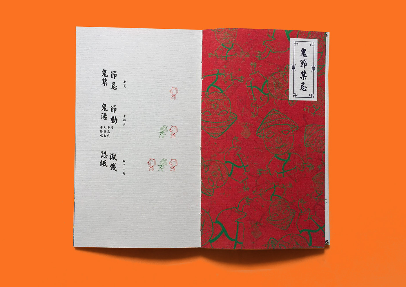
七月十四 / Hungry Ghost Festival
https://www.behance.net/gallery/69942289/-Hungry-Ghost-Festival
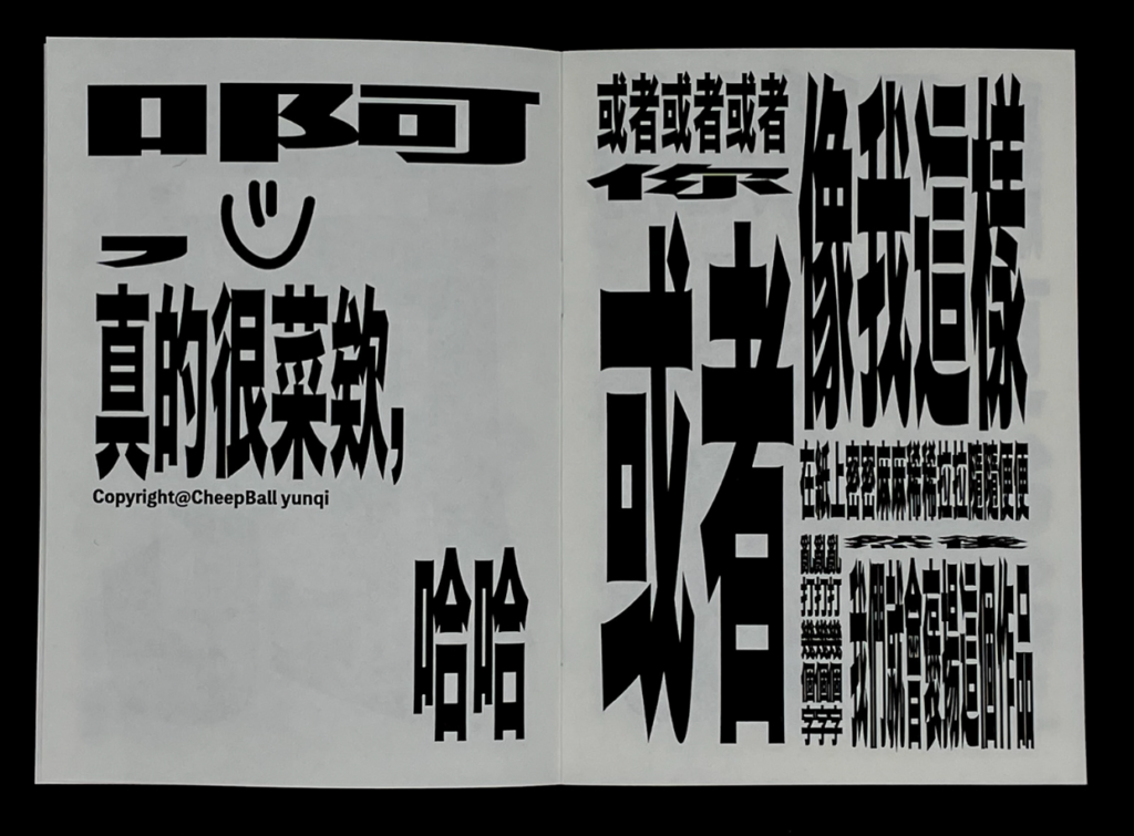
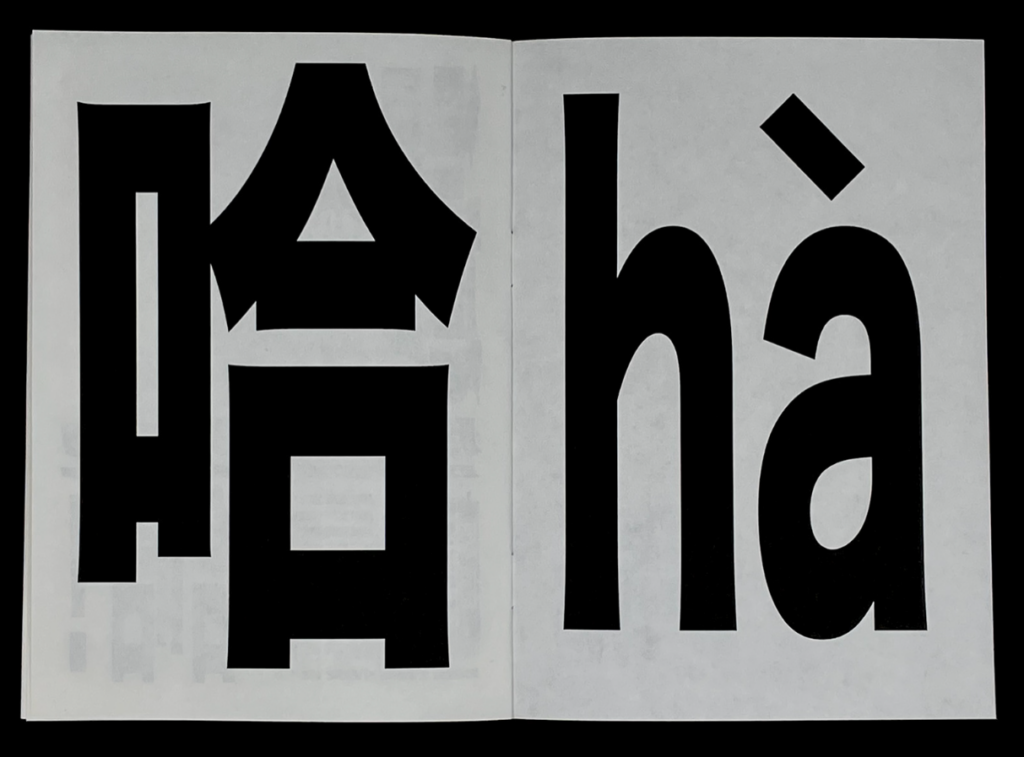
No more design, please 一觉醒来发现自己不会做设计了
https://www.behance.net/gallery/129643221/No-more-design-please-
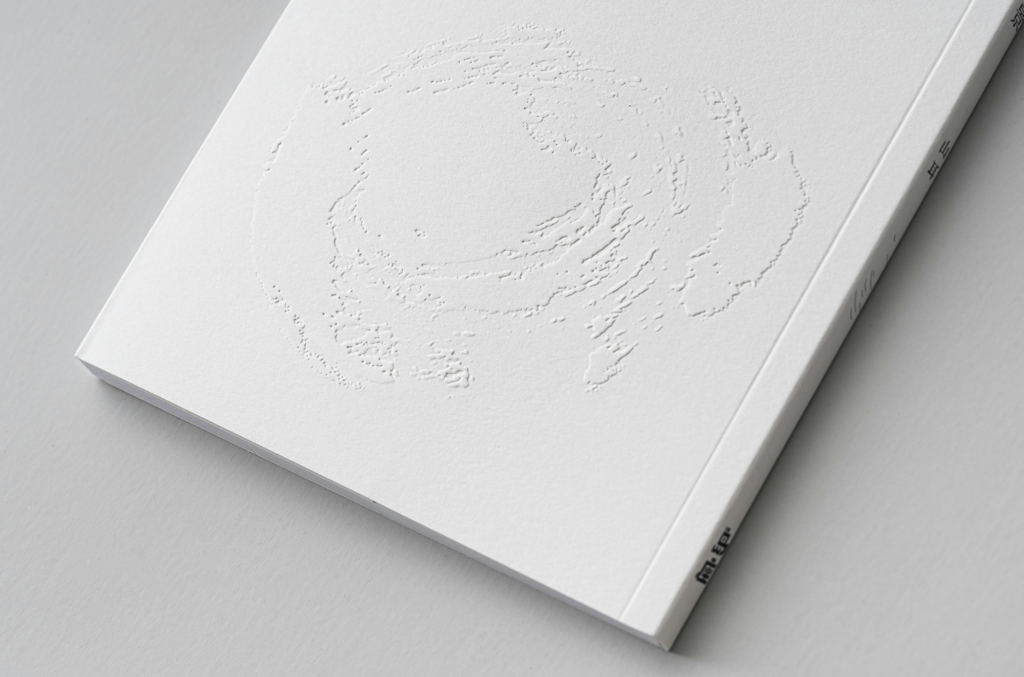
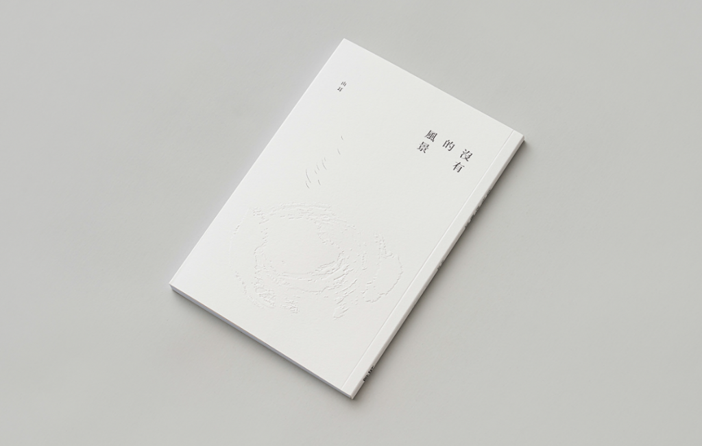
沒有的風景|島座放送
https://www.behance.net/gallery/143902657/_
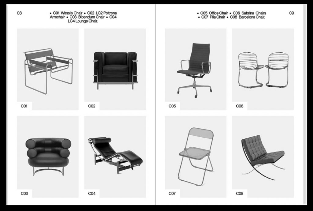
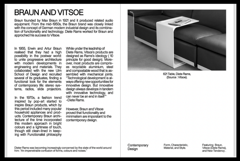
Self-Publication “Various Objects”
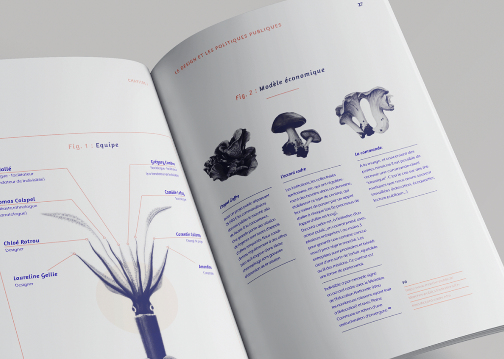
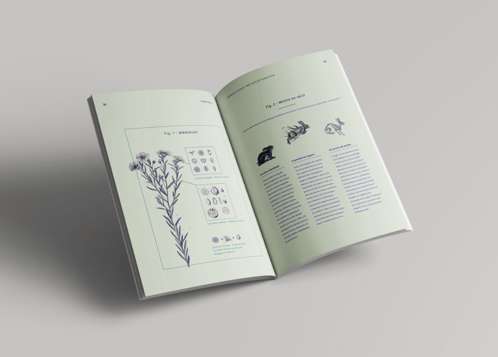
Mémoire master 2
https://www.behance.net/gallery/113170405/Mmoire-master-2
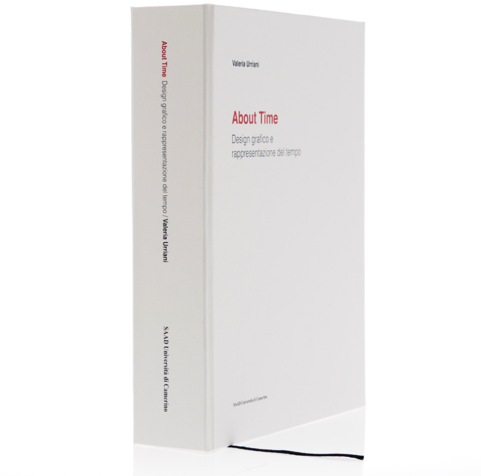
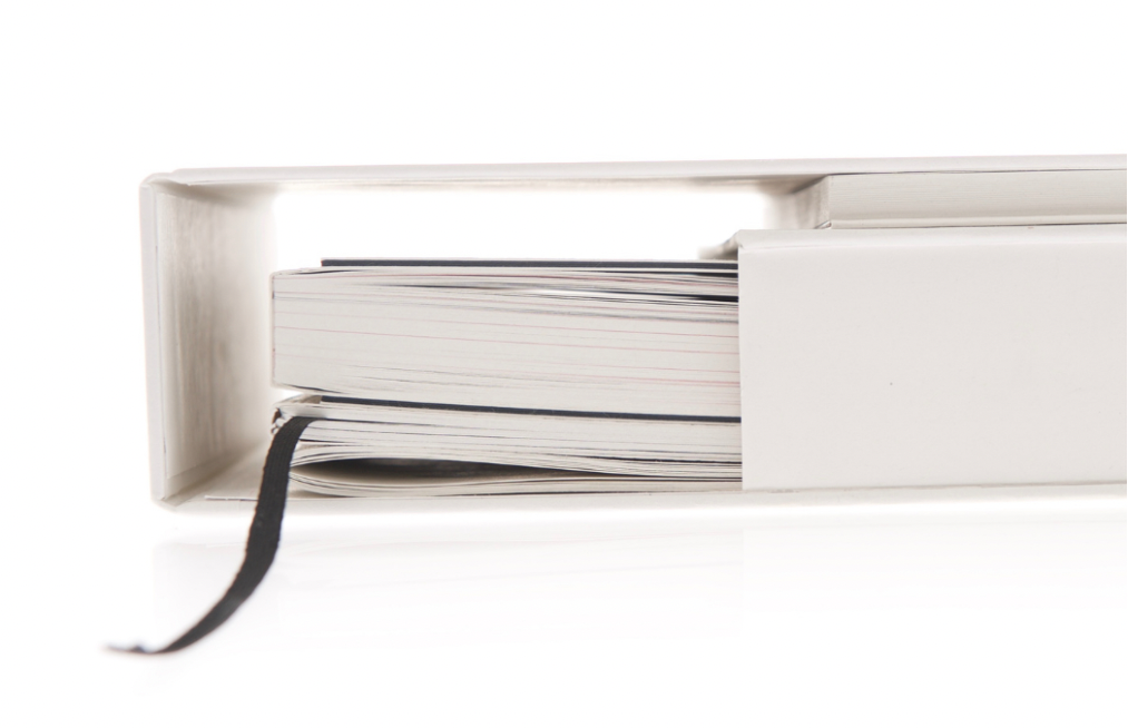
About Time
https://www.behance.net/gallery/142082537/About-Time
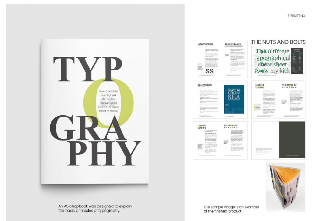
Typography Chapbook
https://www.behance.net/gallery/126670055/Typography-Chapbook
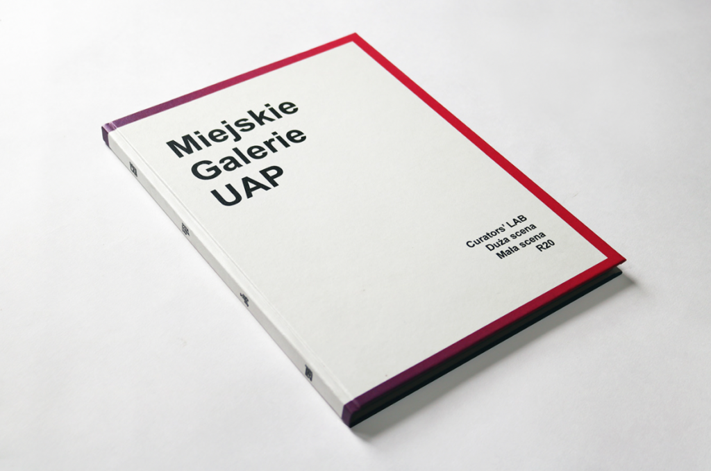
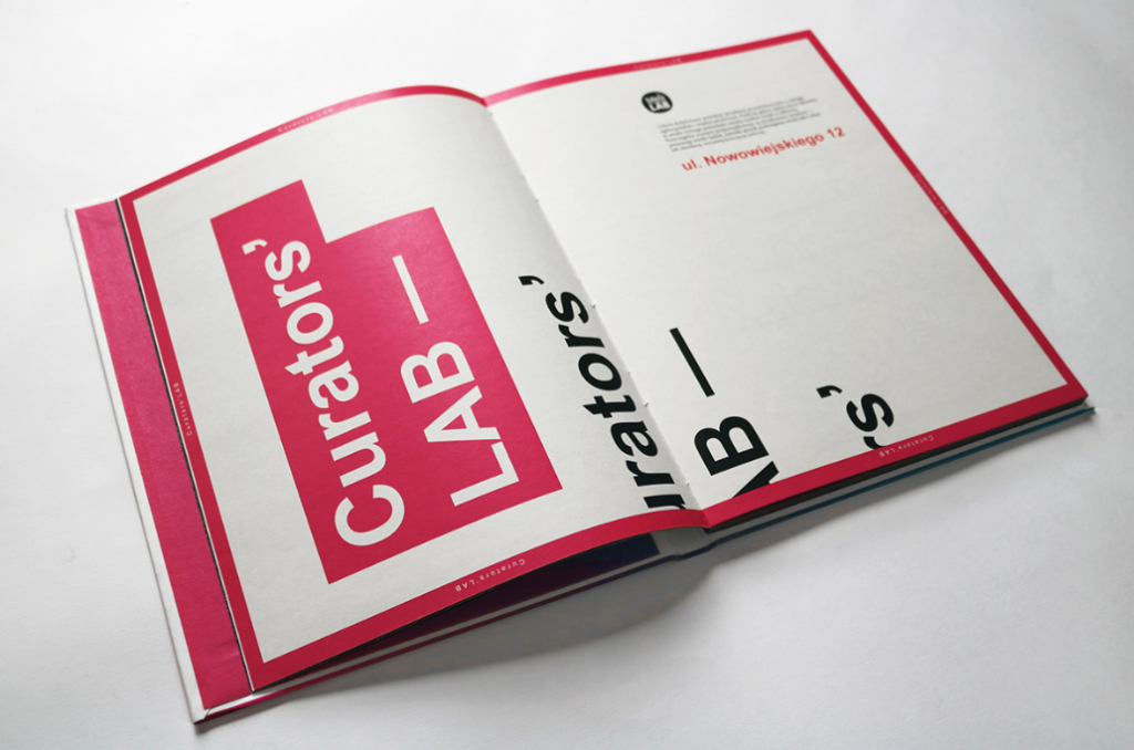
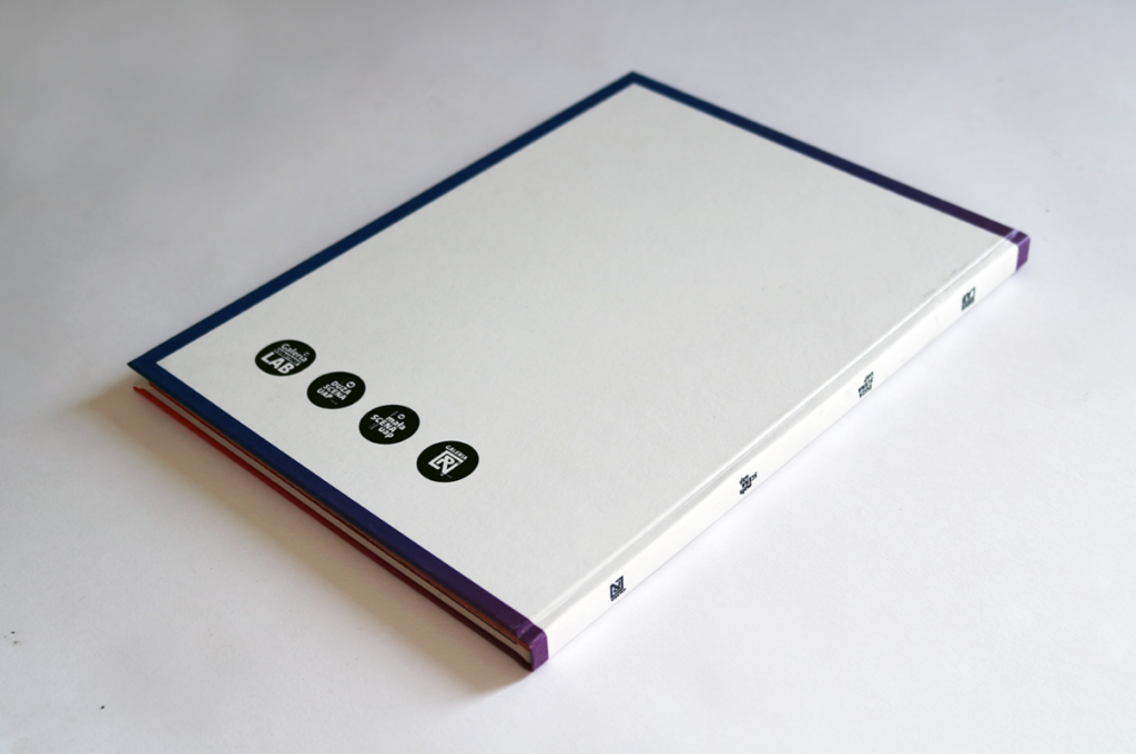
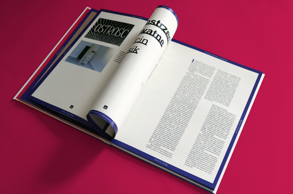
UAP catalog
https://www.behance.net/gallery/115304017/UAP-catalog
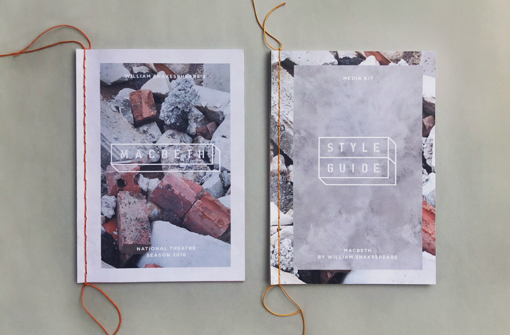
All Hail Macbeth